


About the Row Element
The Row Element is one of the most essential components when creating a page.
Typically, you’ll start with the Row element to lay the foundation of your layout. You can freely arrange multiple rows to structure your page as desired.
For more advanced grid layouts, which help ensure your content is organized and responsive across various screen sizes, you can nest up to 12 columns within a single row.
Once your framework is set, you can easily drag and drop elements like text, images, videos, and buttons into the row.
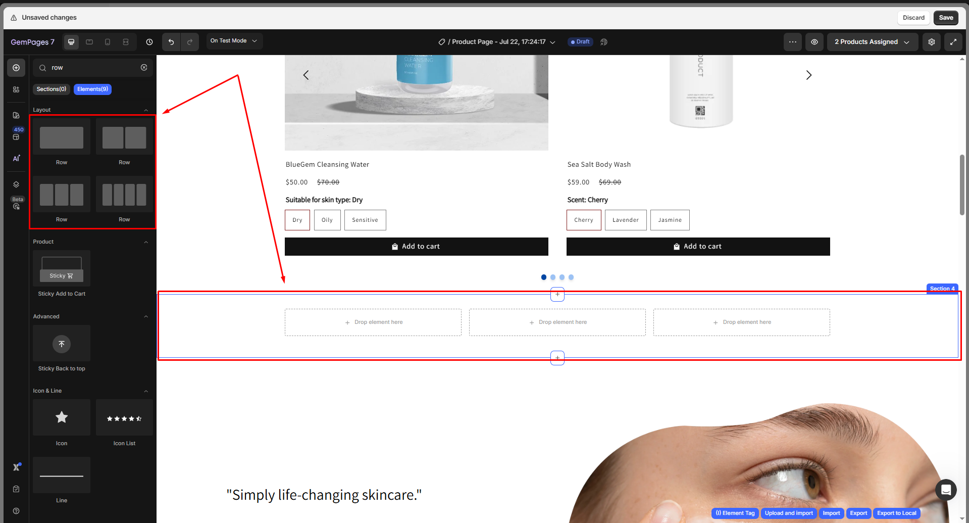
How to Add a Row Element to GemPages V7?
Step 1: In the GemPages Dashboard, access the Pages section, open an existing page, or create a new one. You’ll be directed to the GemPages Editor.
Step 2: Check the left sidebar to find the Row element. Choose a row layout, then drag and drop it onto the design area.
Step 3: Click on the element to open its settings panel in the left sidebar, which separated into Settings and Advanced tabs.
Configure the Settings Tab
Layout
Under the Layout section, define how many columns appear in a single row.
You can choose from six preset layouts (1–6 columns), and each preset automatically divides the row into equal sections.
These columns act as containers where you can add different elements, such as images, text blocks, or buttons, to structure your content.
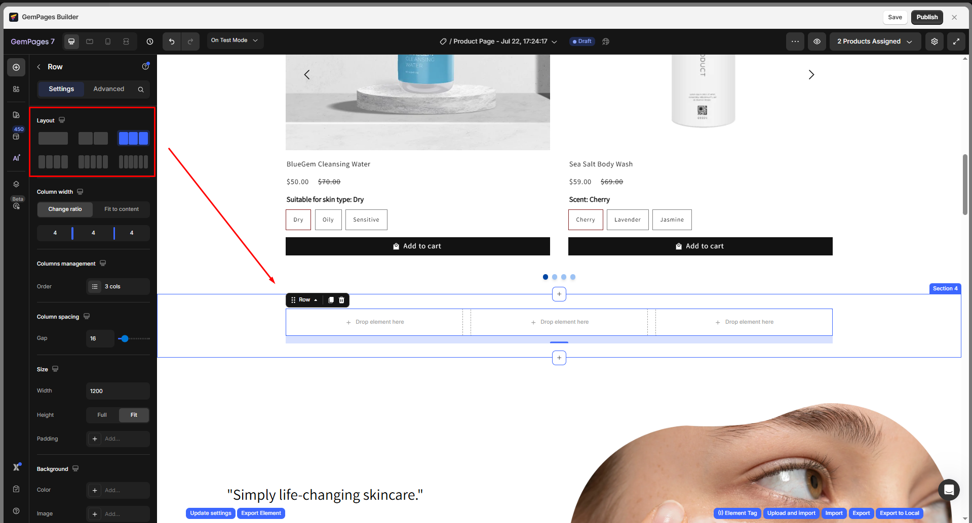
Column width
Control how much space each column takes within the row. You can set it in two ways:
- Change Ratio: All columns are evenly distributed. Drag the slider to adjust the width ratio between them.
- Fit to Content: The column width automatically adjusts to the size of its content.

This flexibility helps you design layouts that adapt to different content lengths and maintain balance across the page.
Column management
Under this section, you can manage the number and order of columns inside your row. Hover over each column in the list to:
- Rearrange: Change the column’s position.
- Copy: Duplicate the column and its content.
- Delete: Remove the selected column.
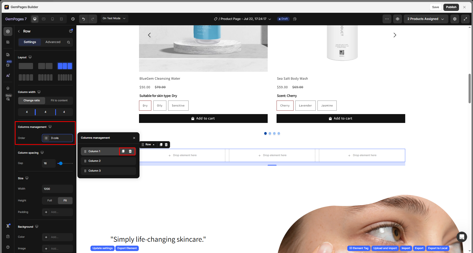
This section makes it easy to reorganize or replicate content blocks without starting from scratch.
Column spacing
Adjust the gap between columns to control how compact or spread out your layout looks. You can either:
- Enter an exact numeric value, or
- Drag the blue slider to visually change the spacing.

Proper spacing helps improve readability and maintain visual hierarchy between columns.
Size
Set the overall size and internal padding of the Row element.
- Width: Defines how wide the row extends across your page.
- Height: Sets the vertical space of the row.
- Padding: Controls the inner spacing between the edge of the row and its content.
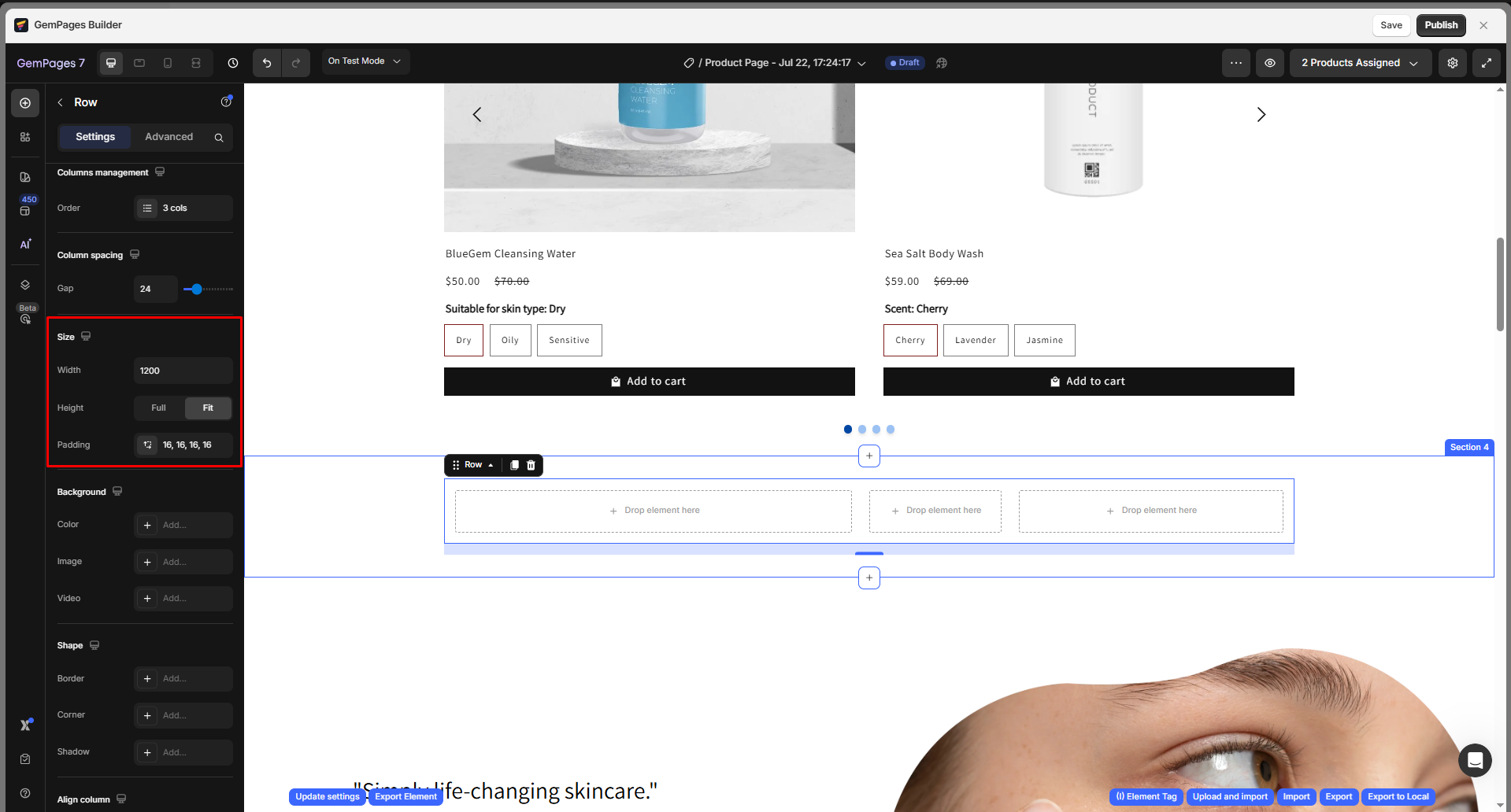
Use these settings to maintain consistent structure and balance throughout your layout.
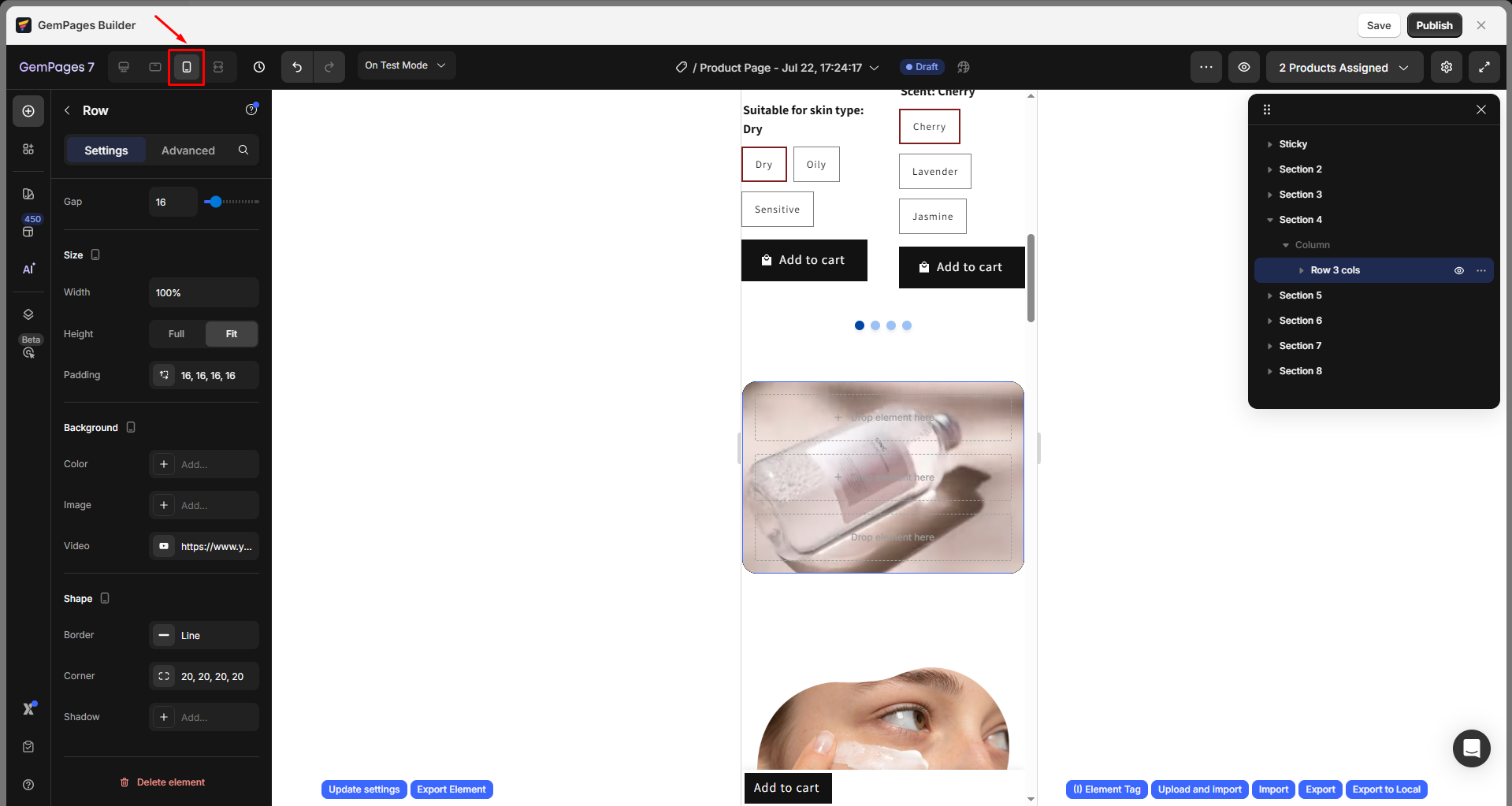
Tip: Match Column Height for Split Layouts
When using a Row with multiple columns, you may encounter cases where the columns have different heights due to varying content lengths.
To make all columns inside the Row display with equal height:
- Select the Row element.
- Go to the Settings tab → Size section.
- Set the Height option to Full.
This allows the left content area to stretch and match the height of the adjacent Image, Video, or Hero Banner, creating a more balanced and visually consistent layout across devices.
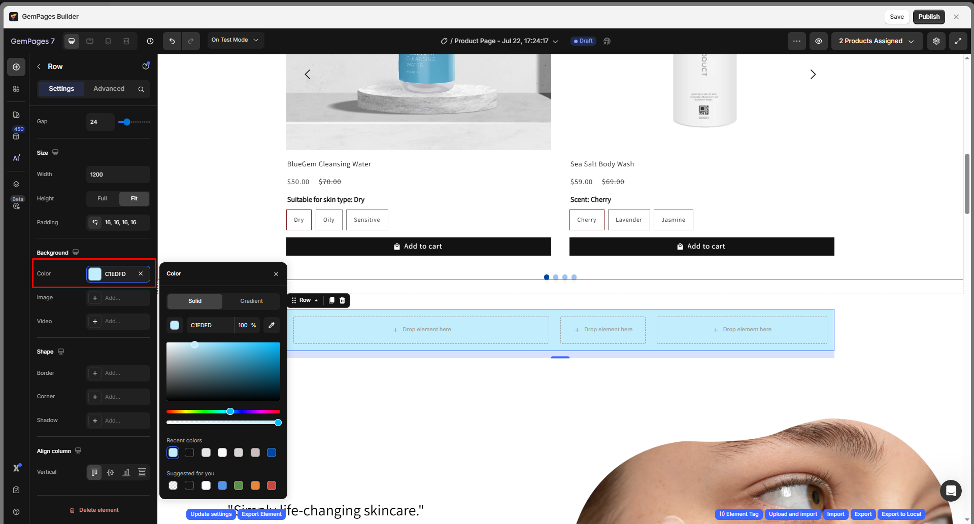
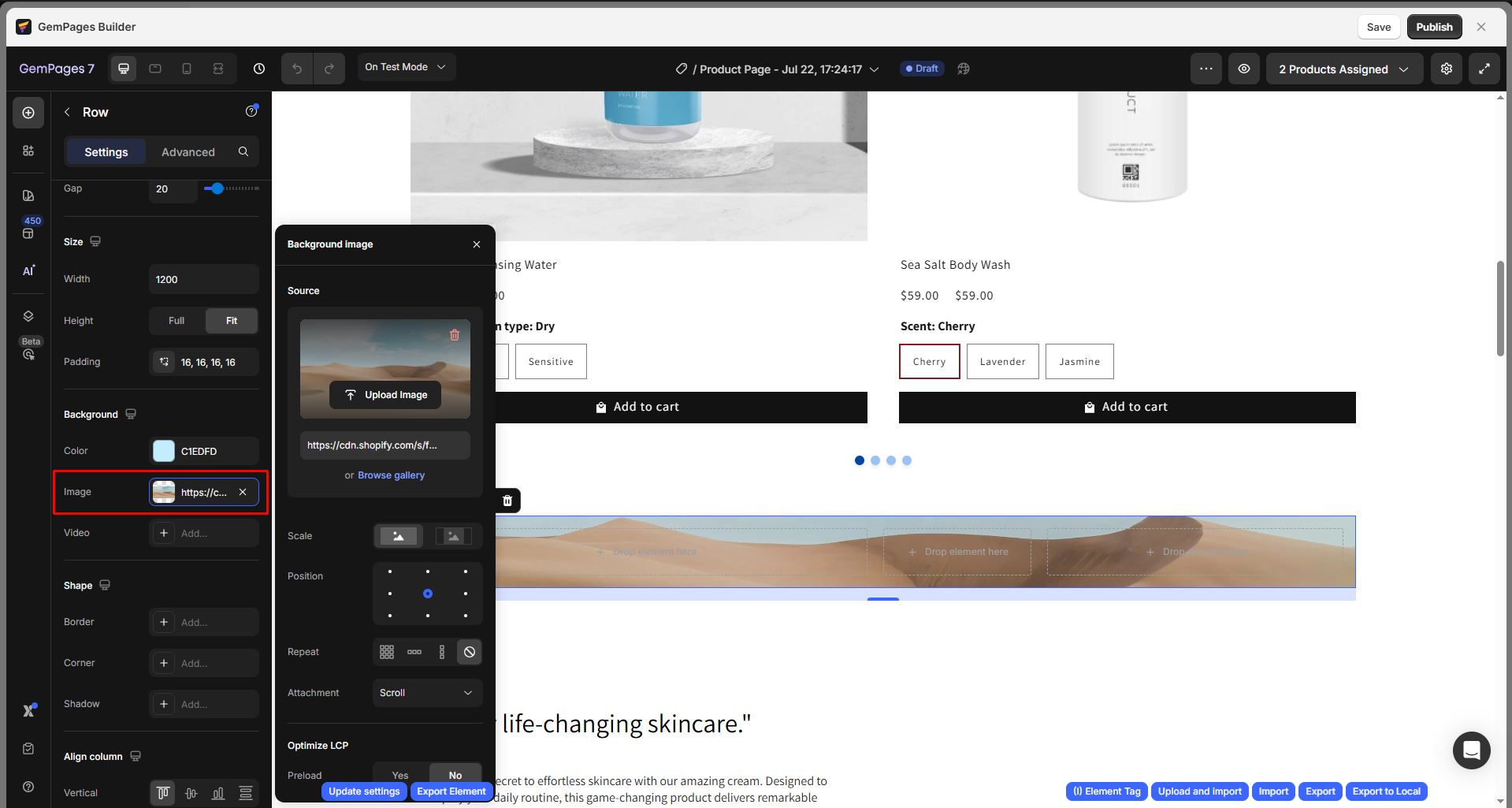
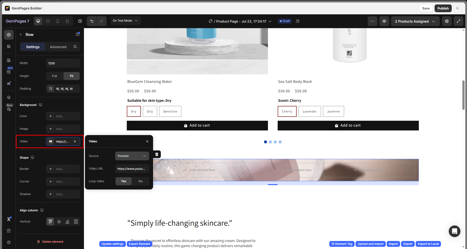
Background
Add a background to your row to create visual depth or highlight specific sections. GemPages provides three background types, including:
- Color: Choose a solid/gradient background color using a HEX code, the color picker, or the swatch selector.
- Image: Upload a new image or select one from your media library.
- Video: Use a hosted video from YouTube or Shopify to create dynamic backgrounds.
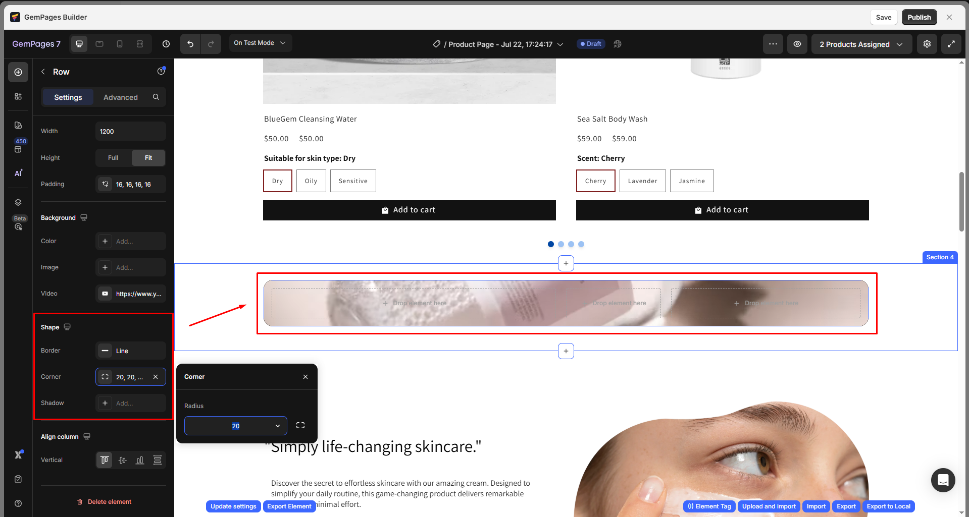
Shape
In this section, you can fine-tune the overall look of your row by customizing its border, corner radius, and shadow effect:
- Border: Add or modify the border around the row. You can define its thickness, style (solid, dashed, or dotted), and color to match your brand style.
- Corner: Adjust the corner radius to make the carousel’s edges rounded or sharp. For example, larger values create a softer, more modern look.
- Shadow: Apply a drop shadow to give your carousel a sense of depth and visual separation from the page background. You can tweak the shadow’s offset, blur, and color for subtle or dramatic effects.
Align column
Adjust the vertical alignment of all columns within the row. Choose from:
- Align Top: Align all content to the top of the row.
- Vertical Center: Center all content vertically.
- Align Bottom: Align all content to the bottom.
- Distribute Vertical Spacing: Evenly distribute space between columns.
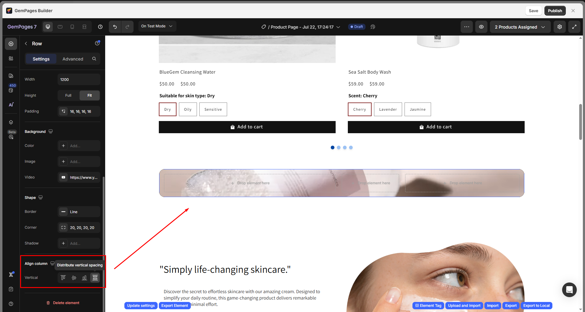
Use this setting to ensure that your content remains balanced and visually consistent across devices.
Configure the Advanced Tab
For more advanced customization, please navigate to the Advanced tab and follow the instructions in this article.
Best Practices for the Row Element
Utilize columns effectively
The Row element is ideal for creating multi-column layouts. You can also nest additional rows within columns to create more complex grid designs.
Design content boxes
Rows are especially effective for creating testimonial sections or similar content areas. You can use the Row element to craft content boxes by adding backgrounds and padding. For full-width content, consider using background images like those in Hero Banners.
Ensure consistent spacing
Within a row, organize your content with a maximum width of 1200px to ensure a uniform appearance across all screen sizes, from small devices to large monitors.
Enhance responsiveness
Take advantage of the flexibility to adjust column positions, order, and widths for different screen sizes. This ensures your design adapts seamlessly and stays visually appealing on all devices.
For step-by-step instructions on making your design responsive across various devices using GemPages, refer to the detailed guidelines in this article.
FAQs
1. How can I set a background color for a column?
Currently, this feature isn’t available. To work around this, you can add custom CSS. Click on the element, go to the Advanced tab, and enter your CSS code in the CSS Class box. Or, you can contact our GemPages Support team for further assistance.
2. How do I create a 5-column row?
You can create a 5-column row by selecting the 5-column layout in the Row settings. Alternatively, you can use the Carousel element for a similar effect.
3. How do I delete a column from a row?
To delete a column in a Row element, follow these steps:
- Choose the row that contains the column you want to delete.
- In the left sidebar, find the column section.
- Click the trash can icon next to the column you want to remove.
4. How do I duplicate a row?
You can duplicate a row by right-clicking the row and selecting Duplicate, or by using keyboard shortcuts:
- On Windows: press Ctrl + C to copy and Ctrl + V to paste.
- On macOS: press Cmd + C to copy and Cmd + V to paste.
5. How to add 8 columns in a row?
Currently, the maximum number of columns is 6 per row in GemPages V7 (as shown in the Settings panel > Layout). If you need more than 6, you can achieve this by nesting another Row element inside one of the existing columns.
6. Can I add border or padding to each column inside a row?
Currently, individual column-level border or padding controls are not available. The border styling is only available at the Row level (under the Shape section), and padding can be applied at the Row level as well.
If you need column-specific styling, please contact our GemPages Support team for further assistance.
7. How do I add more rows to a page?
To add more rows, open the GemPages Editor and drag the Row element from the left sidebar into the design area.
Please note that the number of rows you can add may be affected by section limits. For more details, refer to this article: Shopify Section Limit.


Thank you for your comments