Size and dimension are critical factors that directly impact user experience and interface optimization. This article provides a comprehensive overview of how to manage Size & Dimension effectively when designing with GemPages.
1. Size
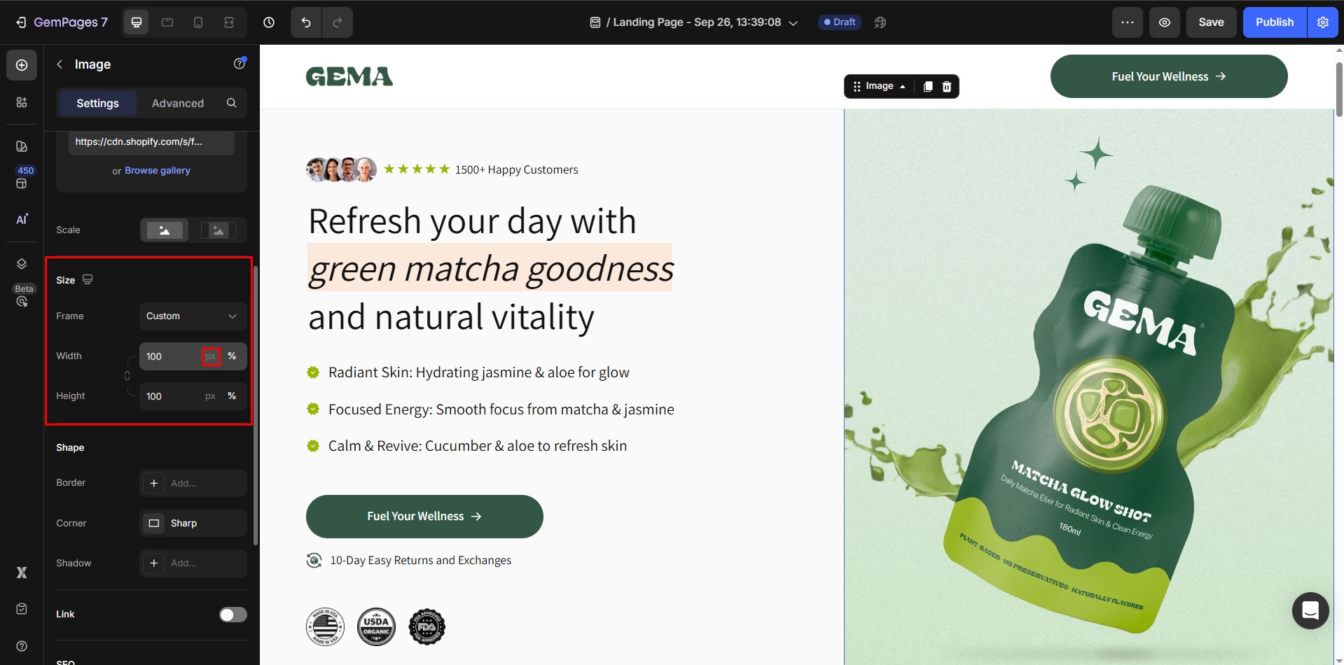
Size determines the scale of an element on a webpage. It can be either fixed or relative, depending on the design requirements.
Fixed Size
- Uses specific values such as px (pixels).
- Ideal for precise control over element size.
Relative Size
- Uses flexible units like %, em, or rem.
- Allows the element to adapt to the size of its parent container or screen.
2. Dimension
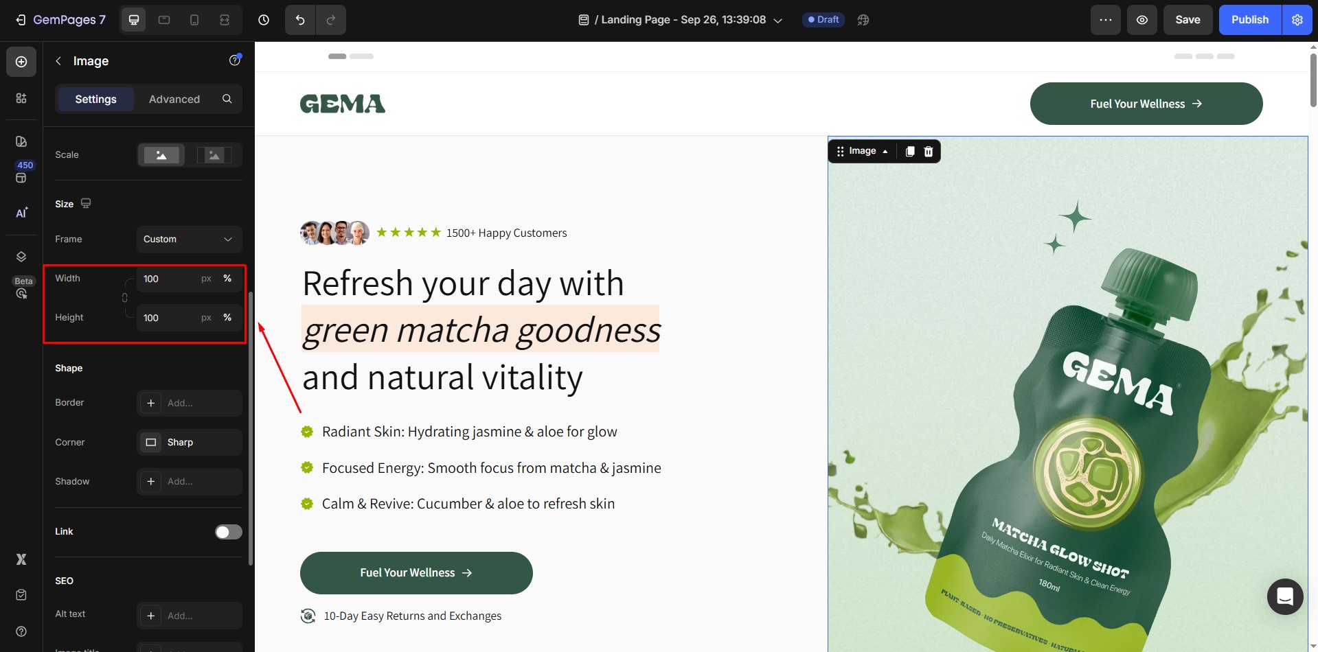
Dimension defines the spatial characteristics of an element, including its width, height, and frame.
Width and Height
- Width: Controls the horizontal size of an element.
- Height: Controls the vertical size of an element.
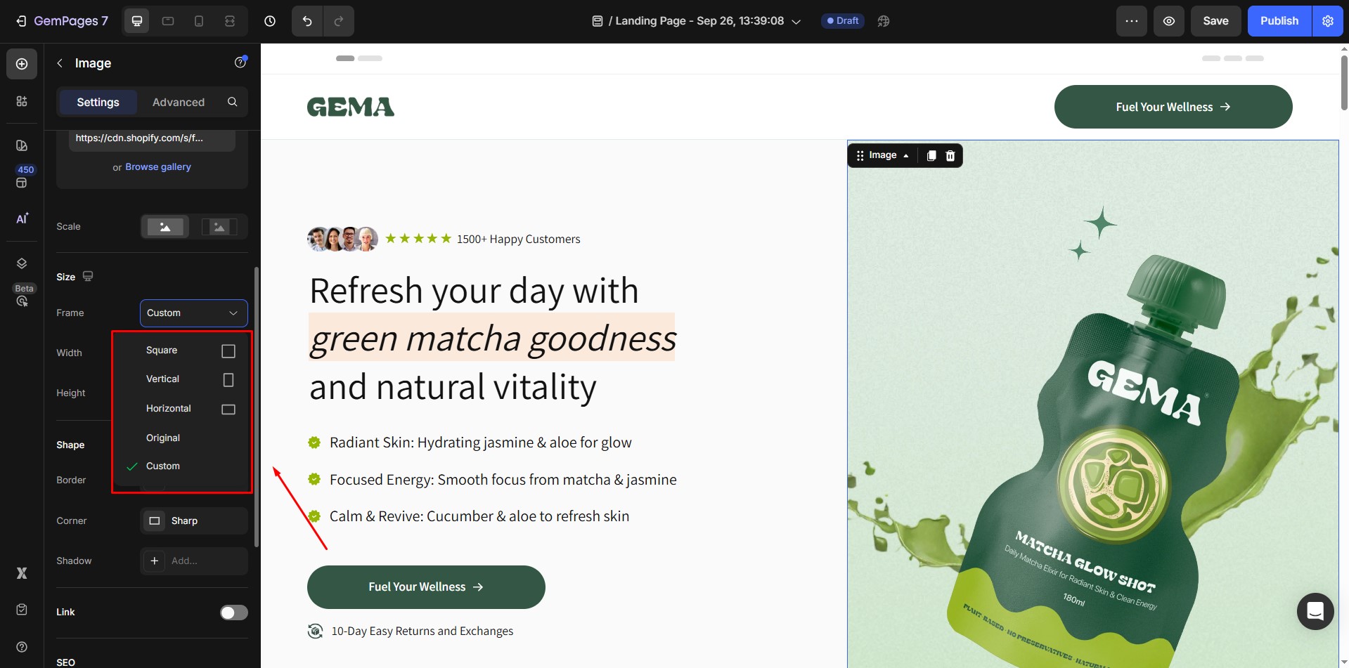
Frame
- Refers to the relationship between an element’s width and height.
- Ensures the element maintains its proportions when resized.
- Example: A 16:9 aspect ratio ensures images or videos remain balanced, avoiding distortion on different devices.


Thank you for your comments