


About the Dynamic Checkout Button
The Dynamic Checkout Button serves as an alternative to the Add to Cart Button, which enables customers to bypass the cart step and make direct purchases.
When the Dynamic Checkout Button is placed inside a Product module, it uses only the product and variant selected in that module to start checkout.
In practice, this means:
- Customers can purchase only one selected variant of the product.
- When the button is clicked, the system does not use the cart at all.
- Any products that were previously added to the cart are completely ignored and removed from the checkout flow.
- Customers are redirected directly to the Shopify Checkout with only the selected product variant from the current Product module.
For example, if a customer has already added Product A to the cart, then visits another product and clicks the Dynamic Checkout Button, only the product shown in the current Product module will appear in checkout. Product A will not be included.
Two main types of Dynamic Checkout buttons
Branded button
Branded buttons appear when third-party accelerated checkout methods supported by Shopify are enabled in your store. These buttons display the official logos of the providers, making it easier for customers to recognize and complete checkout with their preferred service.
Supported providers include:
- Amazon Pay
- Apple Pay
- Google Pay
- PayPal
- Shop Pay
- Venmo
If you see a Shop Pay, Apple Pay, or similar branded button on your live page, that’s the Dynamic Checkout Button automatically showing the accelerated checkout method available for the customer.
For more information, you can check out this Shopify article.
Unbranded button
Unbranded buttons display the text “Buy it now” when no payment gateways are enabled. Once a customer clicks, they skip the cart and are taken directly to the Shopify Checkout.
The display of unbranded buttons can vary depending on several factors, such as:
- Payment settings in your Shopify admin
- Customer’s device and browser
- Customer’s previous payment history
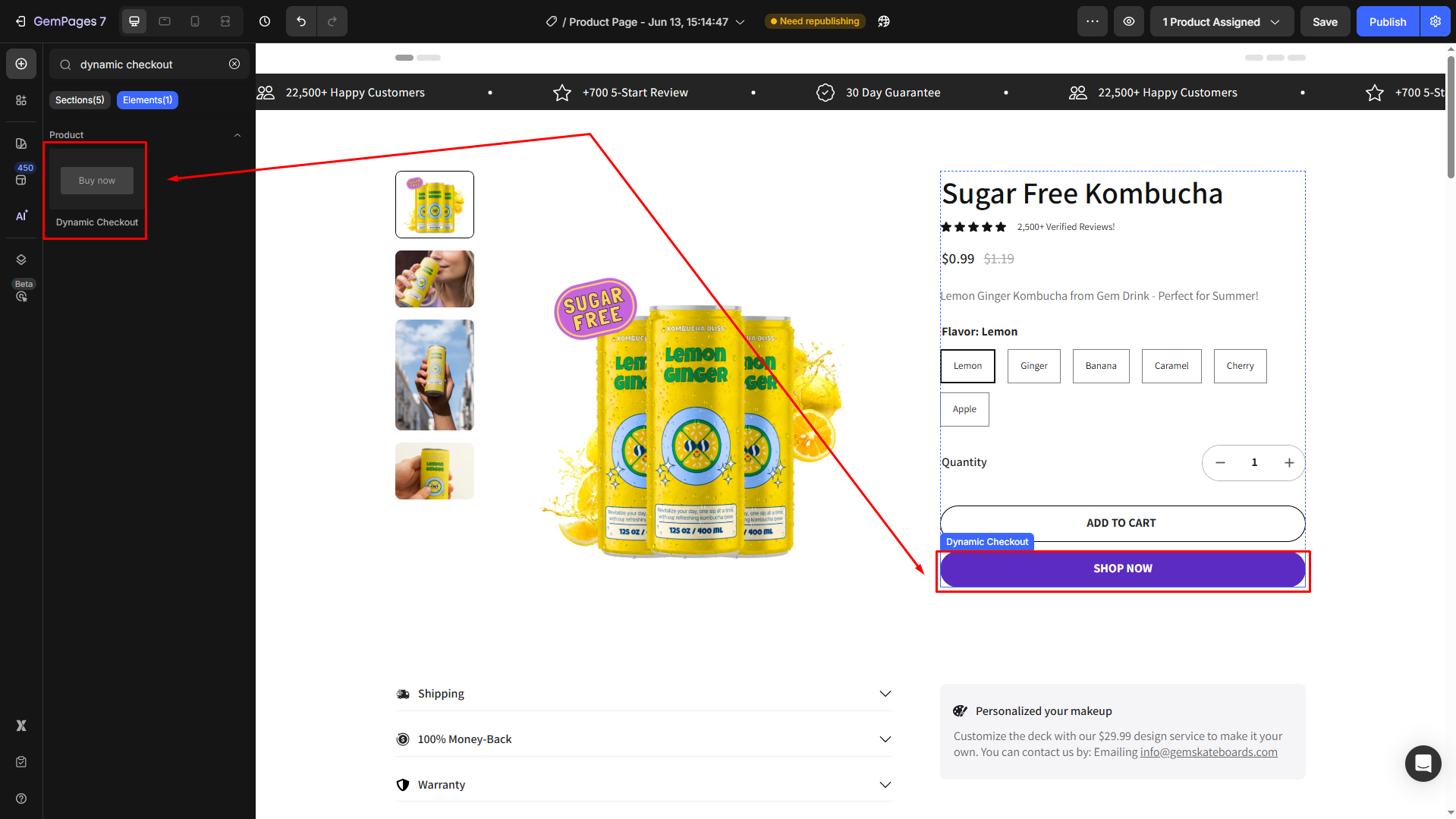
Add a Dynamic Checkout Button element to your page
To add the Dynamic Checkout Button to your page, please follow these steps:
Step 1: Go to the GemPages Dashboard > Pages and select the page you want to work on to enter the Editor.
Step 2: From the left sidebar, enter Dynamic Checkout in the search bar, then drag and drop the element into a Product Module, placing it in your preferred spot.
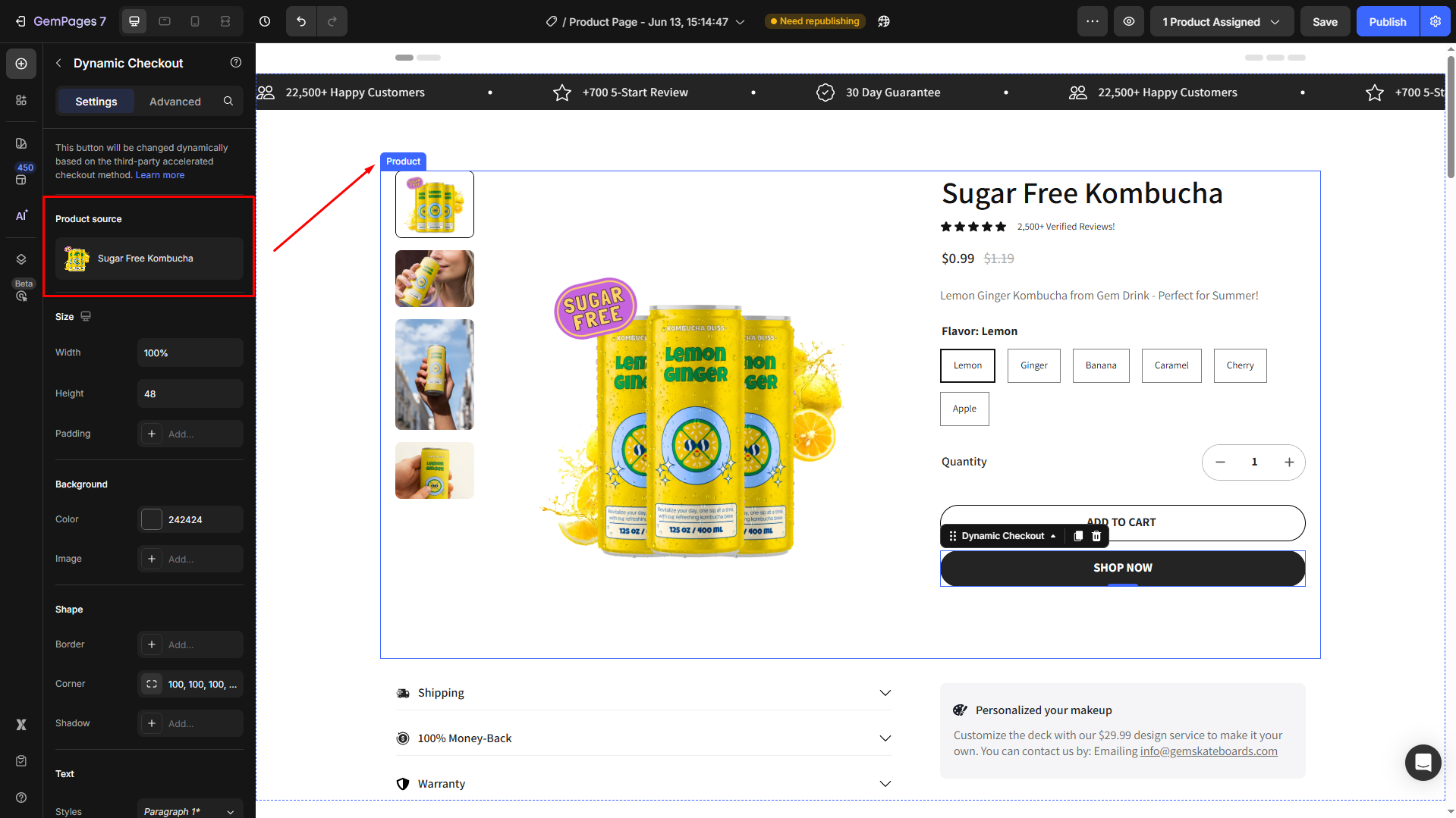
Step 3: Click on the element to open its settings. From here, you can customize it your way within the Settings and Advanced tabs.
Configure the Settings Tab
The Settings tab provides you with a range of options to configure and customize the behavior and appearance of the Dynamic Checkout Button.
Product source
As this element is nested within the Product module, the product source will be automatically synced with the module.
However, if you prefer another product, click on the current product to manage it in the Product element.
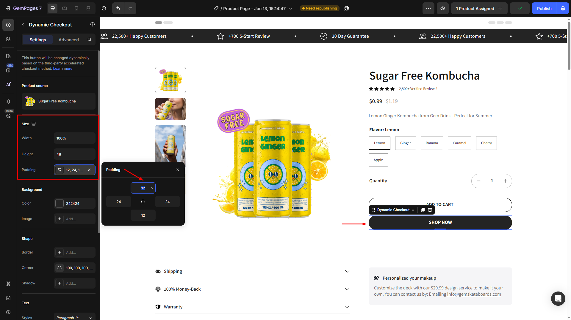
Size
Under the Size section, adjust the width, height, and padding of the button:
- Width: Choose from the dropdown option, including the Fit content (Auto), Full (100%), Small (100px), Medium (116px), and Large (132px). You can also enter an exact desired percentage in the box.
- Height: Customize the height, or select from available options: Fit content (Auto), Small (28px), Medium (36px), and Large (44px).
- Padding: Click the “+ Add…” box to open the padding’s settings panel.
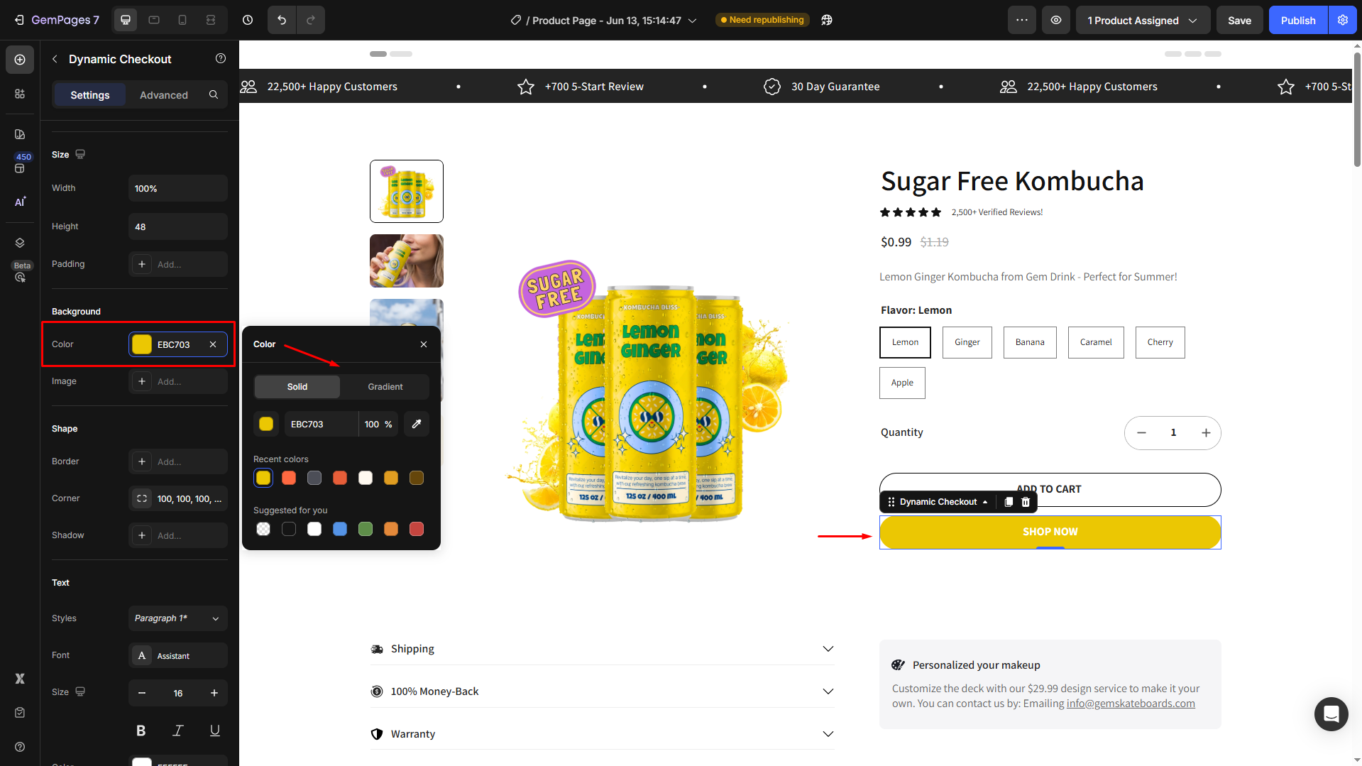
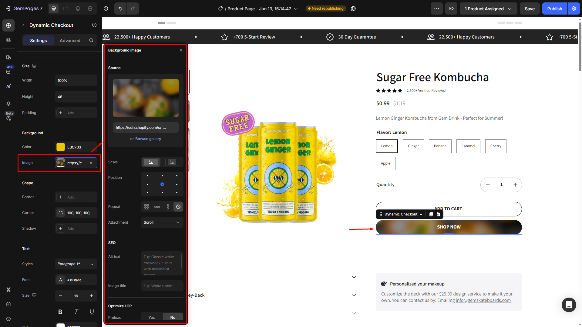
Background
GemPages allows you to set the button’s background by choosing a color or using an image:
- Color: Open the settings panel to select the preferred color for your button. You can use a solid color background or a gradient one.
- Image: Upload a new image or select from your media gallery. Next, modify the image as you prefer in the settings panel.
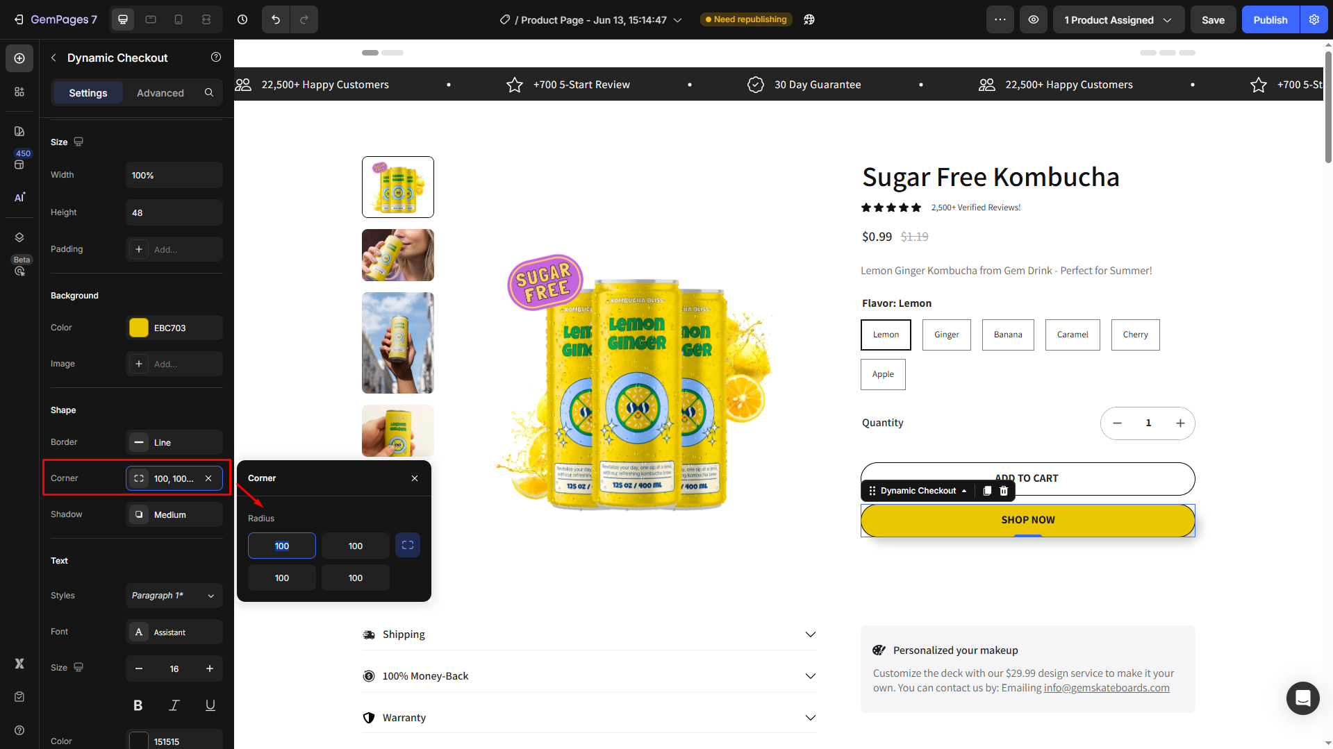
Shape
To improve the button’s look, you can add a shape, adjust the corner radius, and add a shadow effect in the Shape section:
- Border: Choose the border’s color, thickness, and border stroke (line, dash, or dot)
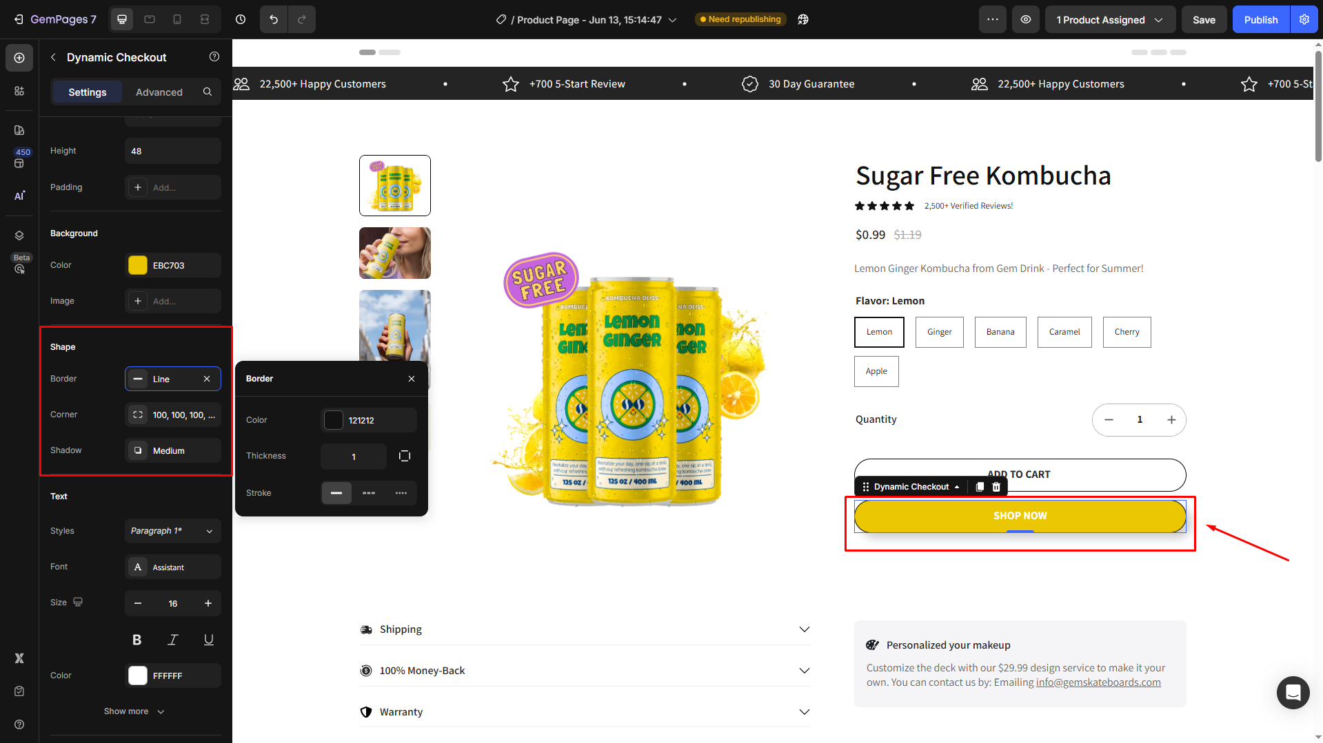
- Corner: Adjust the border’s corner radius
- Higher values = more rounded corners
- 0 value = sharp, square corners
- You can link or unlink the corners to apply the same radius to all sides or set each corner individually.
For example, we set the corner radius to 100 to create a pill-shaped button look.
- Shadow: Add depth to your button by applying a drop shadow, which makes the button stand out and ensures a more dynamic look.
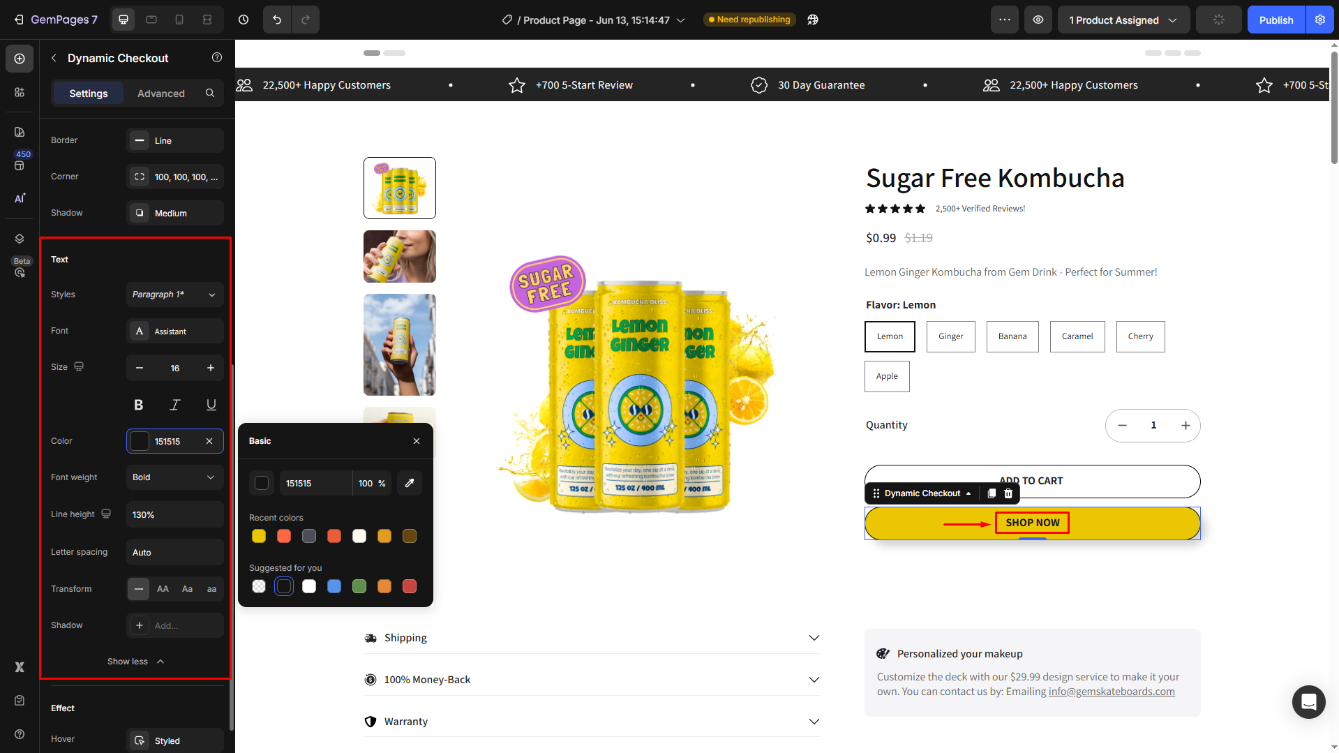
Text
Under the Text section, you can customize the button text your way. Hit Show more to see all text settings.
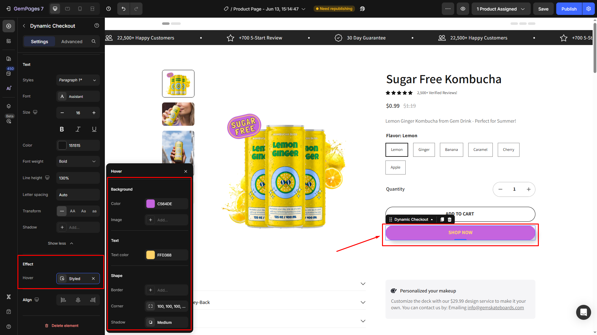
Effect
From here, add a hover effect to your button. Customize how the button looks when visitors hover over your button.
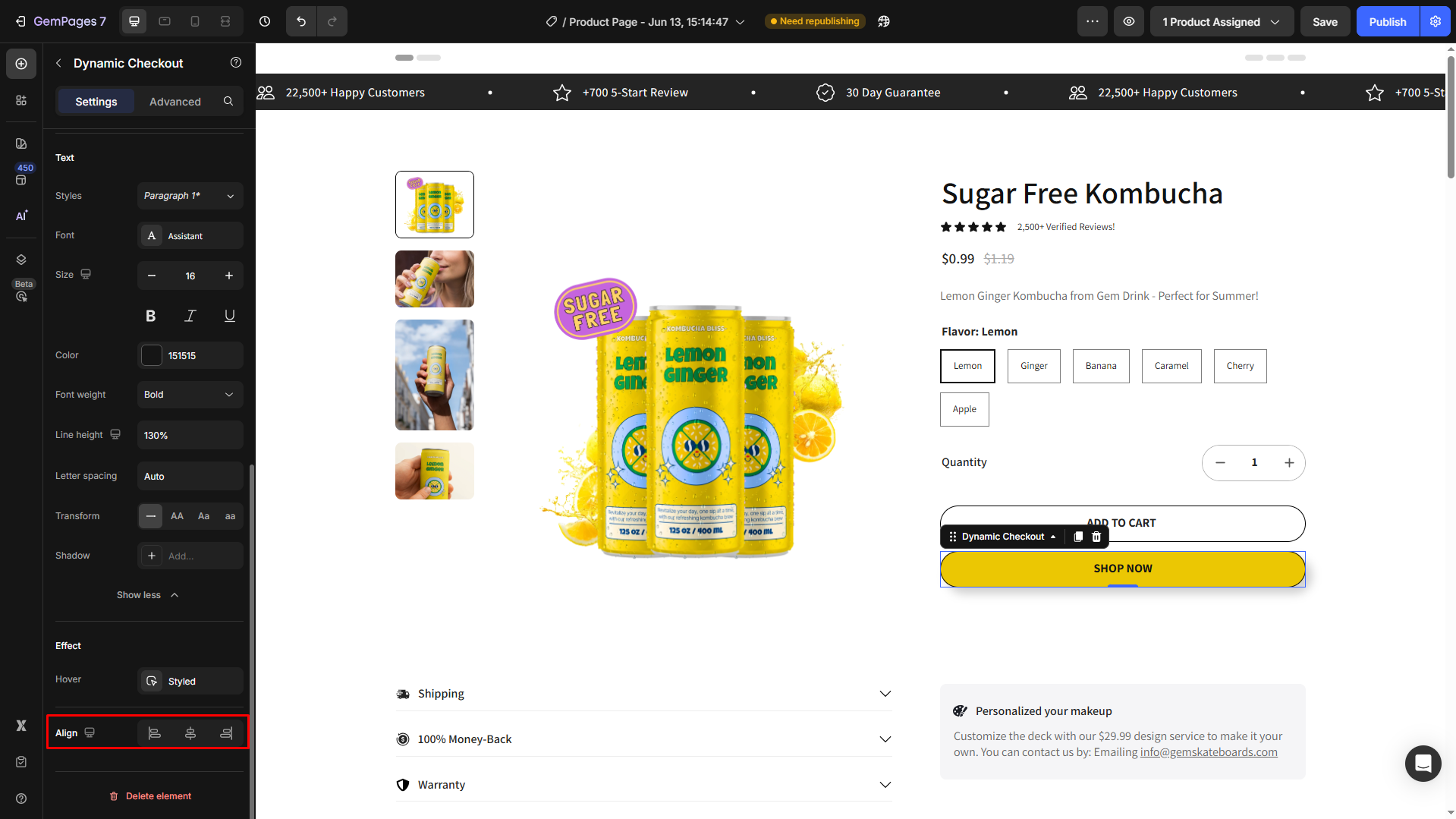
Align
If your button’s width is under 100%, you can change the button alignment: left-aligned, center-aligned, or right-aligned.
Configure the Advanced Tab
For more advanced customization, please navigate to the Advanced tab and follow the instructions in this article.
You can also find more useful tips and video tutorials at GemPages Academy.
FAQs about the Dynamic Checkout Button
1. What’s the difference between Add to Cart (redirect to checkout) and the Dynamic Checkout Button?
The two buttons skip the cart in different ways.
- Add to Cart → Redirect to Checkout still uses the cart. It only skips the cart page visually, so all existing cart items are included in checkout.
- Dynamic Checkout Button skips the cart completely. It sends only the product shown in the current Product module directly to checkout and ignores all other items in the cart.
Example:
A buyer has already added Product A to the cart.
They then go to Product B and click the call-to-action button to go to checkout.
- If the page uses Add to Cart → Checkout, both Product A and Product B will appear on the checkout page.
- If the page uses the Dynamic Checkout Button, only Product B will appear at checkout. Product A is skipped and not included.
2. What’s the difference between a branded and unbranded Dynamic Checkout Button?
- Branded buttons display official payment logos (Shop Pay, Apple Pay, PayPal, etc.) when those payment gateways are enabled in your Shopify store.
- Unbranded buttons display the text “Buy it now” when no accelerated payment methods are available.
3. Where should I place the Dynamic Checkout Button in my layout?
The Dynamic Checkout Button must be nested inside a Product module for it to function correctly. If you don’t have a Product Element on your page yet, add one first, then drag and drop the button inside it.
4. Can I customize the style and size of the Dynamic Checkout Button?
Yes. You can adjust the width, height, padding, background color, corner radius, and shadow under the Settings tab. To add hover animations or advanced effects, open the Advanced tab for more detailed customization options.
5. Why does the Shop Pay button appear instead of the Add to Cart button?
This happens when the Dynamic Checkout Button is active. Then, Shopify automatically shows a branded accelerated checkout (like Shop Pay or Apple Pay) in place of the standard Add to Cart button.
To display only Add to Cart, disable Shop Pay under Shopify Settings › Payments › Accelerated checkouts or remove the Dynamic Checkout Button element from your GemPages layout.


Thank you for your comments