


About the Image Element
The Image element in GemPages allows you to display single images on your page, which is ideal for showcasing products, banners, brand visuals, promotions, or trust badges.
Whether you want to emphasize a product highlight, illustrate your brand’s aesthetic, or create visual separation between sections, the Image element gives you full control over how images appear across devices.
You can easily upload new images, reuse existing ones from your Shopify files, and customize size, position, borders, and animations without coding.
How to Add an Image Element to Your Page?
Step 1: Log in to your Shopify admin > GemPages Dashboard > Pages.
Step 2: You can see all your pages built with GemPages here. Click on the target page to open the Editor.
If you prefer to build a new page, hit Create new page to start building your page from scratch, or select from pre-designed templates.
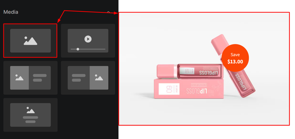
Step 3: From the left sidebar, enter Image in the search bar, then drag and drop the image element to the position you prefer.
Configure the Settings Tab
The Image Element offers flexible image settings so you can control size, shape, and responsiveness with ease.
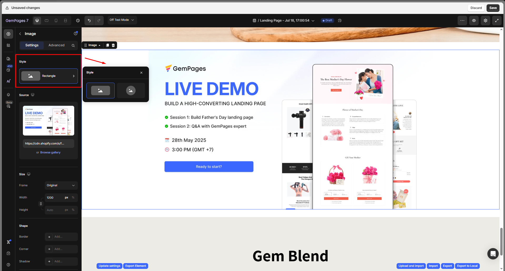
Style
Choose how your image is visually styled:
- Rectangle: Default rectangular shape
- Circle: Automatically crops the image into a perfect circle
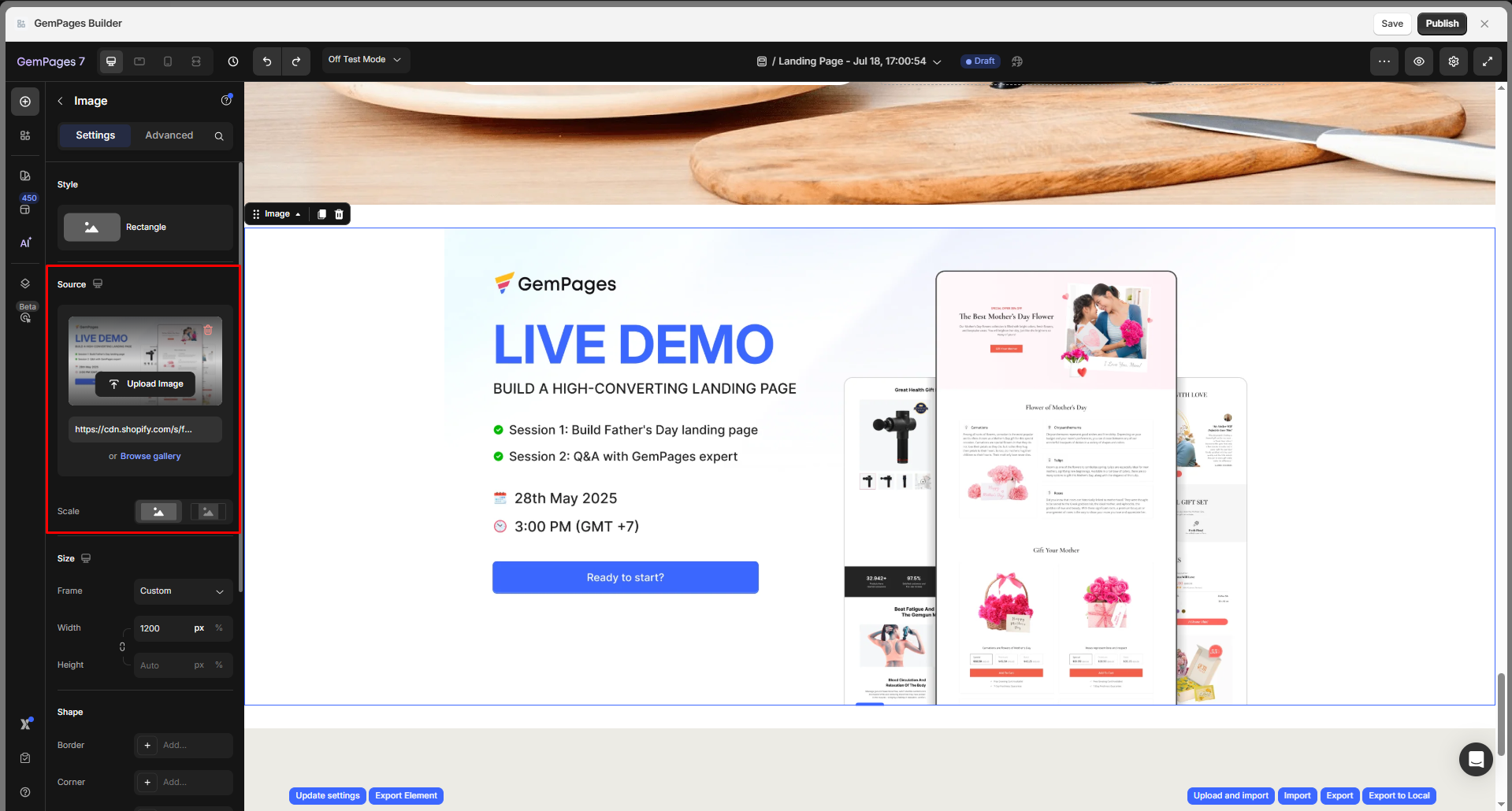
Source
Upload or select the image file. You can:
- Click Upload Image, paste the image URL, or hit Browse gallery to choose from your media.
- Once uploaded, the image URL will appear below for reference or editing
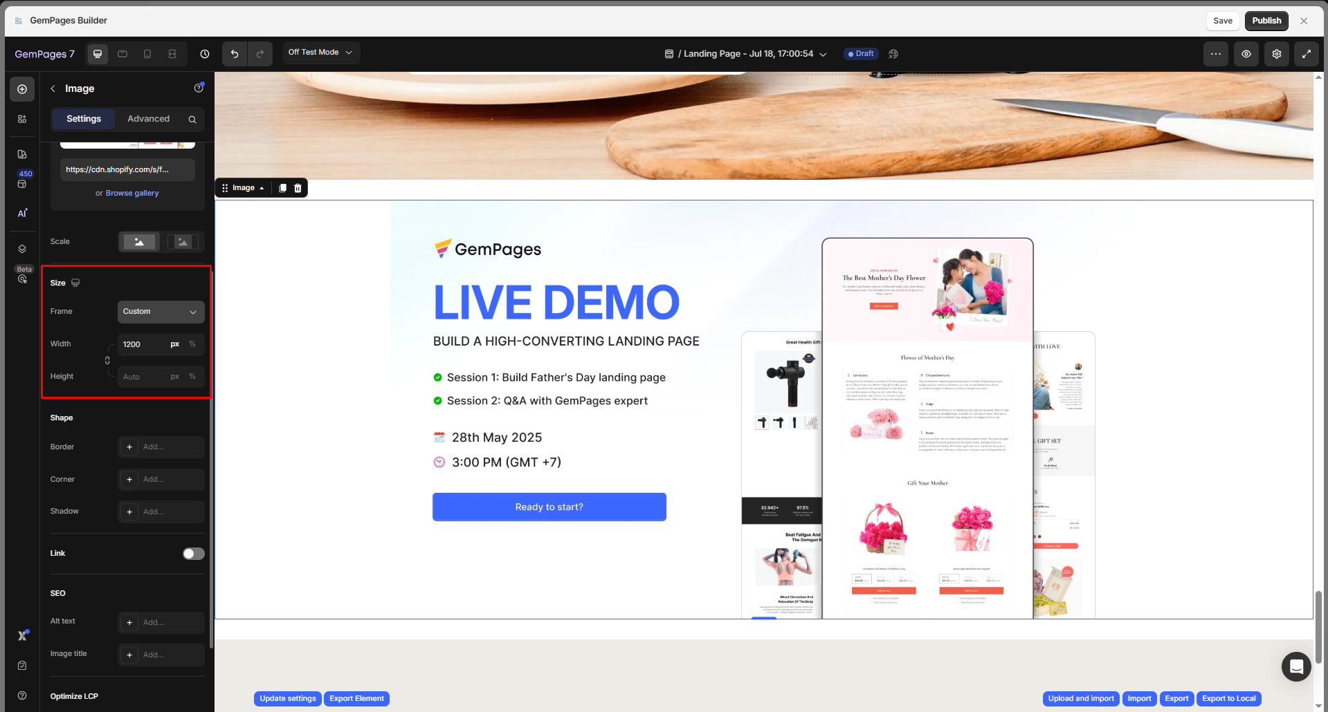
Size
Control how the image is displayed in terms of layout and responsiveness:
Frame: Choose a predefined aspect ratio or use a custom one:
- Square
- Vertical
- Horizontal
- Original (keeps the image’s native dimensions)
- Custom (manually set width & height)
Width/Height:
- Set in pixels (px) or percentage (%)
- Toggle the lock icon to maintain or break the aspect ratio
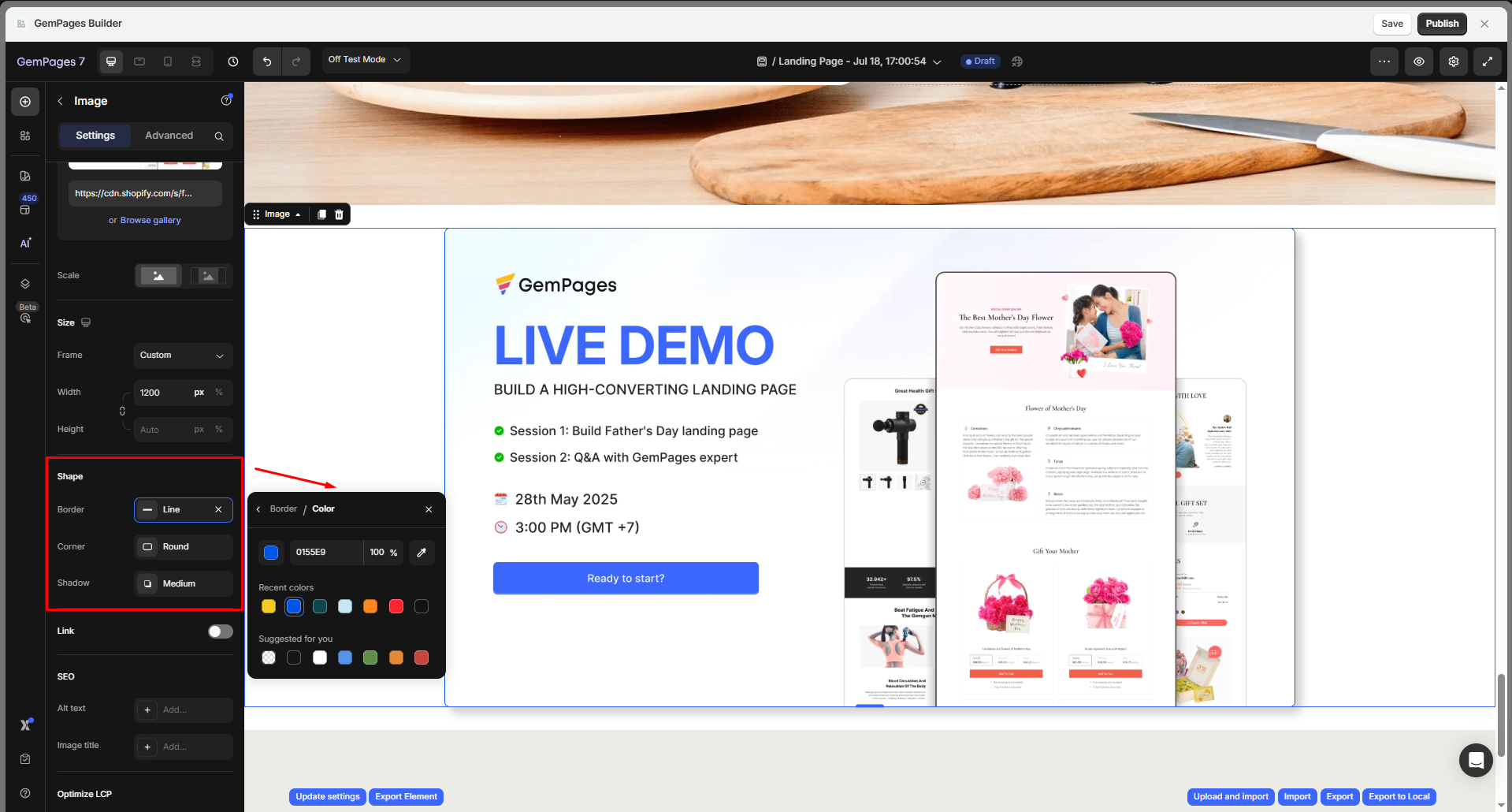
Shape
Style the image container with visual enhancements to better match your design:
Border: Add a border around the image. Customize:
- Color: Choose any HEX color
- Thickness: Set pixel value
- Stroke style: Solid, dashed, or dotted
Corner: Round the image’s corners by adjusting the border radius. You can:
- Apply the same radius to all corners
- Unlock the values to style each corner individually
Shadow: Add a shadow effect to give depth or separation from the background. Configure:
- Type: Outer, inner, or centered
- Direction: Control the shadow angle
- Color
- Distance, Blur, and Size
Link
Make the image clickable by toggling ON, then select the action you want to add after clicking the image, including:
| After Click Option | Field(s) Shown | Description |
| Open page | Page/link | Enter a Shopify page, external URL, or anchor (#section-id). |
| Scroll to | Section | Input the ID of the section you want to scroll to. |
| Open popup | Popup | Choose a pop-up to trigger. |
| Send email | Email address
Subject Messages |
Define the recipient, optional subject, and message for the mailto link. |
| Make phone call | Number | Enter the phone number to dial (mobile devices only). |

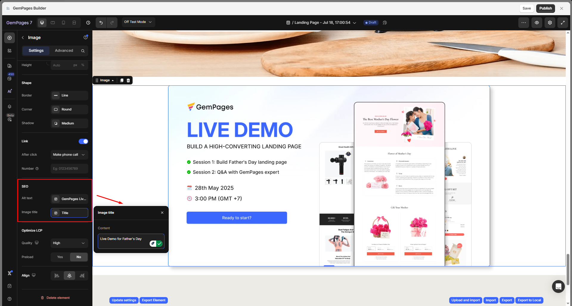
SEO
Improve image accessibility and search engine performance:
- Alt text: Describe the image (used by screen readers and search engines)
- Image title: Optional title that may show as tooltip text
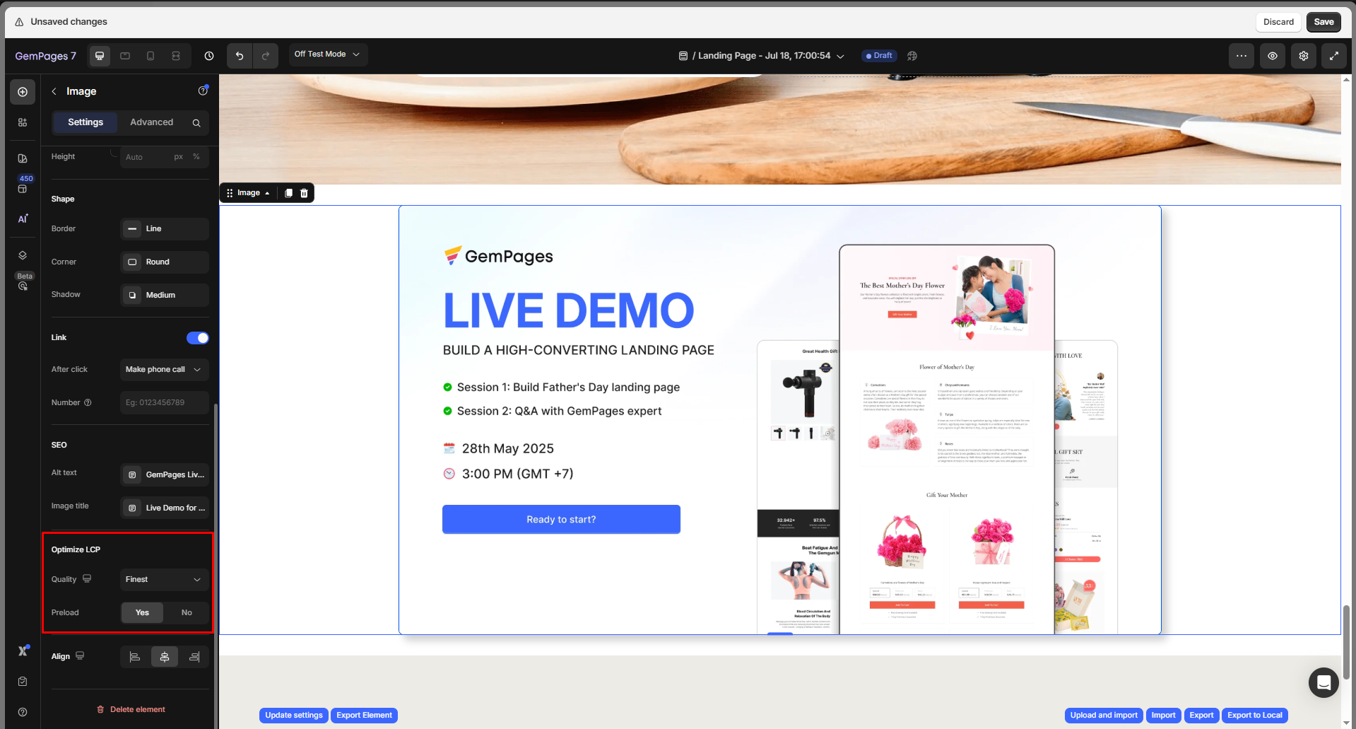
Optimize LCP
Helps optimize loading for better performance scores:
Quality: Choose compression level:
- Finest (highest quality)
- High (default, balanced)
- Medium (for performance-heavy pages)
- Custom (advanced compression settings)
Preload: Enable if the image is above-the-fold and contributes to Largest Contentful Paint (LCP)
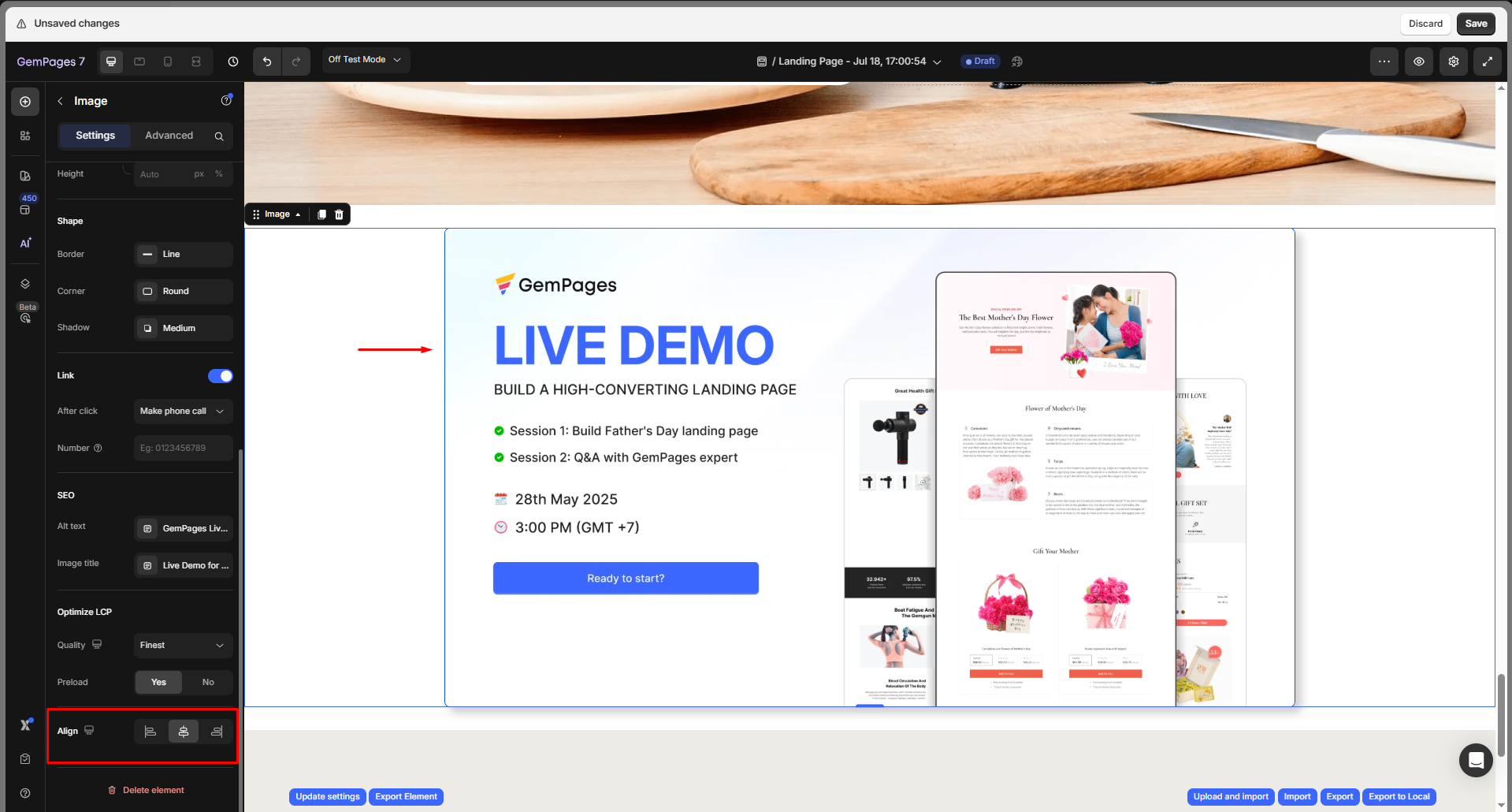
Align
Align the image within its container: Left, Center, or Right.
Configure the Advanced Tab
For more advanced customization, please navigate to the Advanced tab and follow the instructions in this article.
Troubleshooting: Image Not Showing on Page
If your uploaded image doesn’t appear in the Editor or on the live page, try the checks below:
Common Causes & Fixes
| Symptom | Likely Cause | How to Fix |
|---|---|---|
| Image shows blank/broken | File removed from Shopify Files | Re-upload the image and re-select it under Source |
| Image disappears only on mobile/desktop | Device visibility hidden | Select the image, go to the Advanced tab > Visibility to ensure the target device is enabled |
| Image shows extremely small/collapsed | Width or height was set too small (px = 0 / % auto collapse) | In Size, increase pixel values or use a larger % |
| Image not loading above-the-fold | LCP not optimized / image not preloaded | Enable Preload in Optimize LCP |
| Live page shows old/broken version | Browser/CDN caching | Hard refresh or clear cache and republish |
Image Element Best Practices
Put Text Over an Image
If you’re interested in creating a banner with text overlay on an image, we’ve got a video tutorial just for you. Watch the video below for step-by-step guidance.
Make Your Image Clickable
Making images clickable or interactive enhances user experience and engagement.
Learn more: Make a Text or Image Clickable
FAQs about Image Element
1. How can I stop my image from scaling automatically?
If you do not want an image to scale, go to the Size section in the Image settings. Set the width and height in pixels (px) instead of percentages (%). This locks the image to a fixed size across all devices.
2. Where do I find the image settings in GemPages?
Simply click on the image inside the editor, and the Settings tab will appear in the left sidebar. From there, you can adjust all image settings, including size, frame, border, shadow, and link options.
3. Can I make an image clickable?
Yes. In the Settings tab, scroll down to the Link section and toggle it ON. You can link the image to a page, external URL, section anchor, pop-up, email, or even a phone number.
4. How do I add alt text to an image for SEO?
In the SEO section of the image settings, enter descriptive alt text. This improves accessibility for screen readers and helps search engines understand your image.
5. Why does my image look blurry after upload?
If your image looks blurry, check the Quality setting under Optimize LCP. Switching to Finest quality usually fixes the issue, but make sure the source file you uploaded is high-resolution.
6. Can I overlay text on an image directly?
The Image element itself doesn’t support direct text overlay. For this, use the Hero Banner element, which allows you to place text, buttons, or other elements on top of an image.
7. How do you add images to your page in GemPages?
To add images to a template, drag and drop the Image element into your page layout inside the Editor. You can upload a new file, pick one from your Shopify media library, or paste an image URL. This lets you visually customize any product, collection, or landing page template.
8. How do I update images after publishing my page?
Simply click on the image inside the editor. In the Source section, you can upload a new image, replace it with one from your media library, or adjust its settings. Once updated, click Save and Publish to apply the changes live on your store.
9. What does “Following Link” mean when I set the After click action to Open page?

The setting “Following link: Yes/No” controls whether search engines are allowed to follow the hyperlink attached to your image.
- Yes: Search engines (like Google) can follow this link to the target page. Use this if the link goes to an important page you want indexed (e.g., a product or collection page).
- No: Adds a
rel="nofollow"tag to the link. This tells search engines not to follow the link or pass link authority.
10. How do I link WhatsApp using the Image element?
You can turn any image (such as a WhatsApp icon) into a chat button. Just add an Image element, upload your WhatsApp logo, and enable the Link option.
Use this format for your WhatsApp link: https://wa.me/<your-number>. For example: https://wa.me/15551234567.
When customers click the image, it will open a WhatsApp chat with your number.
11. Why does my image upload fail in GemPages?
GemPages supports JPG, JPEG, GIF, PNG, SVG, and WebP images up to 20 MB, following Shopify’s file upload limits. In addition, Shopify also restricts images to a maximum resolution of 20 megapixels (MP). If your image exceeds either the file size or resolution limit, the upload may fail.
Formats such as AVIF are not supported yet. In this case, you can upload the image to Shopify Files to get its link or convert the file to a supported format before uploading it to GemPages.
For more details about Shopify’s supported media types and limits, see this official documentation from Shopify.
12. How do I make an image bigger on mobile?
13. Does GemPages support zoomable images?
14. Does the Image Element support a dynamic image source?
- Product Image element: automatically displays each product’s featured image on product pages
- Article Image element: shows the featured image of a blog post


Thank you for your comments