


About the Product Variants & Swatches Element
Unlike the previous version of the Editor, Editor v7 features a single element called (P) Variants and Swatches to display various options of a product, such as size, color, materials, etc., to increase your conversion rate.
In GemPages V7, the Product Variants and Swatches element lets you display all product variant options in a single, customizable interface, from dropdowns to color swatches to image thumbnails.

Common use cases:
- Let customers choose size, color, or material
- Show sold-out status visually
- Use variant images or upload custom swatch visuals
How to Add Product Variants in Shopify
Before displaying variants in the Product Variants & Swatches element, you must first create those variants in your Shopify product settings.
Follow these steps to add product variants in Shopify:
Step 1: From your Shopify admin, go to Products.
Step 2: Click the product where you want to add variants.
Step 3: Scroll to the Variants section and click + Add options like size or color.
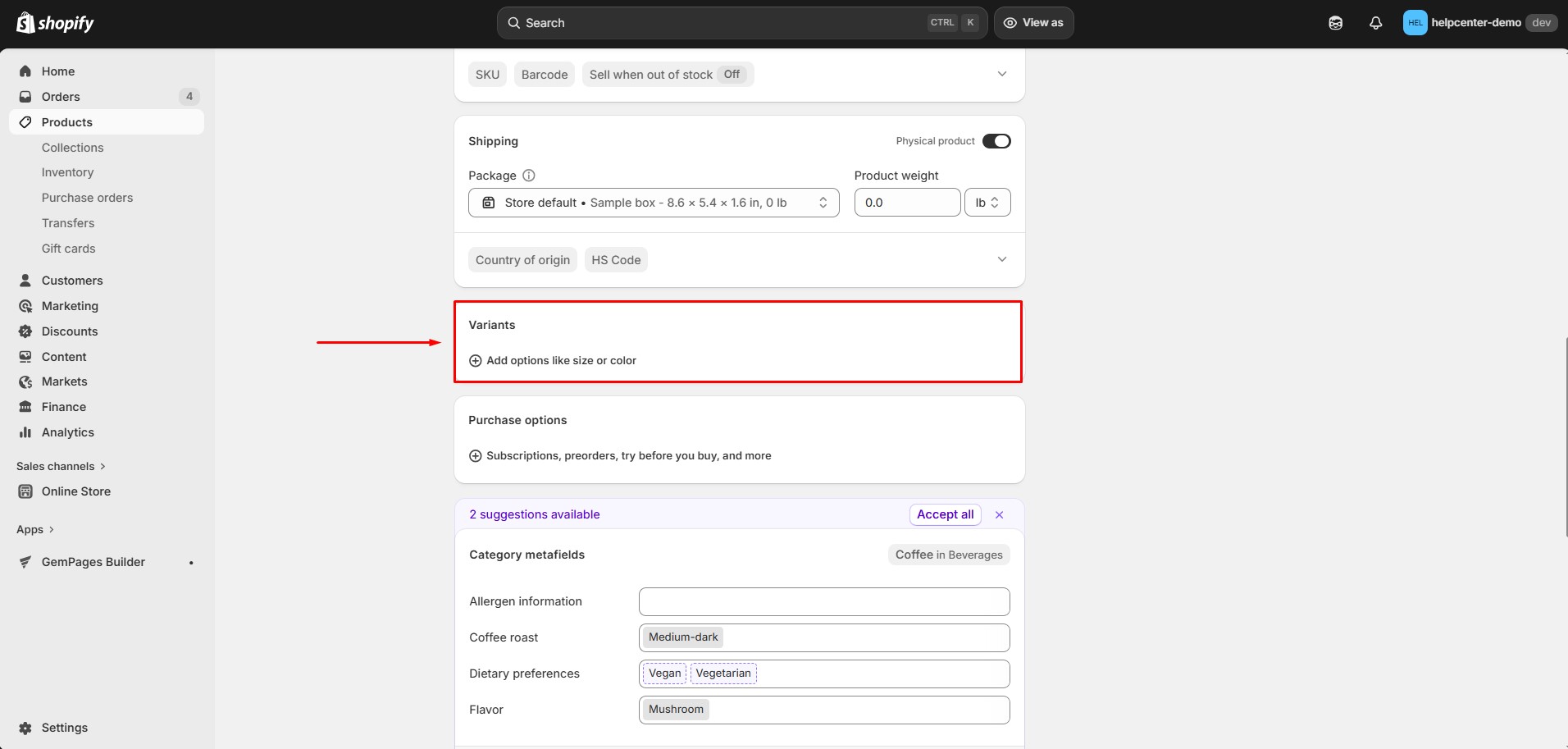 Step 4: Enter the option name (for example: Size, Color, Material).
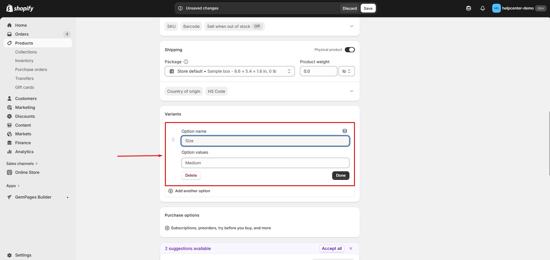 Step 5: Add the option values.
Example:
- Size: S, M, L, XL
- Color: Red, Black, Green
Step 6: Click Done, then Shopify will automatically generate all variant combinations.
Step 7: Configure additional variant details such as:
- Price
- SKU
- Inventory
- Variant image
- Availability
Step 8: Click Save.
Once the variants are created, they will automatically appear inside the Product Variants & Swatches element in GemPages, allowing customers to select different product options on your product page.
How to Add a Product Variant & Swatches Element to Your Page?
Follow these steps to add a Product Variant & Swatches to your page built with GemPages.
Step 1: From your Shopify admin, go to the GemPages Builder app > Pages. Click on your target page to locate the editor.
Step 2: From the left sidebar, use the search bar to locate the Product Variants & Swatches elements. Then, drag and drop the element inside a Product Element.
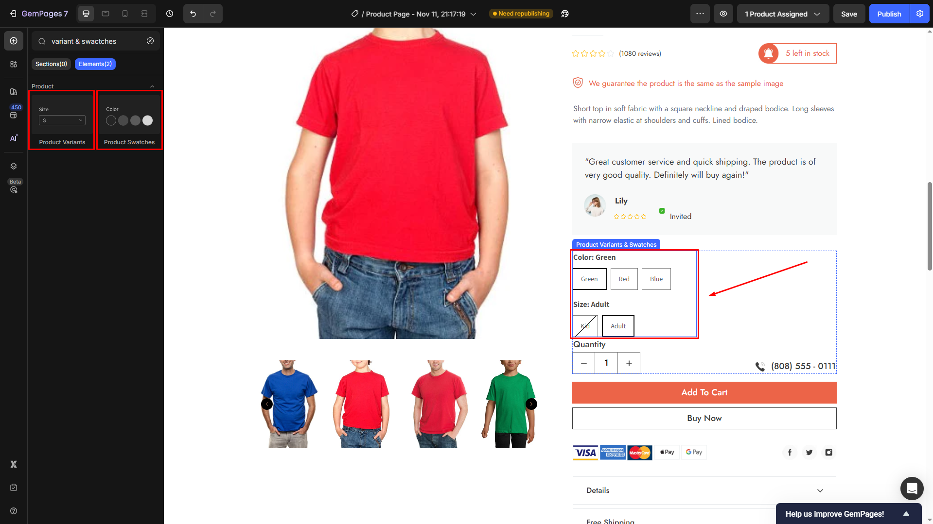
Step 3: Click on the element to open its configuration.
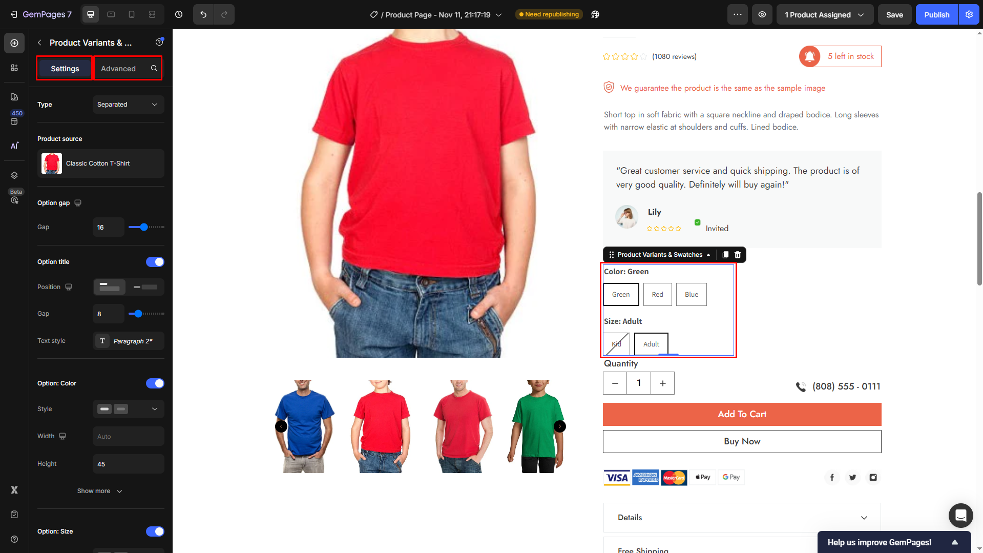
Configure the Settings tab
From here, you can configure the element’s settings, including:
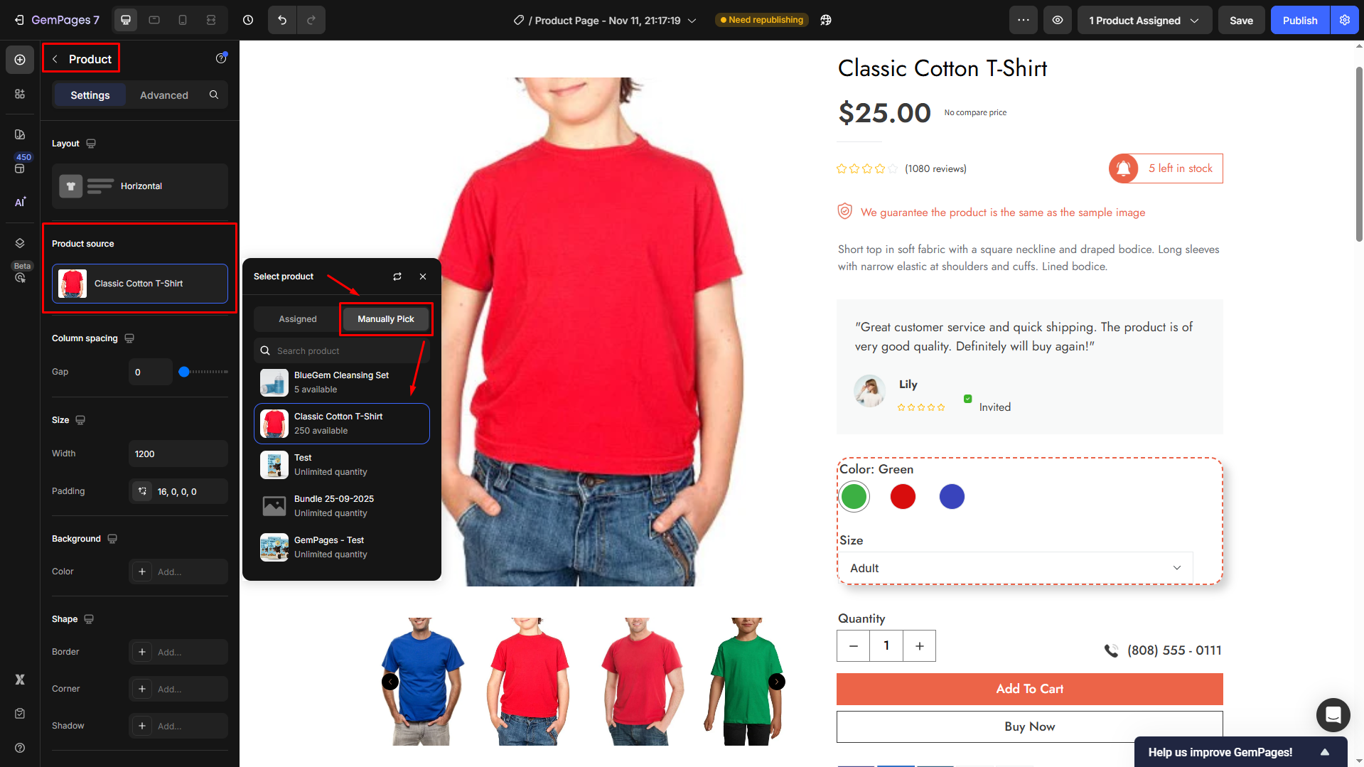
Product source
If you have assigned a product to this template, this product will be automatically synced as the Product source.
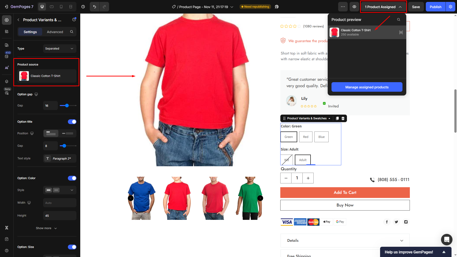
In case you want to select another product, hover over the current product and click the right arrow to locate the Product Element settings, where you can choose your preferred one.

Click the pen icon to edit the product source. From here, you can manually pick your preferred product.


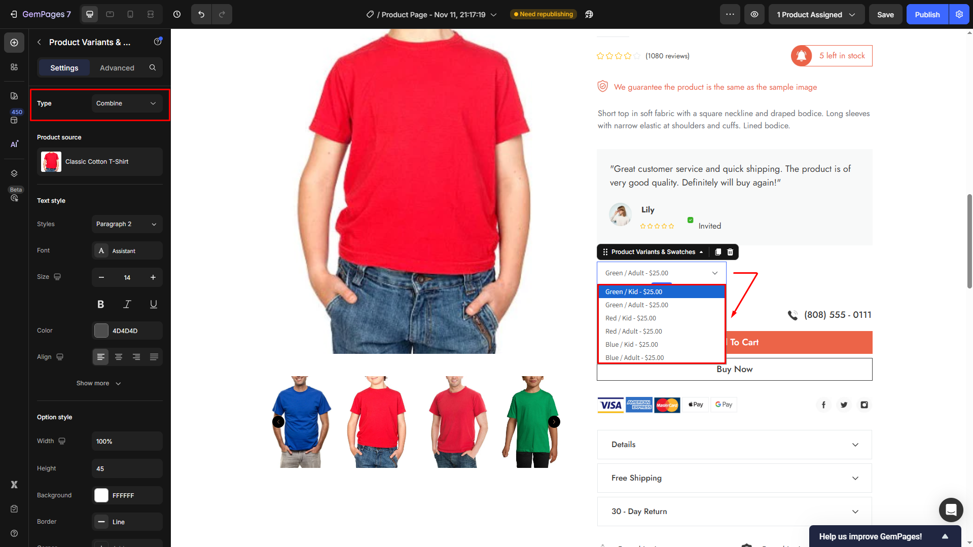
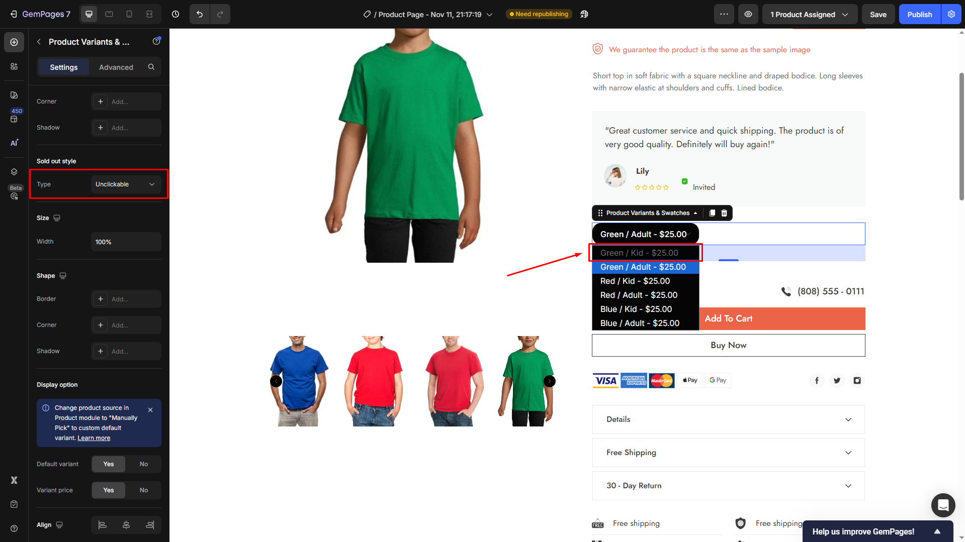
Type
You can select between two options at this point:
- Combined: All the variants will be consolidated into a single drop-down menu.
- Separated: Variants will be organized into distinct categories.

Several following settings will be adjusted according to the type you select here.
- If you set the Type to Combined, click here for further guidance.
- If you set the Type to Separated, click here for detailed instructions.
#1. Type: Combined
If you set the Type to Combined, continue configuring how the variant options display for your product.
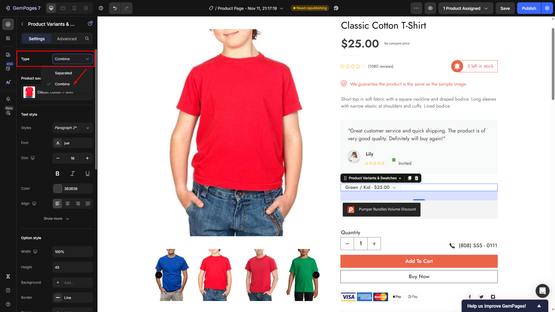
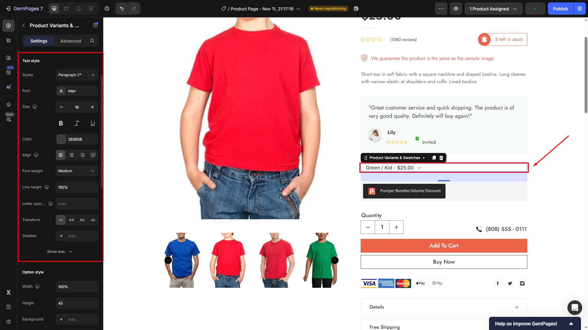
Text style
The Text Style section lets you control how your product variant text looks, helping you keep everything consistent with your brand design.
- Styles: Choose a predefined text style such as Heading or Paragraph to keep your typography consistent with the rest of your store.
- Font: Select a font from the dropdown or use your custom one from Global Styles. Stick with the same family used on your product pages for a cohesive look.
- Size: Adjust the font size to make variant names and prices stand out clearly in the layout.
- Color: Pick a text color from the color picker or enter a HEX code (e.g.,
#3B3B3B). Use a dark tone for better readability. - Align: Align text to the left, center, or right depending on your layout preference. Left-aligned works best for lists of variants.
- Font Weight: Control how bold the text appears — from Light to Extra Bold. For product variants, Medium or Bold is usually ideal.
- Line Height: Adjust the vertical spacing between text lines (e.g., 150%) to make multi-line text more readable.
- Letter Spacing: Fine-tune the space between letters for a tighter or more open look.
- Transform: Change the text case to uppercase, lowercase, or capitalize each word. Great for SKU or label-style variant names.
- Shadow: Add a subtle text shadow to increase contrast or give depth to your text when it overlaps with light backgrounds.
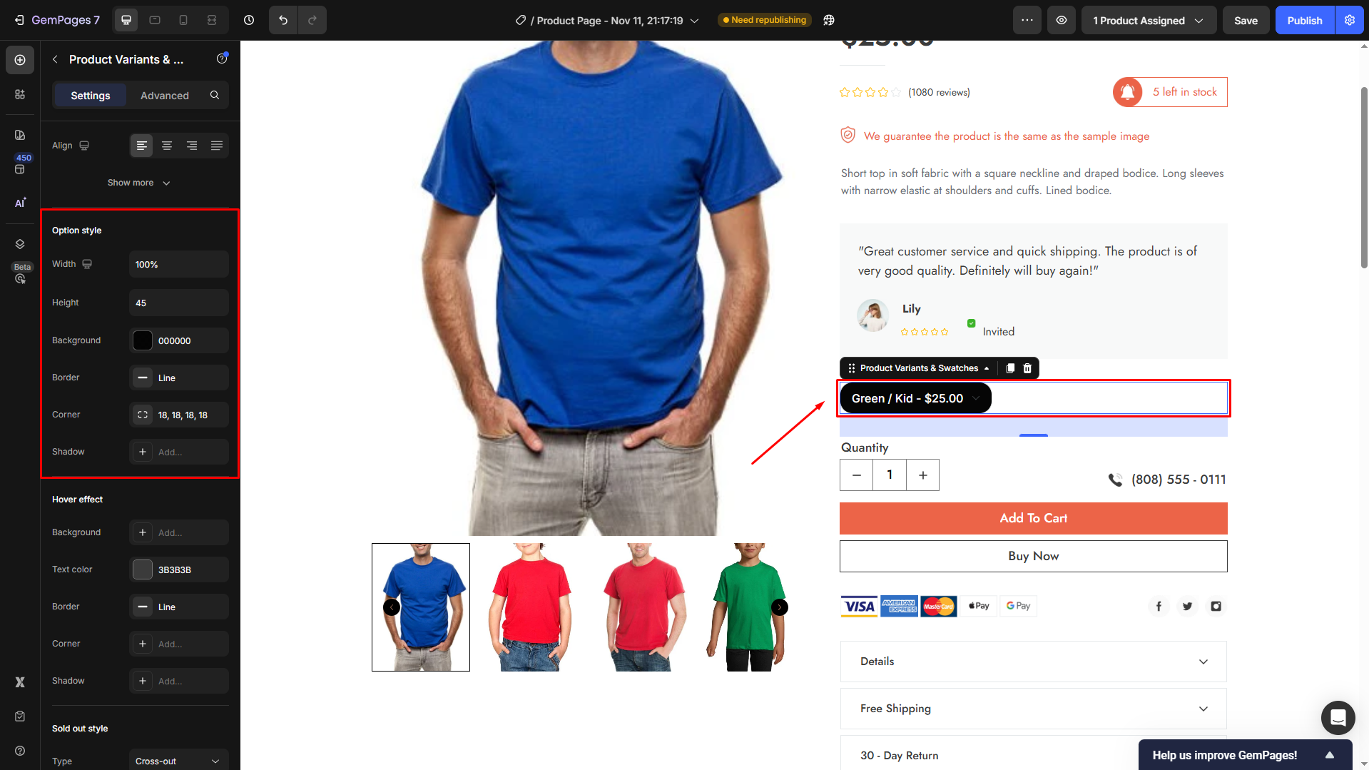
Option style
The Option style section lets you customize how your product variant selector appears, including its size, background, and overall look.
- Width: Adjust how wide the option box appears. You can set a fixed pixel value or use a percentage (e.g.,
100%) to make it stretch across the container. - Height: Define the vertical size of the variant selector (e.g.,
45px) for better visual balance with other elements on the product page. - Background: Choose a background color for the option box. Use solid tones (like black or white) or your brand’s accent color for stronger contrast.
- Border: Add or remove a border around the selector. You can pick between line, dashed, or dotted styles and adjust the color to match your layout.
- Corner: Round the edges of your option box by setting corner radius values (e.g.,
18px). This creates a softer, modern appearance. - Shadow: Add subtle depth by applying shadow effects behind the box. Ideal for highlighting the active or hovered state.
Hover effect
The Hover Effect section allows you to define how the variant option reacts when shoppers hover their mouse over it.
- Background: Change the background color that appears when a user hovers over the variant. Use your brand’s accent color (e.g.,
#EC6448) to make it pop. - Text Color: Set the color of the text while hovering. A light color like white (
#FFFFFF) works best on dark or bold backgrounds. - Border: Customize the border style (line, dashed, dotted) to make the hovered state more noticeable. You can also adjust the border color to complement the background.
- Corner: Maintain or increase corner rounding for a smoother visual transition when hovering.
- Shadow: Add a subtle shadow effect to make the hovered option feel raised or interactive. Ideal for enhancing click feedback.

#2. Type: Separated
If you set the Type to Separated, continue configuring how the variant options display for your product.
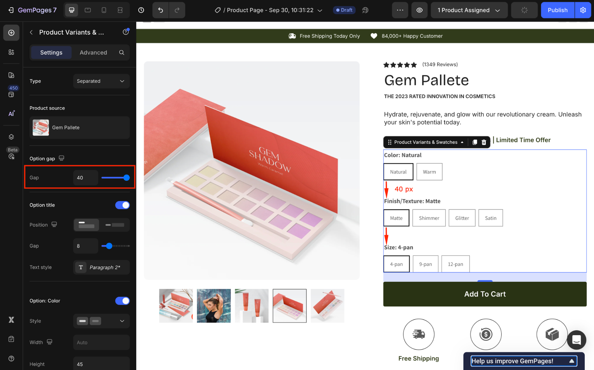
Option gap
Adjust the spacing between variants by entering an exact number in the box or by dragging the slider.
Option title
Under the Option title section, select the title position. You can choose between two options: vertical and horizontal.
- Vertical position:
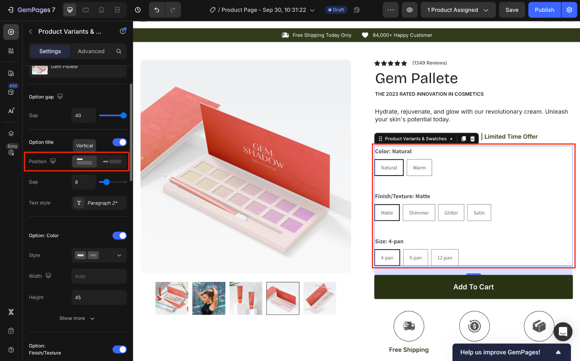
- Horizontal position:

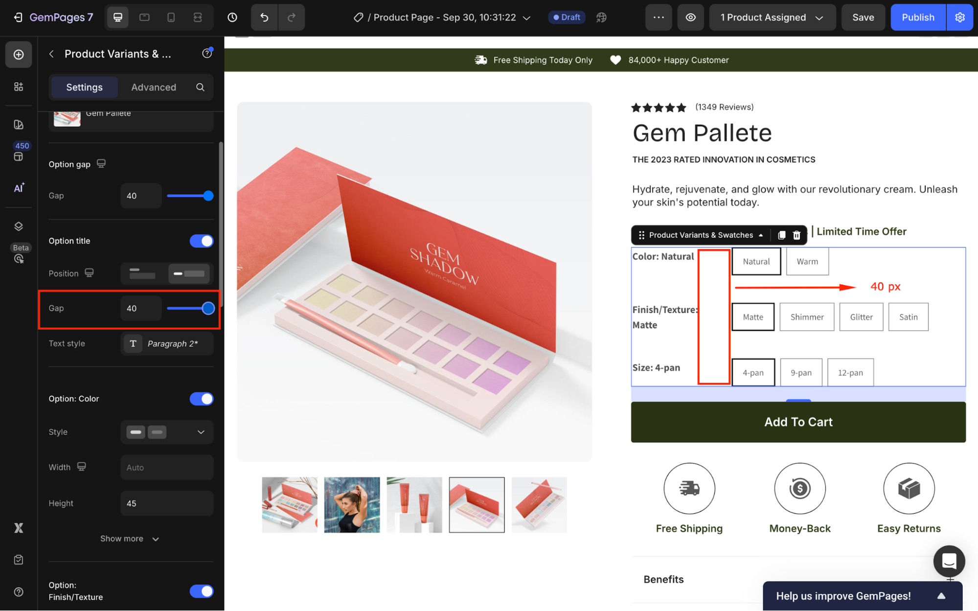
Next, adjust the gap between the variant’s title and text option for better readability. For example, we set the Gap to 40 px.
Then, click the box next to Text style to open the text style configuration panel. From here, you can modify the styles, font, text size, text color, and letter spacing or add a shadow effect for the variant’s title.
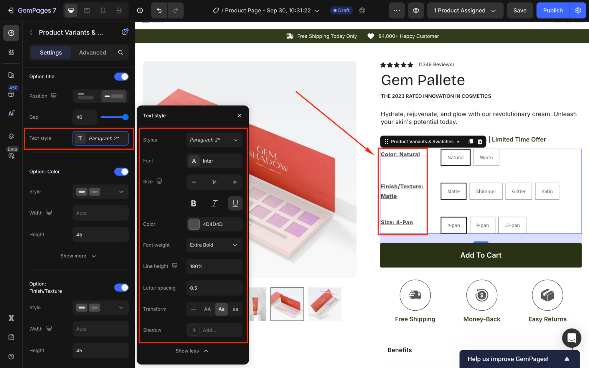
Once done with the Option title (Variant’s title), you can configure each variant option under the following sections.
For example, since we have three variants for this Gem Palette, we can modify the visibility of each one in the following order: Color, Finish/Texture, and Size.
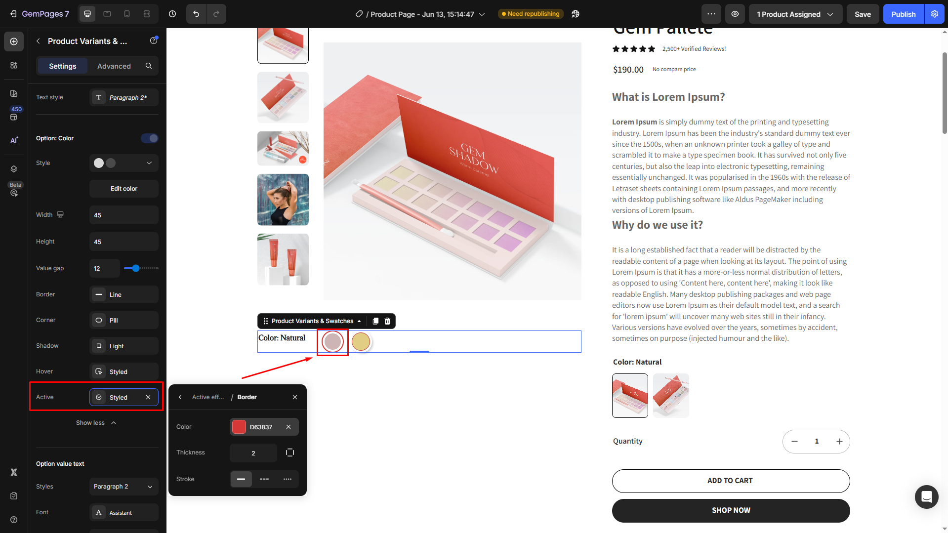
Option: Color
Under this section, you can configure all the color options of this element.
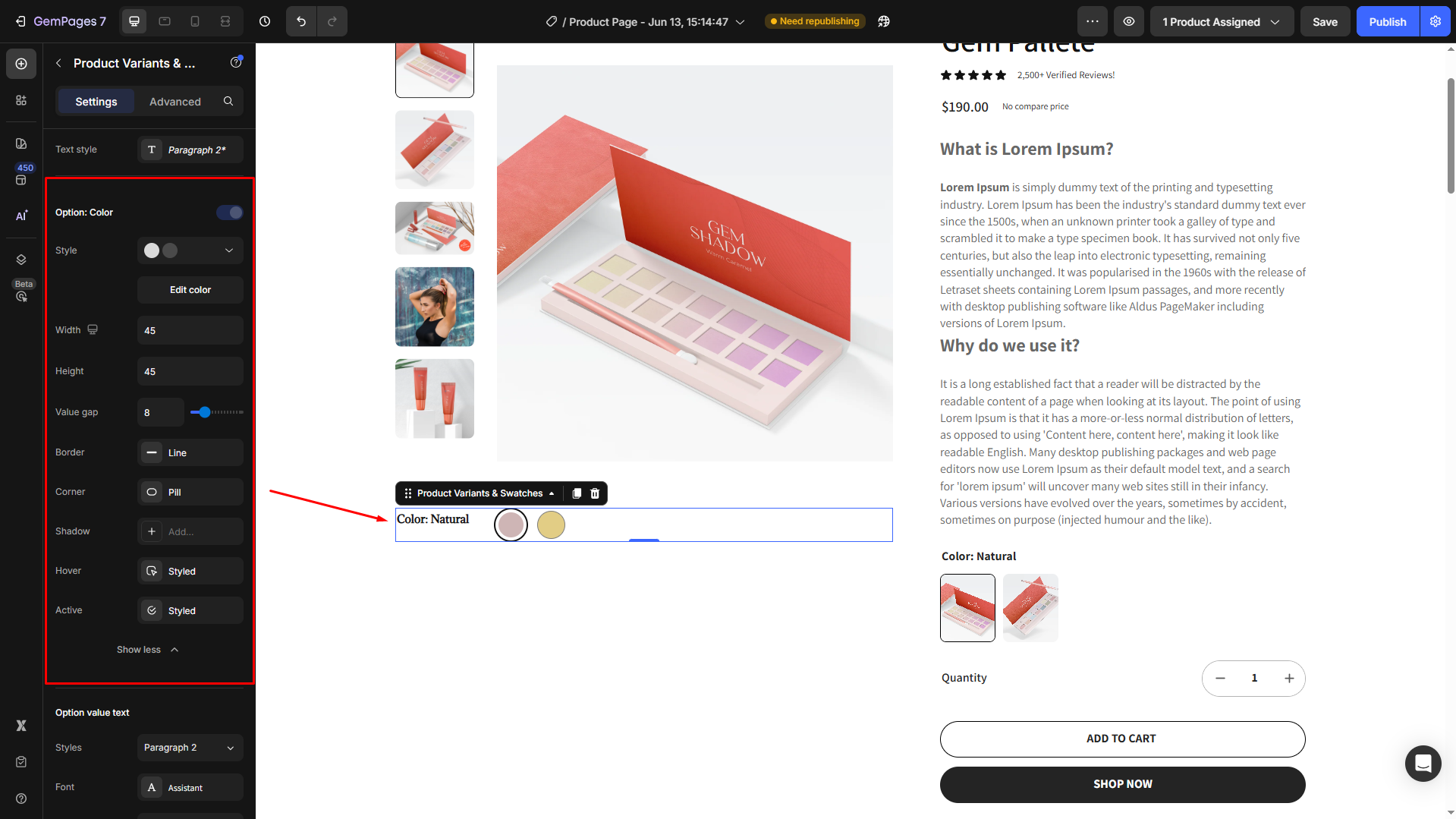
Let’s break down each setting option:
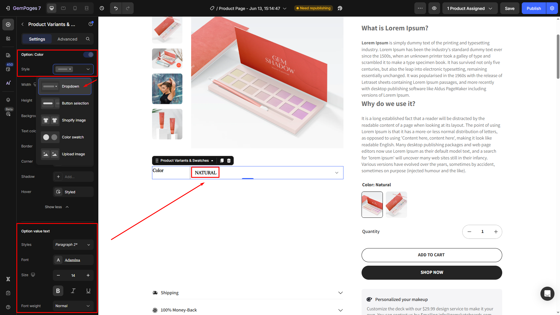
- Style: Choose from these available options, including Dropdown, Button selection, Shopify image, Color swatch, or Upload image.

For example, if you select Style = Color swatch, click Edit color to open the Configure variants style panel for further settings.

If you want to upload new images for each Color option, select Style = Upload image.
Please note that only one image is displayed for each option. In case you prefer adding more images, you need to add the same number of variant options in Shopify.
- Width & Height: Adjust the width and height of the color option.
- Value gap: Change the spacing between each option.

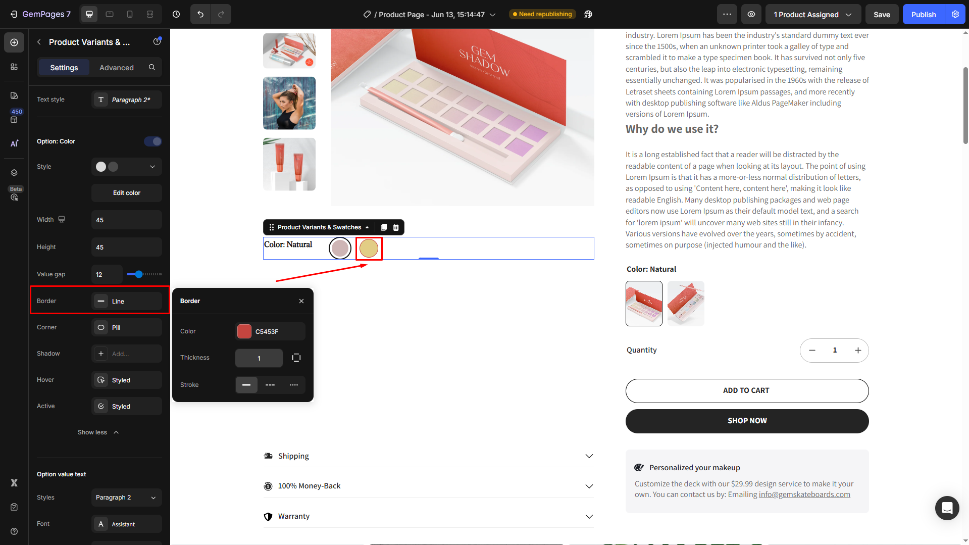
- Border: Add the border for color options, and change the border color, thickness, and stroke as you prefer.
- Corner: Adjust the corner radius. For example, if you want to display rounded color options, set the radius to 999999.
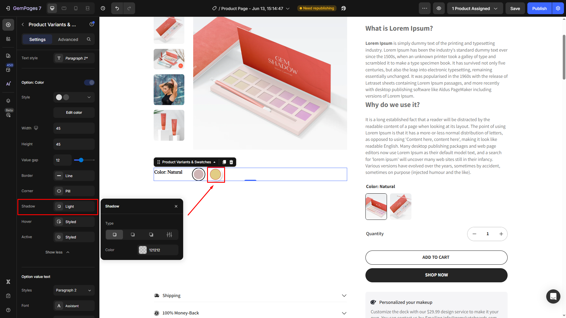
- Shadow: To enhance the UI, you can add a shadow effect for the color options.
- Hover: Click the Style box next to the Hover to open its settings, where you can modify the hover effect.
- Active: Customize the active color option to make it different from the others.
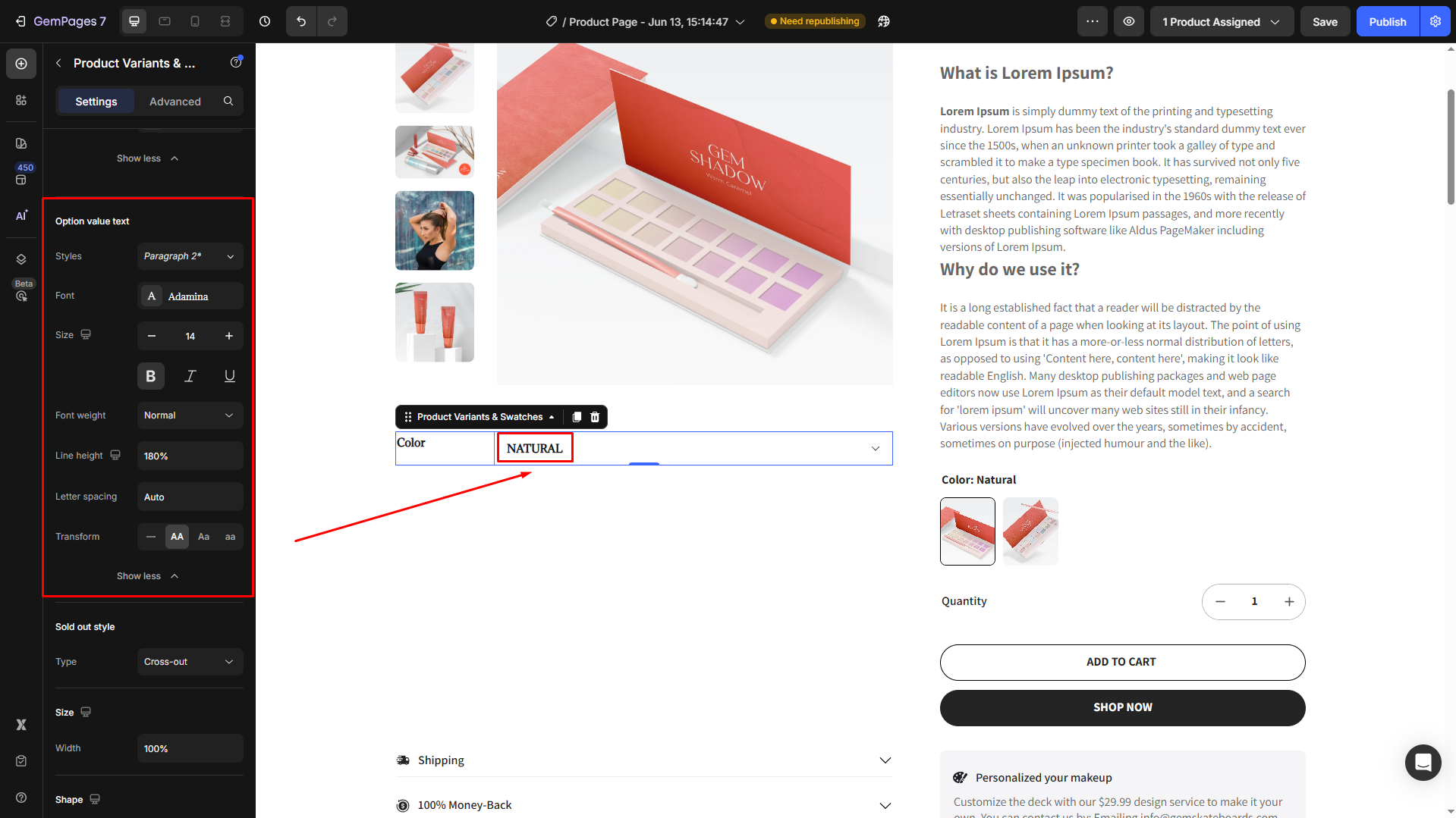
Option value text
Within this section, you can edit the text value for color options from styles, font, size, font weight, line height, letter spacing, and transform.
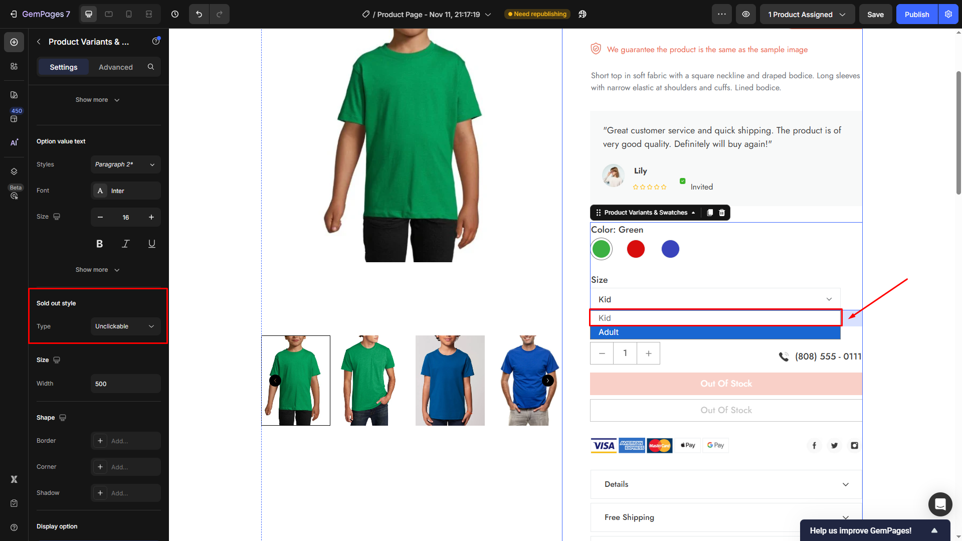
Sold out style
Choose the visual style when a color option is sold out:
- None: No signal for sold-out color option.
- Unclickable: Visitors can not click on the sold-out color option.
- Cross out: The sold-out color option will be crossed out.
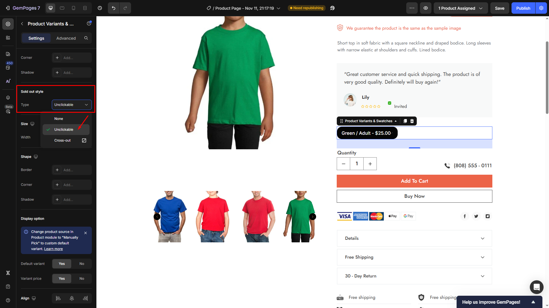
For example, we set the Type to Unclickable:
Size
Use the Size section to control the width of your variant selector or swatch area.
Width: Adjust the element’s width using either a fixed pixel value (e.g., 500px) or a percentage (100%) depending on your layout.
- Larger widths create a full-row dropdown.
- Smaller widths are ideal for compact variant lists.

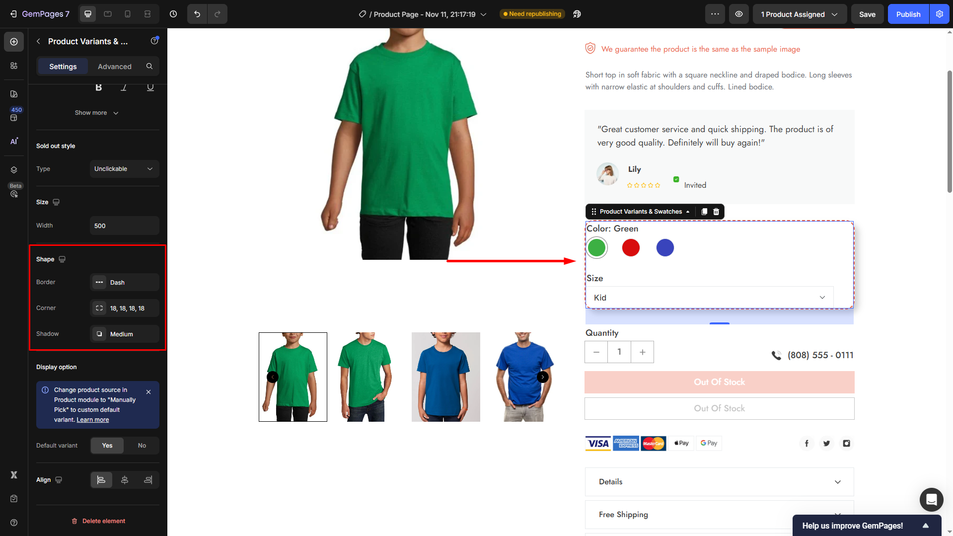
Shape
The Shape section lets you style the appearance of your variant container, including borders and corners.
- Border: Add or adjust border style (Line, Dash, Dotted) to outline your variant selector.
- Corner: Round the edges of the box (e.g.,
18px) for a modern and smooth visual. - Shadow: Add depth with subtle shadows to separate variant boxes from the background. Choose between Light, Medium, or Strong depending on the desired contrast.
Display option
The Display Option controls how your product variants appear when the page loads or how default variants are selected.
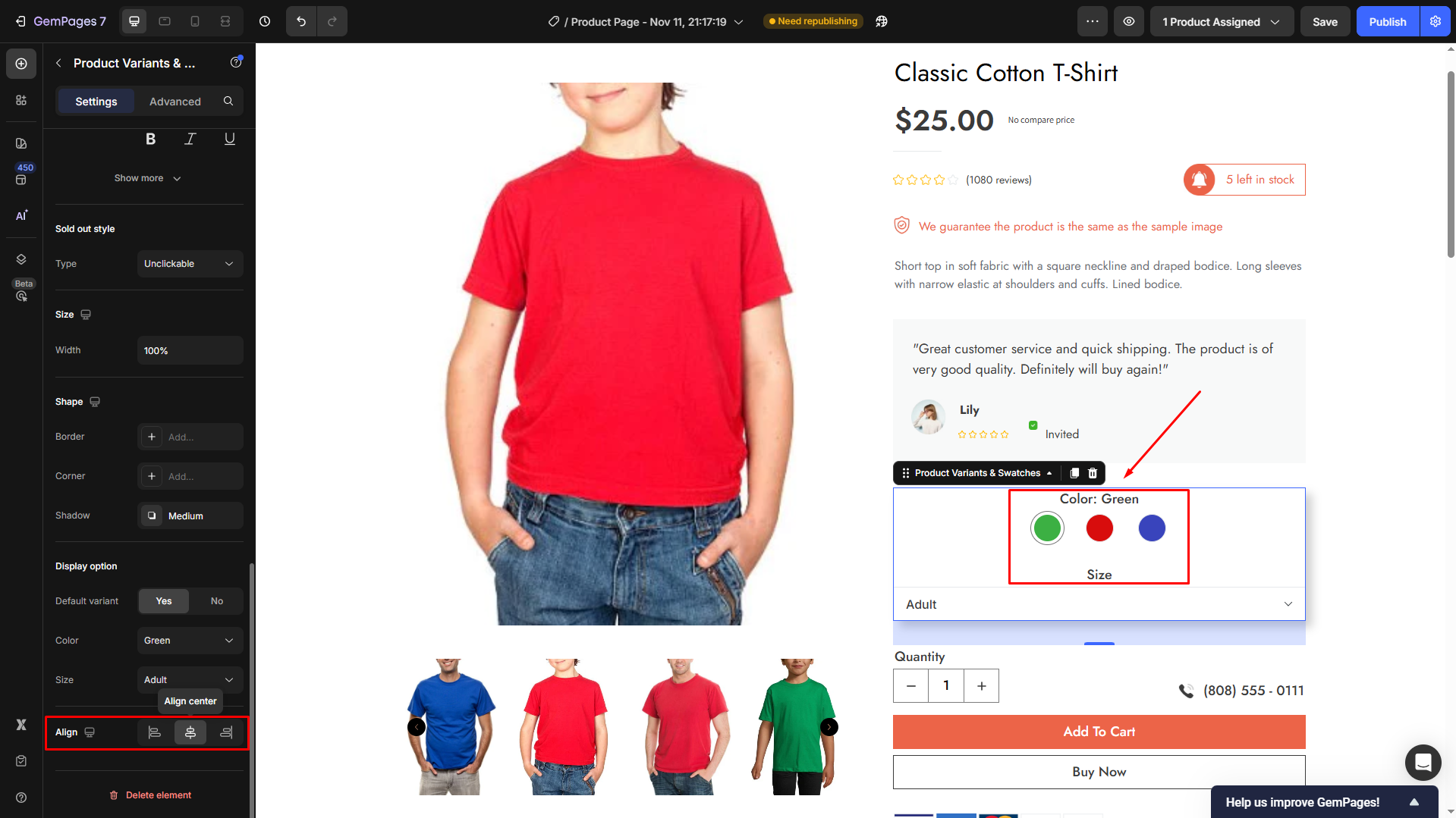
Default Variant: Toggle Yes to show a pre-selected option (e.g., “Green / Adult”) when the product page first loads.
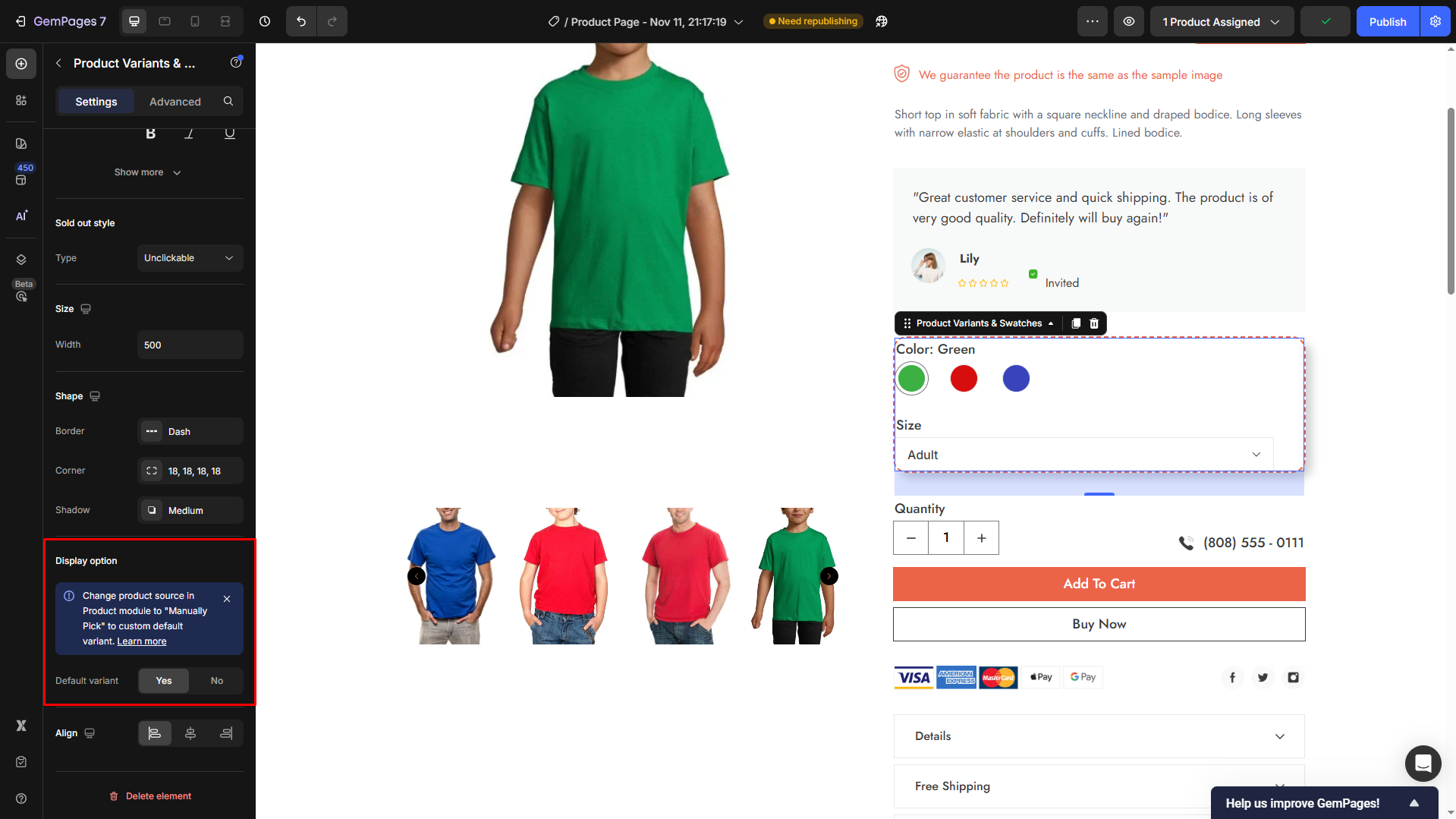
To customize the default option, you need to change the Product Source in Product Element to “Manually Pick” instead of “Assigned”. Learn more.
Align
The Align section allows you to control how your variant options are positioned within their container, helping you fine-tune the overall page layout. You can select from three options: left-aligned, center-aligned, or right-aligned as you prefer.
Configure the Advanced Tab
For more advanced customization, please navigate to the Advanced tab and follow the instructions in this article.
Troubleshooting Color Variant Issues
If one of your color swatches isn’t functioning correctly in GemPages, here are some steps to troubleshoot and resolve the issue:
Variant Configuration in Shopify
Ensure that your product variants are properly set up in Shopify:
- Active Status: Verify that the product and its variants are active and available on your online store.
- Sales Channels: Confirm that the “Online Store” sales channel is selected for the product.
- Variant Setup: Check that each variant has a unique combination of options, such as color and size.
Examine Product Module Settings
- In the GemPages Editor, click on the Product Module.
- Under the Select Product section, ensure that the correct product is assigned.
Frequently Asked Questions
1. Can I display each product variant as a separate product page?
Shopify does not support showing variants as separate product pages by default.
However, a common workaround is to create separate products for each variant, then manually link them together as a “variant group” using metafields or a custom section.
2. What’s the difference between variants and separate products?
Variants share the same product page and use swatches/dropdowns to switch between options (e.g., sizes, colors).
Separate products have unique product pages and URLs. This is often used when each variation has very different photos, pricing, or descriptions.
3. How do I link separate product pages together like variants?
You can use:
- Manual linking in product descriptions or custom blocks (e.g., “Also available in…”)
- Product recommendation apps
- Custom Liquid sections or metafields (requires some Shopify knowledge)
4. How do I enable zoom when hovering over a variant’s image?
Zoom is controlled in the Product Images element, not in the Variant Swatches.
To enable it:
- Click the Product Images element in the editor.
- Under Featured image > Hover action, choose Zoom.
- Adjust the zoom type and zoom value as needed.
5. Why doesn’t Zoom trigger when I hover over a variant swatch?
Variant swatches only change the selected product image, they do not control zoom behavior.
To activate the zoom effect, configure it in Product Images > Hover action, not inside the swatch element settings.
6. How do I edit the price for product variants in Shopify?
You can update variant prices directly in your Shopify admin. Go to Products, select the product with variants, then in the Variants section update the Pricing field for the variant and click Save. The new price will automatically appear on your product page, including pages built with GemPages.


Thank you for your comments