What is a (P) View More element?
(P) View More element in GemPages is designed as a button that redirects customers to an associated product detail page.
Let’s take the image below as an example. (P) View More element has been added to a Product list where multiple products within a collection are displayed with few fundamental details such as product images, and titles. The button will be in charge of driving traffic to a specific product that possibly boosts up your sales, or gives your customers more detailed information.

Configure the Settings tab
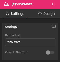
Settings
This feature allows you to edit the text within the button. Also, you are able to open the product detail page in a new tab by enabling the Open In New Tab feature.

Typography
GemPages provides powerful styling options for the (P) View More element.

- Font Size (in pixel): You just need to simply slide the adjustment bar from left to right and vice versa to resize the font.
- Font: You can choose between any fonts available in the Font Manager or you can add any custom font from external sources. For better page loading and graphic design, the maximum font displayed on a page is three fonts. However, there are no limits when configuring fonts in your store. You can take a look at this article to know how to add a custom font to your site.
- Font Style: You can decide to make your text bold, italic, or underlined.
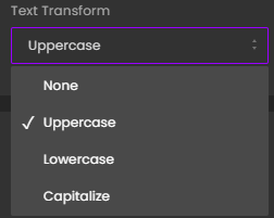
- Text Transform: This allows you to customize your text (None, Uppercase, Lowercase, Capitalize).

Button Color
This allows you to design your button’s background color and text color with your preferred colors.

If you enable Hover Options, you are able to customize the hover effect for your button and make it more eye-catching.

Dimensions
This allows you to make the button stretch and fit perfectly with the row’s width. Besides, you are free to manually adjust the button’s width and height as your wish by entering the specific values into the box(es).

Alignment
This parameter allows you to determine how the text is positioned within the description box. The three primary types of text alignment include left-aligned, centered, and right-aligned.

Image
You can use an image, GIF, or video as a button which can also be linkable to a specific product page. This feature allows you to upload the media directly to GemPages by hitting the Upload image or Browse gallery. In case your imagery size is greater than 3MB, you can use the URL link, which can be found after uploading it to Shopify Files to box Image Src.

Extra Class
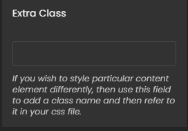
If you wish to customize the variant’s content element in a particular way, kindly use this field to add a class name and then refer to it in the CSS file.

Configure the Design tab
To style how the element looks, please navigate to the Design tab and follow the instructions in this article.
The (P) View More element is all set now.


Thank you for your comments