Step 1: In the GemPages Dashboard, choose your page and enter the Editor via the “Edit” button.

Step 2: Drag & drop a Product module onto your page. Next, drag & drop a (P) Image List element inside the Product module.

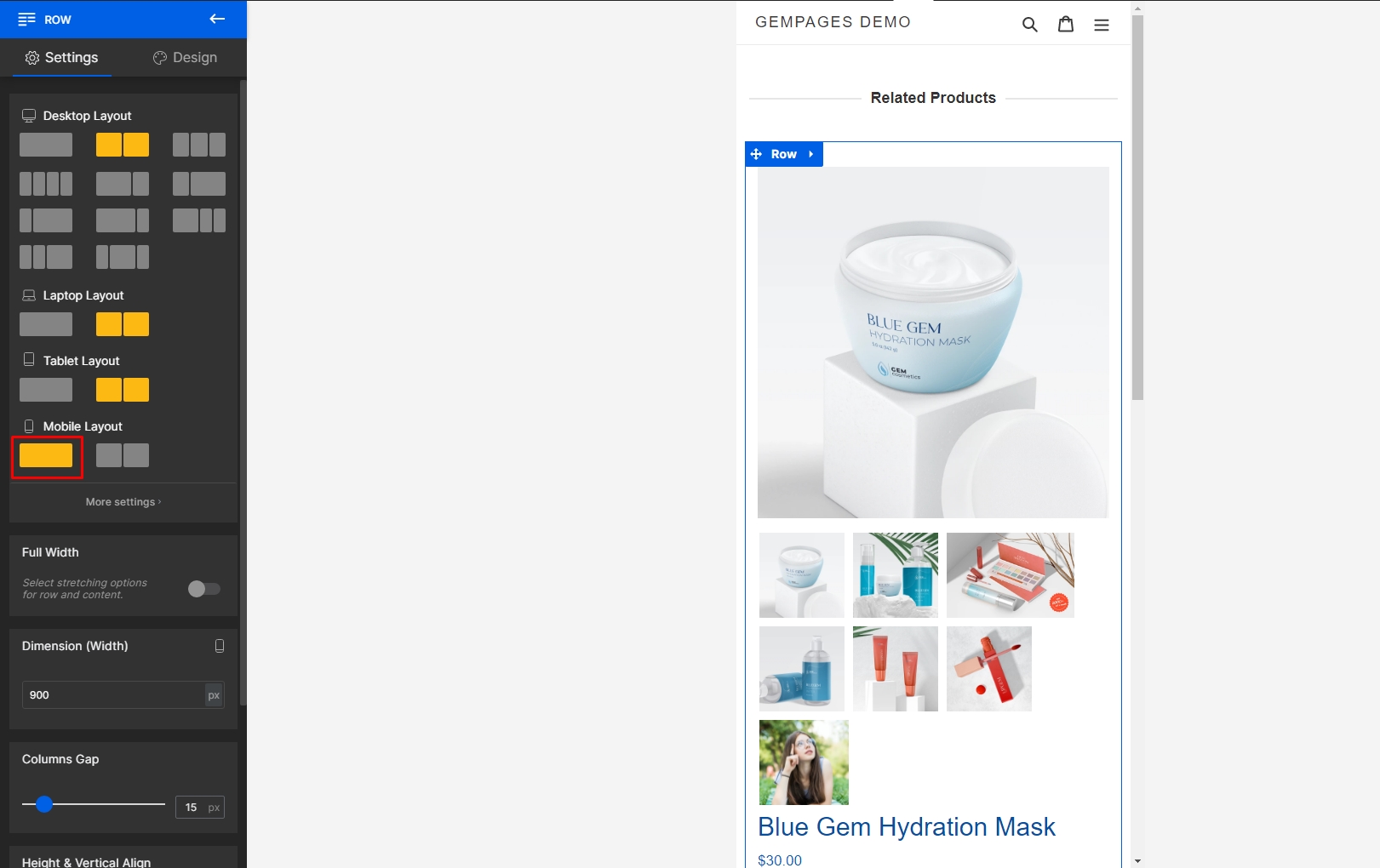
Step 3: Select the (P) Image List element and turn to the Settings tab on the left sidebar. Select the Mobile tab under the Display section to switch to the Mobile view of your page.


Step 4: Select Slider from the Style drop-down menu. The settings parameters underneath will change accordingly.

Step 5: Reduce the number of Columns down to one to fit the Mobile screen. There are also four additional settings in this step:
- Dots Navigation: Toggle this on to provide a dots navigation for your image slider, this gives users a sense of which image they are viewing and the total number of images.
- Next/Prev Buttons: Toggle this one to display the Next and Previous buttons.
- Loop: Toggle this on to loop your image list upon reaching the last image.
- Spacing: You can adjust the spacing between your images here. But since we’ve set the number of columns to one, this setting will not make a difference.

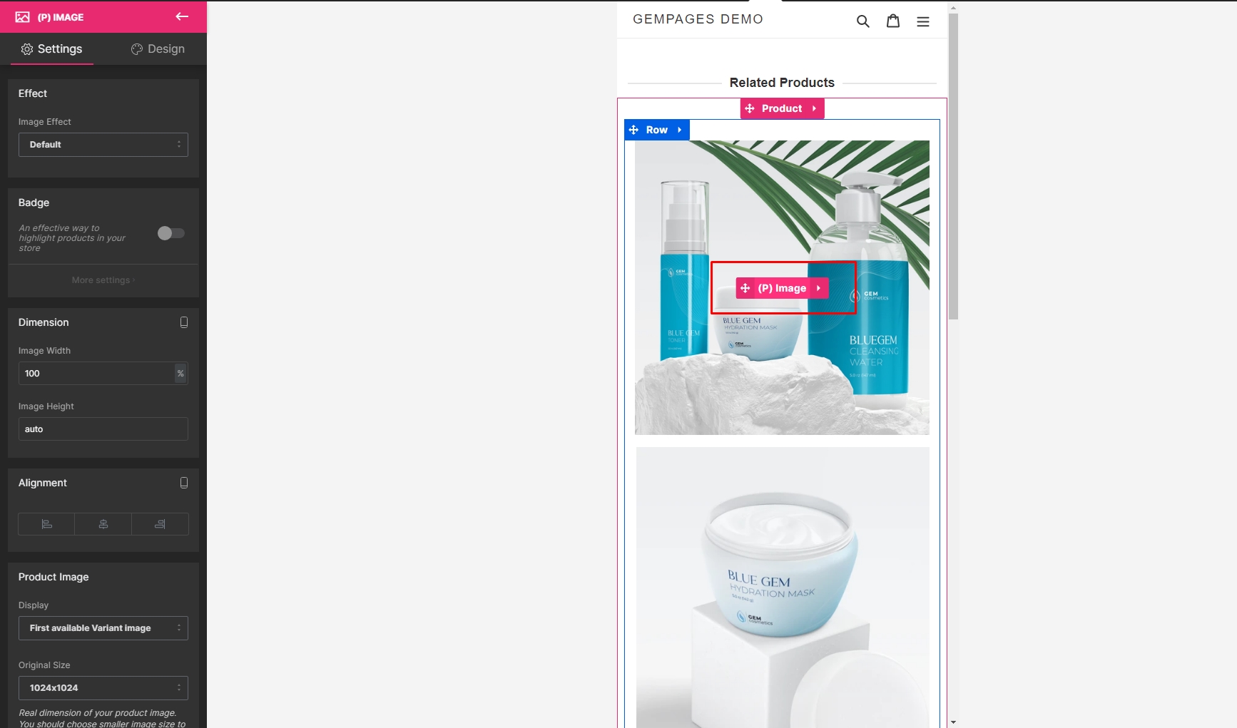
Step 6: Exit out of the (P) Image List element and select the (P) Image element.

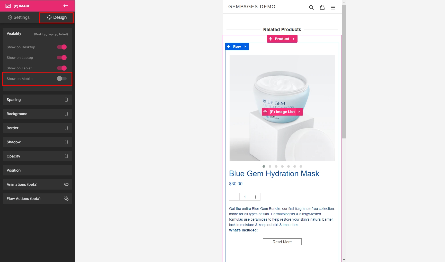
Step 7: Go to the Design tab and turn off the Show on Mobile option under Visibility.

Step 8: Hit “Save” and “Publish” to bring your changes to the front store.

The result on your live page should look like this:

As mobile devices are becoming more and more popular, websites also need to responsively adapt to different screen sizes and ratios. With GemPages, it’s easier than ever to get the perfect design you want for your online store, whether it’s browsed on desktop, laptop, tablet, or mobile.
You can also check out our video tutorial below:
Check out more articles here to learn how to use GemPages like a pro.


Thank you for your comments