


In this article, you will learn about the (P) File Upload element and how to use it to offer more custom order options.
About the (P) File Upload Element
The (P) File Upload element allows people to upload their files when adding a product to the shopping cart. This helps your customers to share the special requirements about the order without contacting the seller directly.

The (P) File Upload element supports image, video, and audio files. Once an order is placed by a customer, the uploaded files will be attached to the Order section in the Shopify admin.

Add the (P) File Upload Element to GemPages Editor
Step 1: From your GemPages dashboard, select the preferred template and enter the Editor.
Step 2: After that, access the Library on the left side of the top bar.

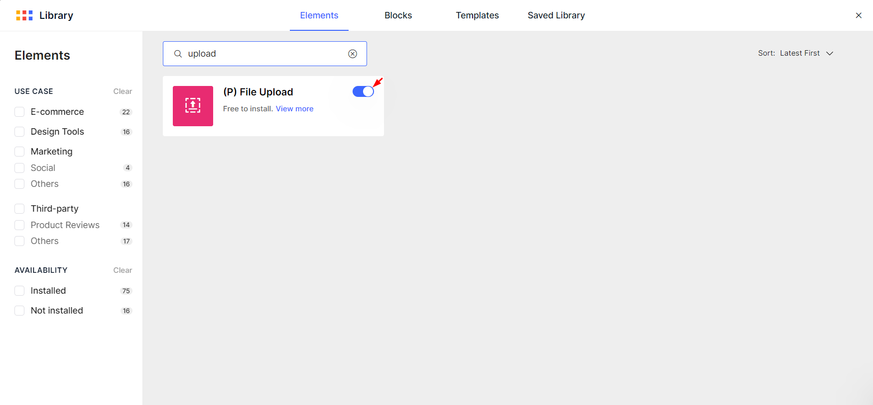
Step 3: Next, go to the Elements tab and search for (P) File Upload. Toggle on the blue switch to add the element to the Editor.
Add the (P) File Upload element to your page
After adding the (P) File Upload element, you can find it on the left sidebar, under the Product section.
As a child element, the (P) File Upload element should be located in a Product Module to work correctly. Drag & drop the Product Module, then nest the (P) File Upload element inside if your page doesn’t have them.

Click on the element to view its configurations in the left sidebar, including the Settings and Design tabs.
Configure the Settings Tab
Required
Toggle this switch on if you want the file upload to be compulsory for your customers.

Button Text
Primary text & Secondary text: Enter the text to show on your button.
Text gaps: Adjust the space between the Primary and the Secondary texts in pixels. You can use the slider or the number box.

Hit “More settings” to further customize the Secondary Text.
- New line: Toggle this switch on if you want to put the Secondary Text in the line below.
- Font Size: Use the slider or input your preferred size in pixels.
- Font: Choose the font for your text label from the drop-down menu. Click on “Font manager” to explore more fonts available on GemPages. In case you want to use a custom font, kindly take a look at this article.
- Font Style: Select the style of the text – Bold, Italic, or Underlined.
- Text Transform: Transform the text to Uppercase, Lowercase, or Capitalize.
- Text color: Pick a color or enter the hex color code.

Typography
Style the Primary Text with multiple options.

- Font Size: Use the slider or input your preferred size in pixels.
- Font: Choose the font for your text label from the drop-down menu.
- Font Style: Select the style of the text – Bold, Italic, or Underlined.
- Text Transform: Transform the text to Uppercase, Lowercase, or Capitalize.
Button Color
Background color & Text color: Choose a color or enter the hex color code for the button’s background and text colors.

Dimension
Stretch Button: Turn on the switch for the button to adapt to the space it’s put in.
Otherwise, you can manually adjust your button’s width and height by entering values in the fields below, in pixels or percentages. Preview
This section allows you to customize the display of the file preview after being uploaded.

- Preview Width/Height: Adjust the preview’s width and height by entering values in the fields below, in pixels or percentages.
- Show File name: Toggle this switch on if you want to show the file name.
- Show File size: Toggle this switch on if you want to show the file size.
Alignment
This parameter allows you to determine how the element is positioned on your page. There are three options to choose including left-aligned, centered, and right-aligned.

Extra Class
If you wish to further customize the element with coding, please use this field to add a class name and refer to it in the CSS file.

Configure the Design tab
To style how the element looks, please navigate to the Design tab and follow the instructions in this article.
That’s it! Remember to “Save” and “Publish” your page to bring the update to the live store.


Thank you for your comments