


This article will guide you through the steps to create a 5-column row in GemPages using the Carousel element.
You might have noticed that the Row element does not have an option for a 5-column layout. This is because based on the 12-column grid-view design that most websites (including your Shopify store) follow, dividing a section into 5 columns will make it difficult for the page to be responsive.
However, with a Carousel element added to the Row, you can easily create a 5-column layout to fit your design needs while still maintaining a responsive web page.
Follow the steps below:
Step 1: Go to the GemPages Dashboard, select your page, and enter the Editor by clicking on the “Edit” button.
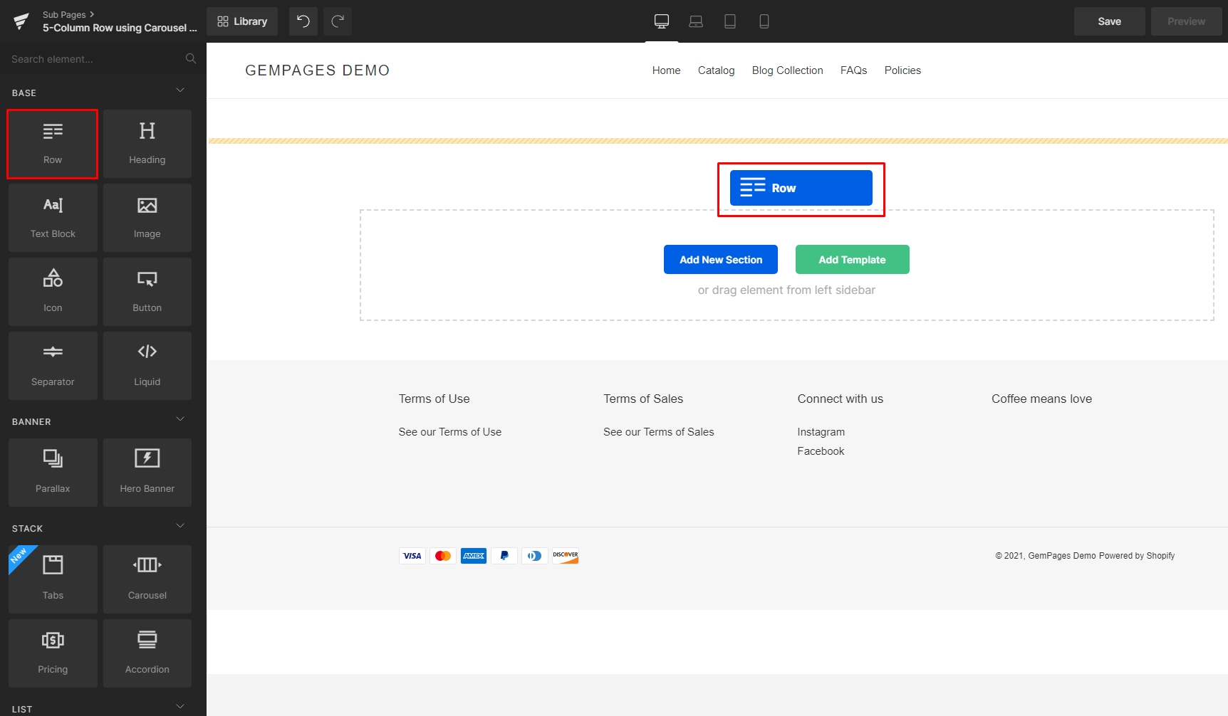
Step 2: Drag & drop a Row element onto your page.
Step 3: Drag & drop a Carousel element inside the Row.

Step 4: In the Carousel element’s Settings tab, use the Duplicate icon to reach a total of 5 slides.

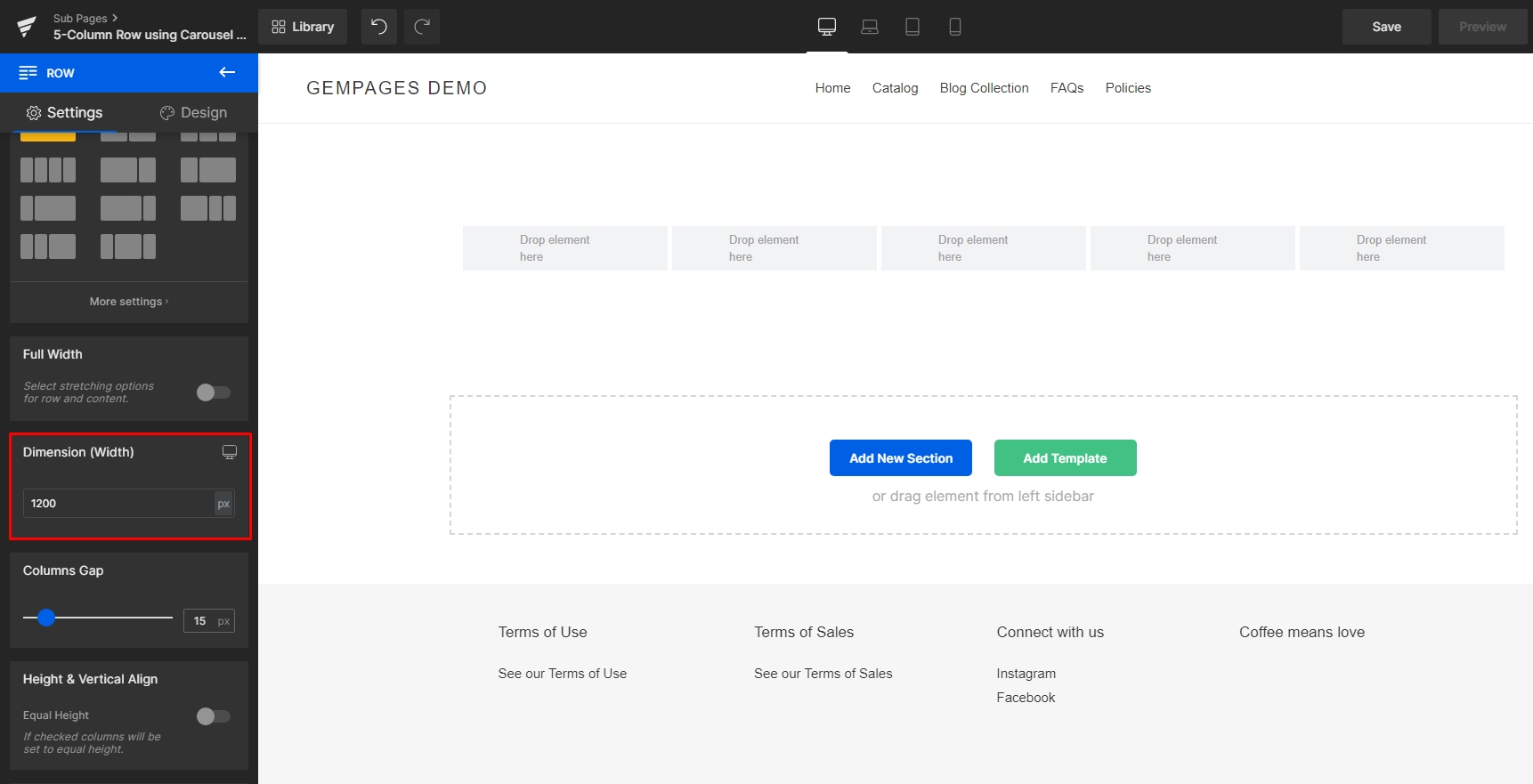
Step 5: In the Slides section, drag the Columns slider to 5.
Use the Spacing section to adjust the gap between columns. Simply adjust the slider or input a value (in pixels) into the number box.

You now have a 5-column row to use! Let’s start nesting elements inside the columns to create the final design.
Here’s an example of the final result:
On Desktop

On Mobile: The Carousel responsively turns into an image slider that shows one column at a time.


Thank you for your comments