About the Button Element
The button is an interactive element used when you want users to perform a specific action on your site.
From the GemPages dashboard, open your preferred template to edit. You can quickly find the Button element on the left sidebar of the Editor, under the Base section.

When clicking on the element, you will find its configuration options in the left sidebar, including the Settings and Design tabs.
Configure the Settings Tab
1. Text
You can edit the text label of your button here.

2. Edit Link
Pick link: Select this option if you want to send visitors to a destination page. The link picker window will appear for you to select the link to add. There are two options for you at this point: enter the link to the Custom URL field or choose from the tabs below.
- Pages, Collections, Products, and Articles: internal links to other pages of your store.
- Scroll to: this option allows you to leap to a specific section of the current page. For more information, please check out the article about anchor links.
- Email: Visitors can send emails to your address with the subject and body pre-filled.
- Phone: Shows your visitors your phone number and the option to call.

Pick Action: This feature allows you to show or hide a popup after clicking the button. Select “Show Popup” or “Hide popup.”
All the popups you have created will then be listed here to select. If you don’t have one, click here for a detailed guide on creating a popup with GemPages.

Open in: You can decide how the link will be opened at this point:
- Current Tab: The link will open in the existing browser tab or window.
- New Tab: The link will open in a new browser tab or window.

3. Typography
Style the text of the button with multiple options.

- Font weight: Select your preferred font weight from the drop-down menu.
- Font Size: Use the slider or input your preferred size in pixels.
- Font: Choose the font for your text label from the drop-down menu. Click on “Font manager” to explore more fonts available on GemPages. Check out how to use a custom font here.
- Text Transform: Transform the text to Uppercase, Lowercase, or Capitalize.
- Button color: It allows you to set the background color and the text color when it is normal or when it’s on hover.
4. Button color
Background color & Text color: Enter the hex color code for the button’s background and the text color.

Hover Options: Toggle this switch on to enable the hover effect. The two options below will then appear.
Background Color Hover & Text Color Hover: Enter the hex color code for the button’s background and text color when hovered.

5. Dimension
Stretch Button: Toggle this switch to adapt the button width to the row it’s put in.
Otherwise, you can manually adjust your button’s width and height by entering values in the fields below.

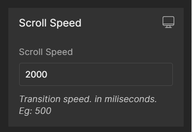
6. Scrolling Speed
To increase or decrease the scrolling speed to the level you prefer, edit the default scrolling speed in the box.
7. Alignment
This parameter allows you to determine how the element is positioned on your page. There are three options to choose including left-aligned, centered, and right-aligned.

7. Extra Class
If you wish to further customize the element with coding, please use this field to add a class name and refer to it in the CSS file.

Configure the Design tab
To style how the element looks, please navigate to the Design tab and follow the instructions in this article.


Thank you for your comments