A Global Style preset setting is divided into two main categories:
- Design System: Color, Text, Border, Corner, and Spacing.
- Elements: Button
Color Style
In the Color style, you will have the option to predefine a color palette and later use it for different elements on your page.

- Brand color: The brand color is pre-populated from your page’s CSS.
- Other colors: There’re 9 colors auto-generated and you can add 3 more colors by hitting the Plus icon.To replace the existing color, hover over it and click on the Pencil icon.
Suggested Pallets: Recommended color pallets by the GemPages team. When clicking on your preferred suggested pallet, the suggested colors will automatically refill on the other pallets then.
To use these colors in the Editor, please select the element you want to change color and go to the settings tab. Under the color section, switch to the Global Style tab. You will see the list of predefined colors here.

Text Style
General settings
You can choose a font for the Heading and Paragraph from the drop-down menu to ensure consistency for your page. Click on “Manage font” to explore more fonts available on GemPages. In case you want to use a custom font, kindly take a look at this article.

Base size: Input your preferred base font size.
Type scale: Select a type scale from the drop-down menu.
The type scale is a value that helps you create a balanced and friendly font sizing. All your heading and paragraph can use a range of type sizes related to each other since they grow by the same ratio. You can also select the Custom option to break the rule of ratio and set a different value for each text style.

Advanced settings
You can customize 6 predefined Heading and 4 Paragraph styles and later use these styles for the text-based elements on your page.
Click on the Edit icon next to the text level to start the configuration. Don’t forget to hit the “Update” button after editing to make sure you don’t lose your progress.

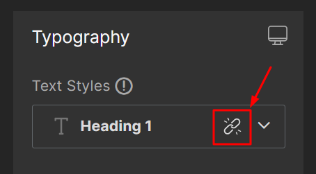
To use these text styles in the Editor, please select the text-based element and go to the settings tab. Under the Typography > Text styles section, choose a Heading or Paragraph level from the drop-down menu.


Border Style
There’re two types of borders:
- Default Border: The border styles are generated automatically including Border Solid, Border Dashed, Border Dotted, and Border None.
- Custom Border: You can create a border style as you want. The maximum number of custom border styles is up to 7.

Hit the “Add New Border” button to create a custom border style. You will see the option to select the style, thickness, and color of the border. Don’t forget to check the preview to see how it looks.

To use these border styles for the GemPages element, open the element settings and click on the Design tab. Under the Border style section, select your preferred style from the dropdown menu.

Corner Style
There are two types of corners available:
- Default Corner: The corner style is generated with a default value.
- Custom Border: You can customize a corner style as you want. The number of custom border styles is limited to 9.

Hit the “Add New Corner” button to create a custom corner style.
Input your preferred value into the fields. The four values will be set the same as default. If you want to adjust the value for each corner, click the icon in the middle to switch from All together to Individual mode.

To use these border styles for the GemPages element, open the element settings and click on the Design tab. Under the Corner section, select your preferred style from the drop-down menu.

Spacing Style
There are two spacing value types:
- Default Spacing style: The spacing styles are generated automatically including 5 styles – XS, S, M, L, and XL. The spacing value will follow the below formula as default, however, you can modify the number as you want.
XS= 0.5 * Text base size
S= small = Text base size
M= medium = 2 *Text base size
L= 3.5 * Text base size
XL= 4.5 * Text base size

- Custom spacing style: Create a spacing value as you want. You can be able to add up to 5 more spacing values here. Hit the “Add new spacing value” button to create a custom value and input your preferred value into the field.
To use these spacing values for the GemPages element, open the element settings and click on the Design tab. In the Spacing section, click on the value you want to edit and select your preferred one from the dropdown menu.

Button
In this section, you can customize six types of buttons and later use these styles in the process of building your pages.
- Button
- (P) Cart Button
- (P) View More
- Submit Button
- (P) Dynamic Checkout Button
- Custom Button: Customize a button style as you want.

To edit the button style, hit the arrow next to the button name to reveal the configuration. Hit “Update” when finished.
To use these button styles on the Editor, open the element settings and click on the Settings tab. Under the Button styles section, you will have the option to select between the Global Style button or custom style.


Thank you for your comments