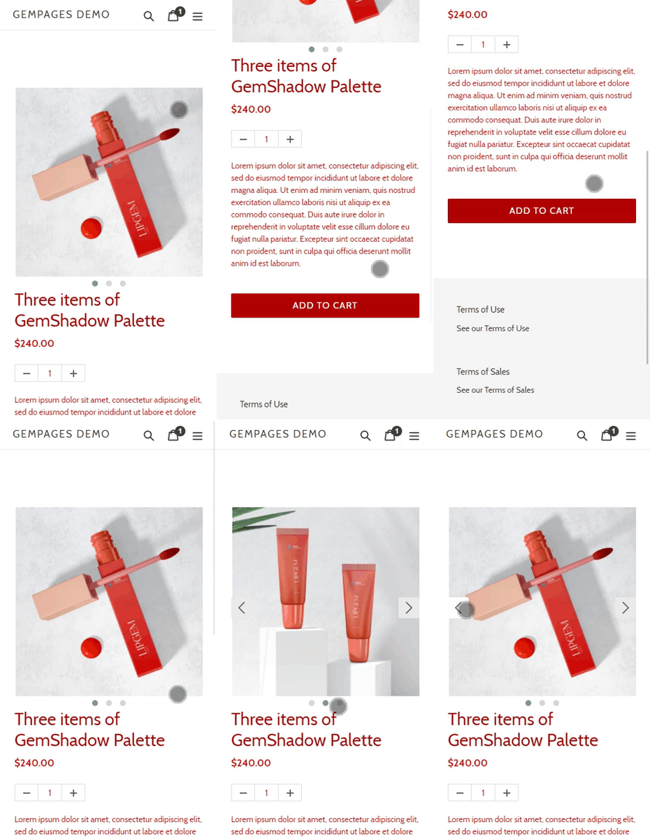
For a quick glance at our responsive feature, you can also check out this video:
Why does your Product module need to be responsive?
The Product module consists of child elements such as the (P) Image, (P) Description, (P) Title, etc. When you drag & drop a Product module onto the page in the Editor, you will notice the child elements stack on top of one another vertically.
While this layout is ideal for mobile screens, it can leave a lot of unused space on other devices, as seen in the example below:

In order to optimize the Product module’s display across all devices, we’ll use the Row element.
Responsive design for Desktop
Step 1: Go to the GemPages Dashboard, click on one of your pages and enter the Editor via the “Edit” button.
Step 2: Drag & drop a Product module onto your page.
*Skip this step if you already have one.

Step 3: Drag & drop a Row element and nest it inside the Product module.

Step 4: Select a layout for the Row. In this case, we will use the double-column option.

Step 5: Grab all of the (P) child elements and place them inside the Row.
By doing this, we ensure that all (P) child elements function correctly as they are still nested inside the Product module.
Step 6: Make adjustments as you see fit before hitting “Save” and “Publish” to bring your changes to the live store!

The final result should look something like this:
On Desktop screen:

Responsive design for Mobile
On mobile devices, where users usually scroll in portrait mode, the Product module’s design should also adapt to this ratio.
Instead of using a double-column row, we’ll use a single-column row, when elements are vertically stacked on top of each other, the layout is more eye-pleasing for viewers.

The result on the Mobile should look like this:


And there you have it! Designing your dream store with GemPages is not difficult at all. All you need is a vision, and we will take care of the rest.


Thank you for your comments