


What is a Section in GemPages?
A Section is the main building block of any page in GemPages. Each page is made up of multiple sections stacked vertically, and every section can contain one or more columns, rows, and elements inside it.
Sections help you structure your page into clear content blocks, such as hero banners, product features, testimonials, or CTAs, so you can design and manage each part independently.
In GemPages New Editor v7, sections are more flexible than ever:
- You can add up to 6 columns inside a section
- Adjust spacing, sizing, and background styles
- Apply borders, corner radius, and shadows
- Control how the section appears on different devices
Configure the Settings tab
In the GemPages Editor, click on the target section to open its settings panel on your left side.
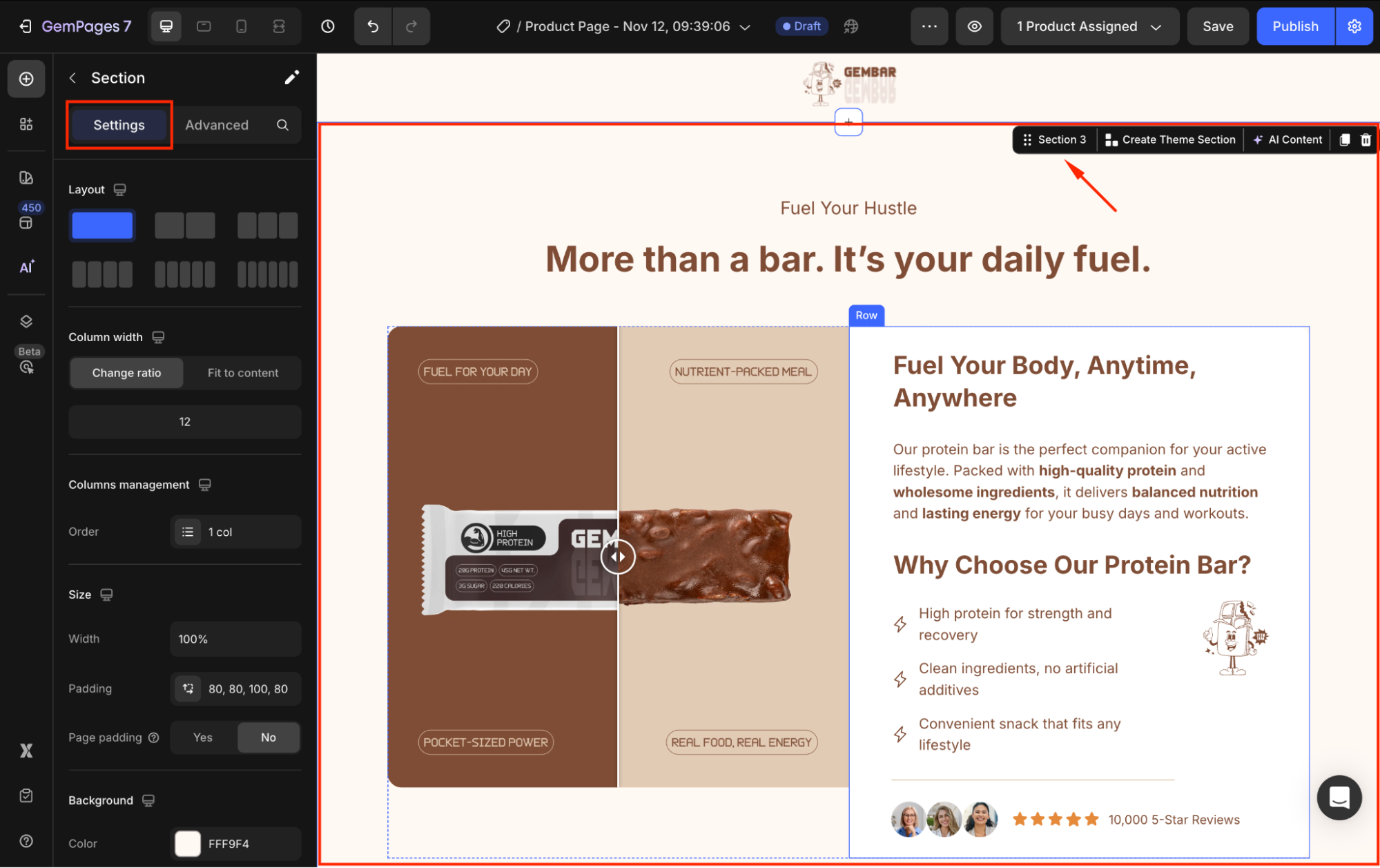
From there, you can customize the visibility of your section as you prefer, including:
Layout
Select the preferred layout of your section under Layout settings. You can add up to 6 columns in a section.
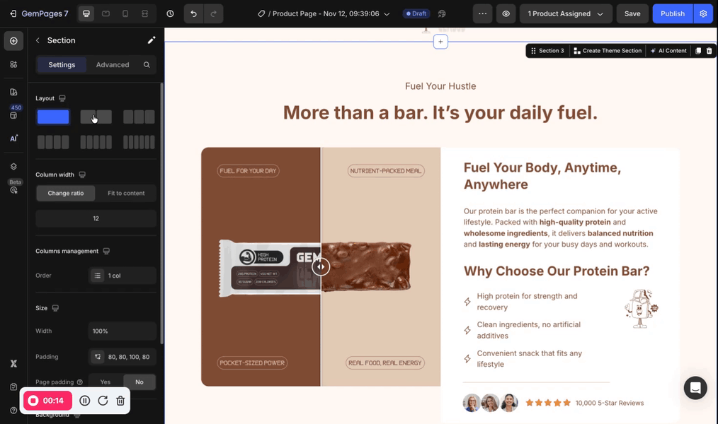
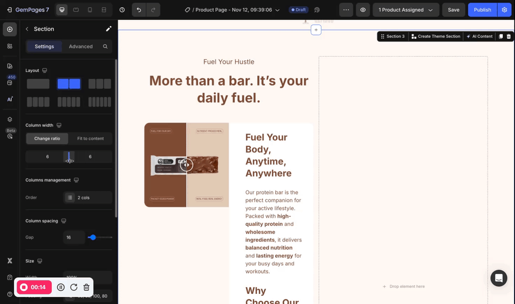
Column width
If your section has more than one column inside, you can adjust the column width from
- Change ratio: manually adjust
- Fit to content: automatically adjust the width of each column to fit your content
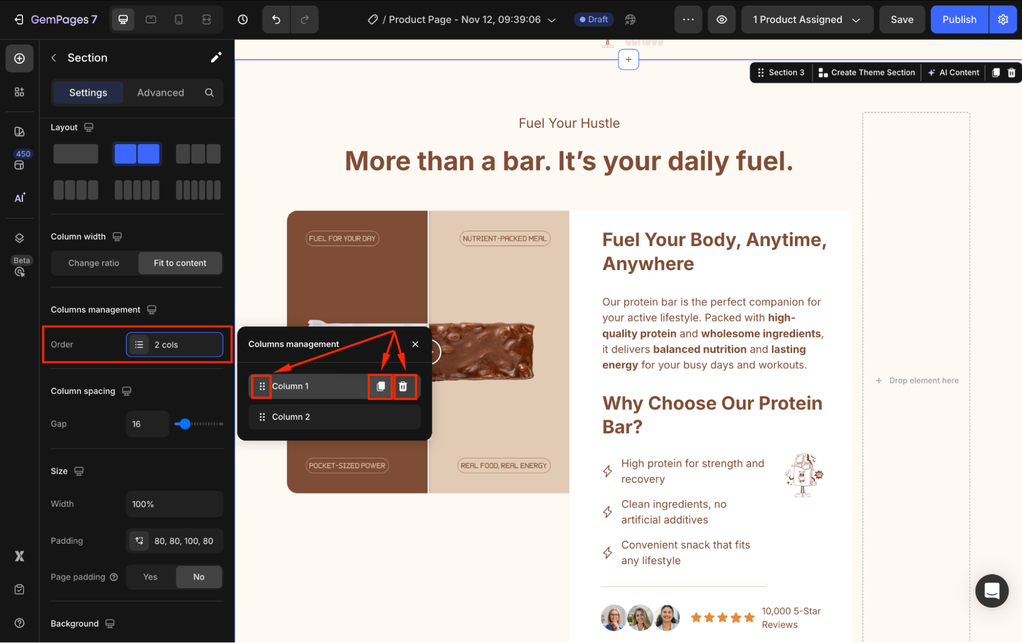
Columns management
Under this configuration, click on the Order box to open the detailed settings panel. You can rearrange the position of each column, duplicate it, or delete it.
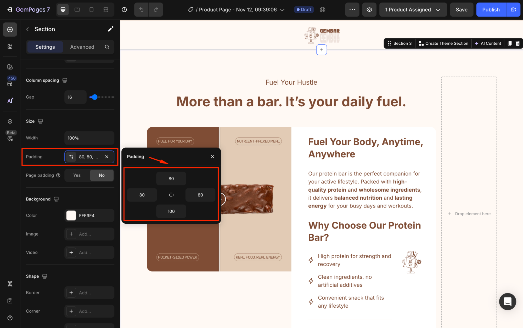
Size
The Size settings let you control how wide your section appears and how much inner spacing it has, helping you create a clean and comfortable layout.
- Width: Choose how wide your section should be:
- Full (100%): The section stretches across the entire browser width, ideal for hero banners, full-width images, or large visual blocks.
- Default (1200px): Keeps the content centered with a fixed maximum width for a more structured page layout.
- Padding: Padding adds space inside the section, around all inner elements. You can adjust padding for the top, bottom, left, and right to give your content more breathing room.
- Page padding: Page padding controls the space between the browser edges and your page sections. You can define this globally under Global Styles > Page Padding.
- Yes: The section follows the global Page Padding setting for consistency across the entire page.
- No: The section uses the custom padding values you set above, giving you more layout flexibility.
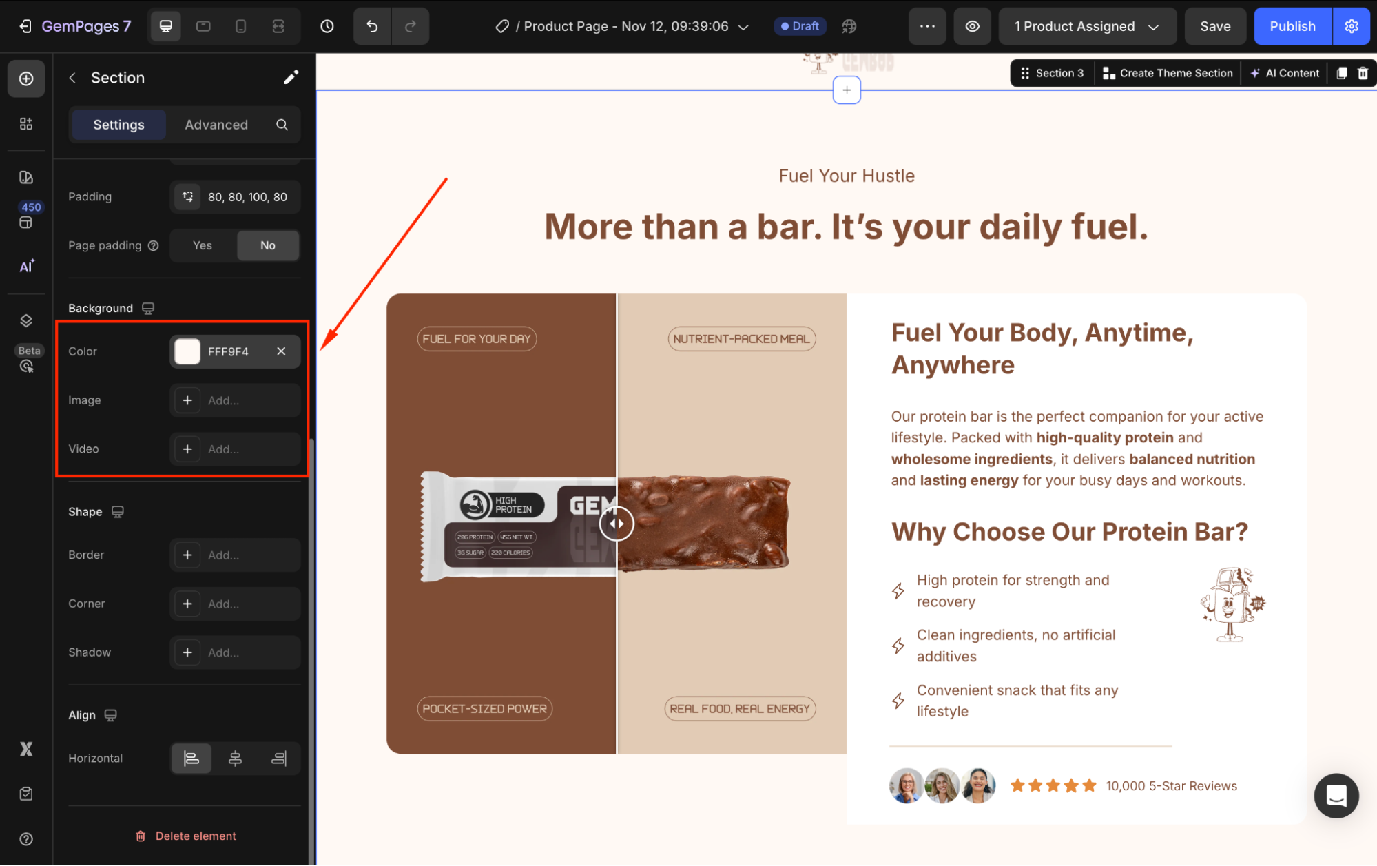
Background
Under the Background settings, you can change the background color or use an image/video as your section’s background.
Refer to this article for further information about customizing the background settings in GemPages.
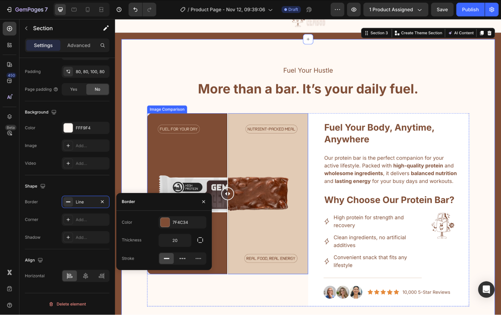
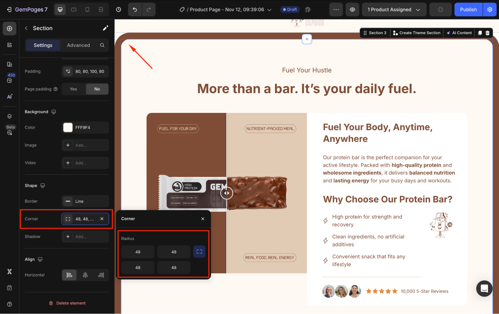
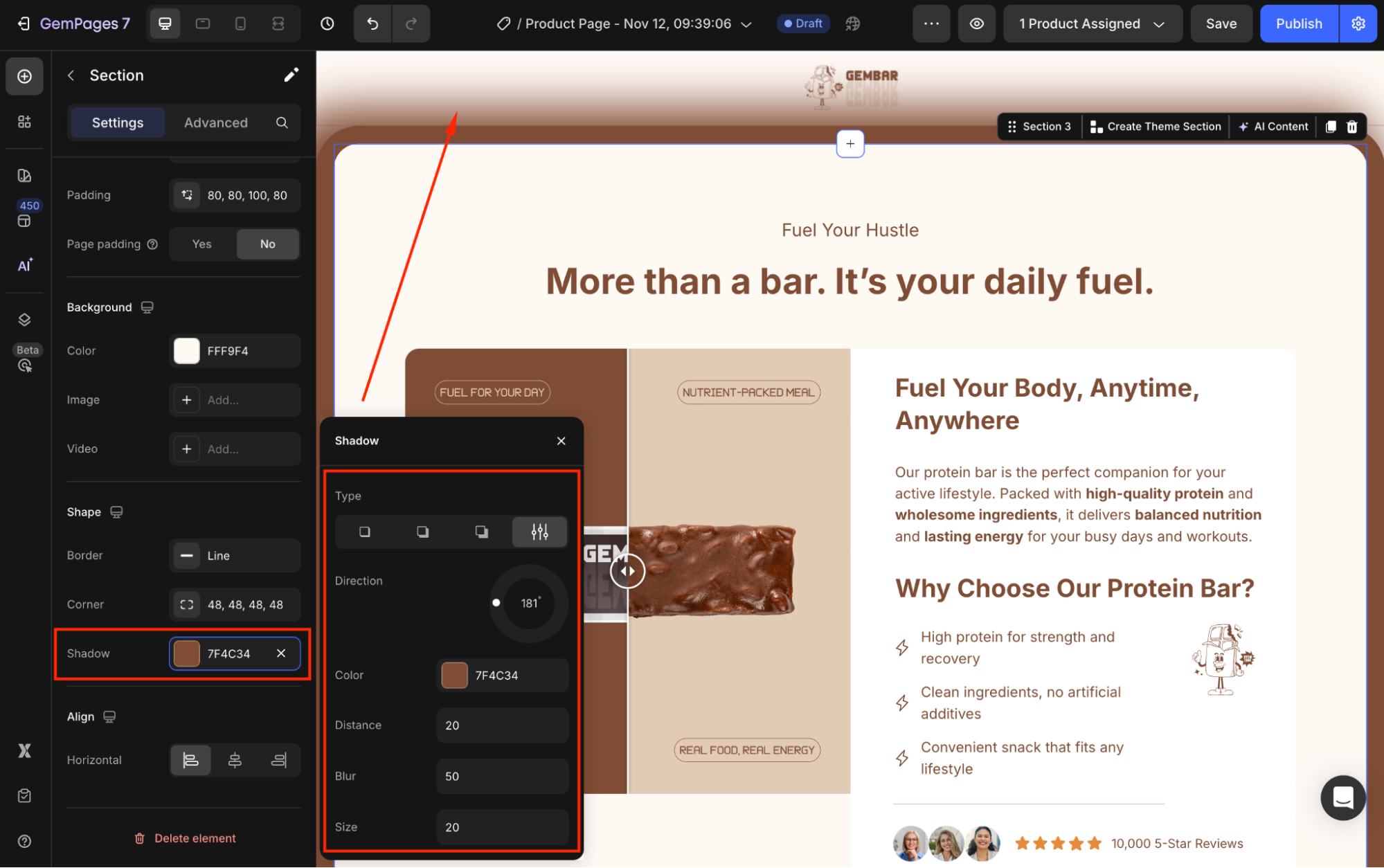
Shape
The section’s shape settings allow you to style its border, corners, and shadow to make your layout look more polished and aligned with your brand style.
- Border: Add a border around your section and adjust the border’s color, thickness, and stroke to define clear boundaries between large content blocks.
- Corner: To create a smoother visual style, adjust the corner radius of your section.
- Shadow: Use the Shadow controls to create visual depth or highlight your section. You can configure:
- Type: Outer, Inner, or Centered
- Direction: Choose where the shadow falls
- Color: Match your brand palette
- Distance: How far the shadow is cast
- Blur: How soft or sharp the shadow appears
- Size: The shadow’s spread
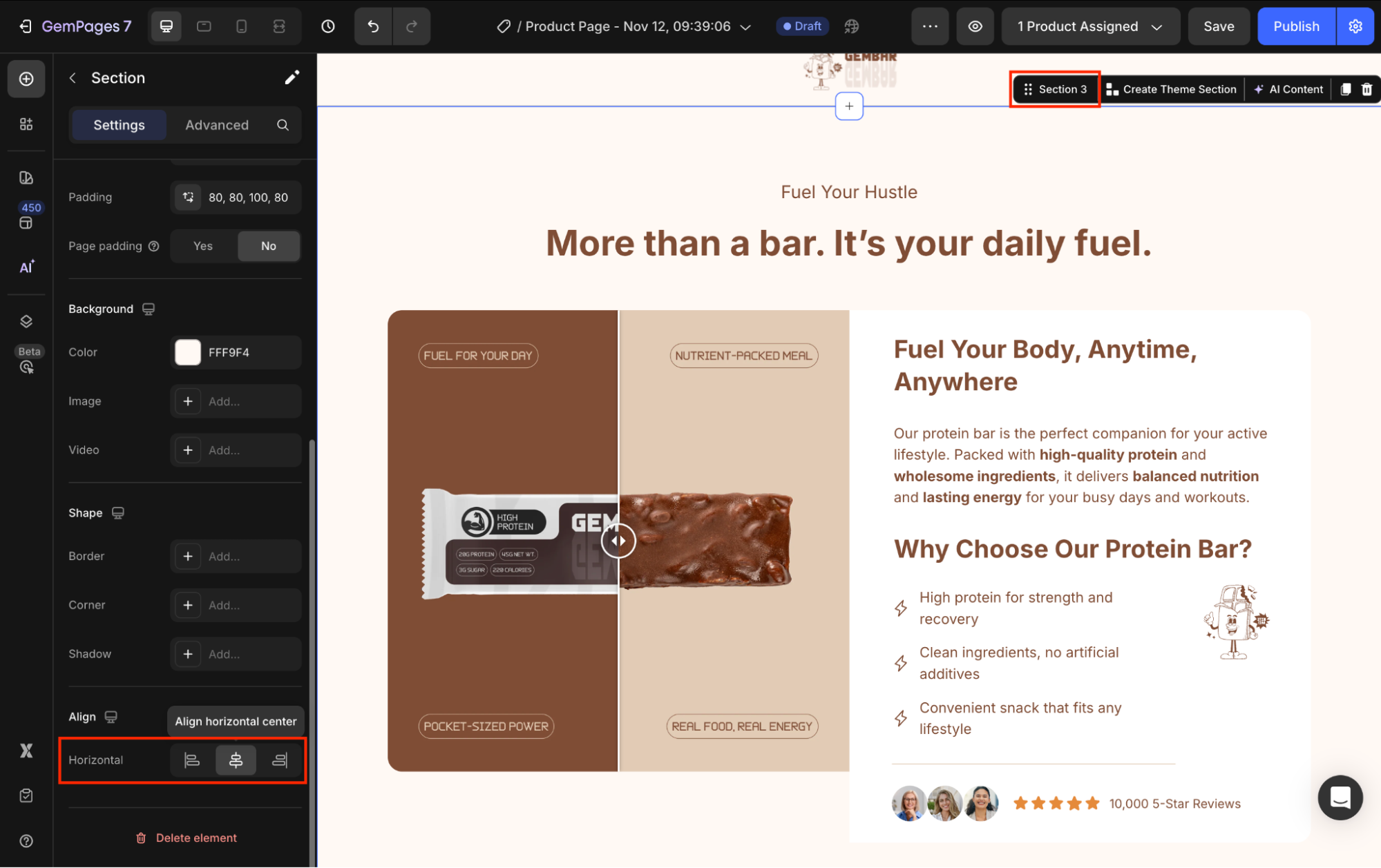
Align
Adjust the alignment of your section. You can choose from left-aligned, horizontal center-aligned, or right-aligned.
Configure the Advanced tab
The Advanced tab gives you more control over how your Section appears across different devices, along with detailed spacing options and additional shape styling.
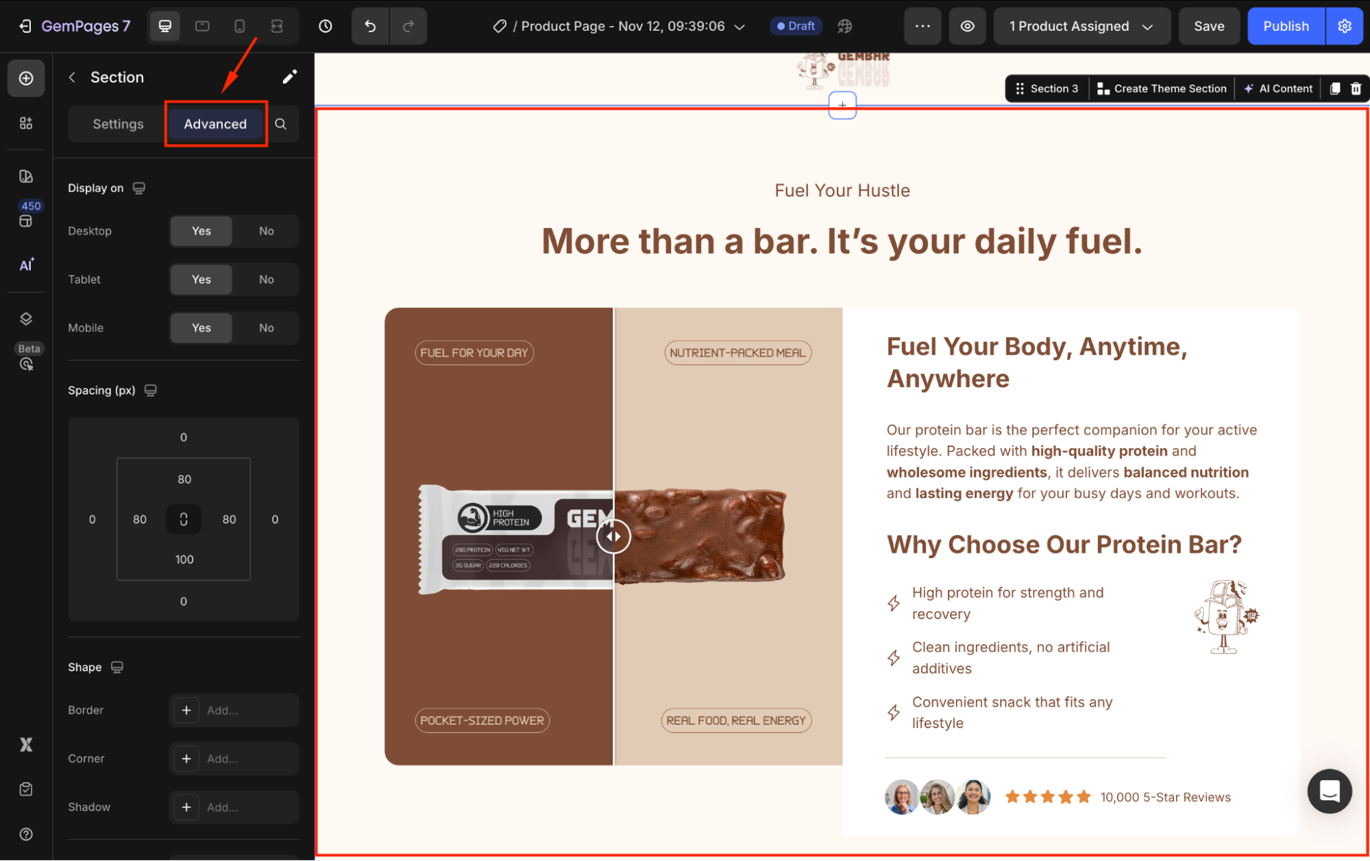
These settings help you fine-tune responsiveness and create a clean, consistent layout throughout your page.
For more advanced customization, please follow the instructions in this article.


Thank you for your comments