


What Is Horizontal Scrolling on Mobile?
Horizontal scrolling occurs when the total width of a page exceeds the device’s viewport width. On mobile devices, this causes users to accidentally scroll sideways, revealing blank space or hidden content.
From a UX perspective, this is considered a layout bug rather than a feature for most ecommerce pages.
Why Horizontal Scrolling Happens (Common Causes)
Based on discussions and troubleshooting patterns across the Shopify Community, horizontal scrolling usually originates from one or more elements breaking the mobile layout width.
1. Fixed-Width Elements Larger Than the Screen
Elements with hardcoded widths (for example width: 400px) can overflow on smaller screens.
Typical sources:
- Custom HTML blocks
- Images inserted with fixed pixel width
- Embedded iframes (forms, maps, videos)
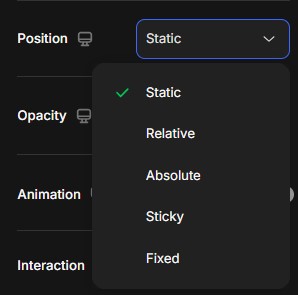
2. Absolute or Fixed Positioning
Elements using:
- position: absolute
- position: fixed
may escape the normal layout flow and extend beyond the viewport.
Common examples:
- Floating buttons
- Sticky badges
- Custom icons or labels added via HTML/CSS
3. Negative Margins or Extra Padding
Negative margins or excessive padding on mobile can push content outside the viewport.
Example:
- margin-left: -20px;
- padding-left: 40px;
This is often introduced unintentionally during desktop-first design adjustments.
4. Images or Videos Not Set to Be Responsive
Media elements without responsive rules can exceed screen width.
Typical issues:
- Images missing max-width: 100%
- Videos embedded via iframe without responsive containers
5. Third-Party App Widgets
Apps that inject frontend code (chat widgets, popups, review badges, tracking scripts) may introduce hidden overflow.
This is a very common cause reported in Shopify Community threads, especially when issues appear only after installing a new app.
How to Identify the Problem Element
Before fixing the issue, you need to identify which element is causing the overflow.
Quick Checks
- Open the page on a real mobile device
- Scroll horizontally and observe where the overflow appears
- Temporarily disable sections in the GemPages editor to isolate the source
Advanced Check (Recommended)
- Use Chrome DevTools
- Enable mobile view
- Inspect elements and look for:
- Elements wider than 100vw
- Unexpected margins or transforms
How to Fix Horizontal Scrolling in GemPages
1. Use Responsive Width Settings
In GemPages, always prefer:
- Width: Auto or 100%
- Avoid fixed pixel widths for mobile
Check Tablet and Mobile settings separately, not only Desktop.
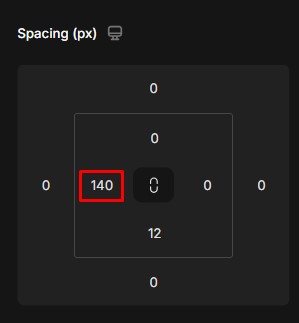
2. Review Mobile-Specific Padding & Margin
- Reduce horizontal padding on mobile
- Avoid negative margins unless absolutely necessary
A common safe range:
- Padding left/right: 10–16px on mobile
3. Make Images and Videos Fully Responsive
For images:
- Enable responsive scaling
- Avoid custom width overrides
For videos or iframes:
- Use responsive containers
- Avoid setting fixed iframe widths
4. Check Custom Code Blocks Carefully
If your page uses Custom HTML / CSS / JS:
- Avoid width values larger than 100%
- Avoid transform: translateX(…) on mobile
- Avoid absolute positioning without mobile overrides
5. Test Without Third-Party Apps
If the issue persists:
- Temporarily disable recently installed apps
- Recheck the page
- Contact the app’s support if the issue disappears
Best Practices to Prevent This Issue
- Always preview on real devices
- Avoid fixed widths and absolute positioning on mobile
- Keep custom code minimal and controlled
- Test after installing or updating app


Thank you for your comments