


Sometimes a design that looks great on mobile may not work the same way on desktop. For example, you may want to apply a gradient background on mobile devices to create a stronger visual impact, while keeping a simple background on desktop and tablet.
In GemPages, you can achieve this by duplicating a section or element and controlling device visibility settings. This guide explains how to apply a gradient background only on mobile in GemPages while keeping the original design for larger screens.
What Is a Gradient Background?
A gradient background is a background style where two or more colors blend smoothly together. Instead of a single solid color, gradients create a transition effect between colors.
Gradient backgrounds are commonly used to:
- Create more visually engaging sections
- Highlight important content like hero banners or promotions
- Improve visual contrast on smaller screens
When to Use a Mobile-Only Gradient Background:
There are many design scenarios where applying a gradient only on mobile can improve the user experience.
For example:
- Making mobile hero sections more visually attractive
- Improving text readability on small screens
- Creating mobile-first promotional sections
- Matching campaign designs optimized for mobile users
Because mobile screens are smaller, gradients can help draw attention and improve visual hierarchy without overcrowding the layout.
How to Apply a Gradient Background Only on Mobile
Follow the steps below to display a gradient background only on mobile devices while keeping the original background on desktop and tablet.
Step 1: Duplicate the Section or Element
First, locate the section or element where you want to apply the gradient background.
Then duplicate that section or element.
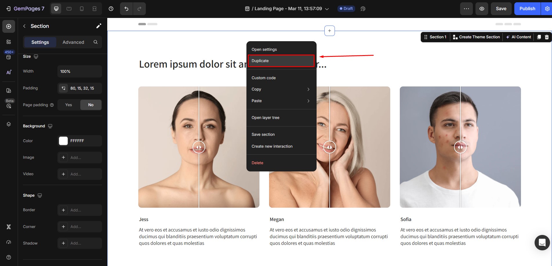
After duplicating, you will now have two versions:
- The original version (for desktop and tablet)
- The duplicated version (for mobile)
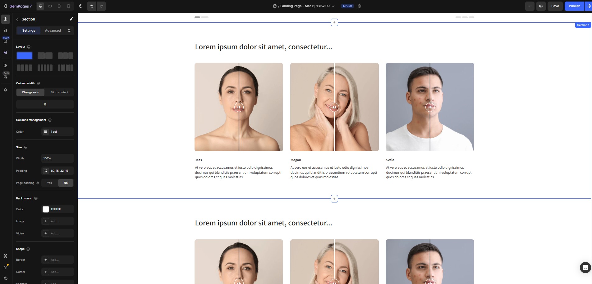
Both versions initially look identical.
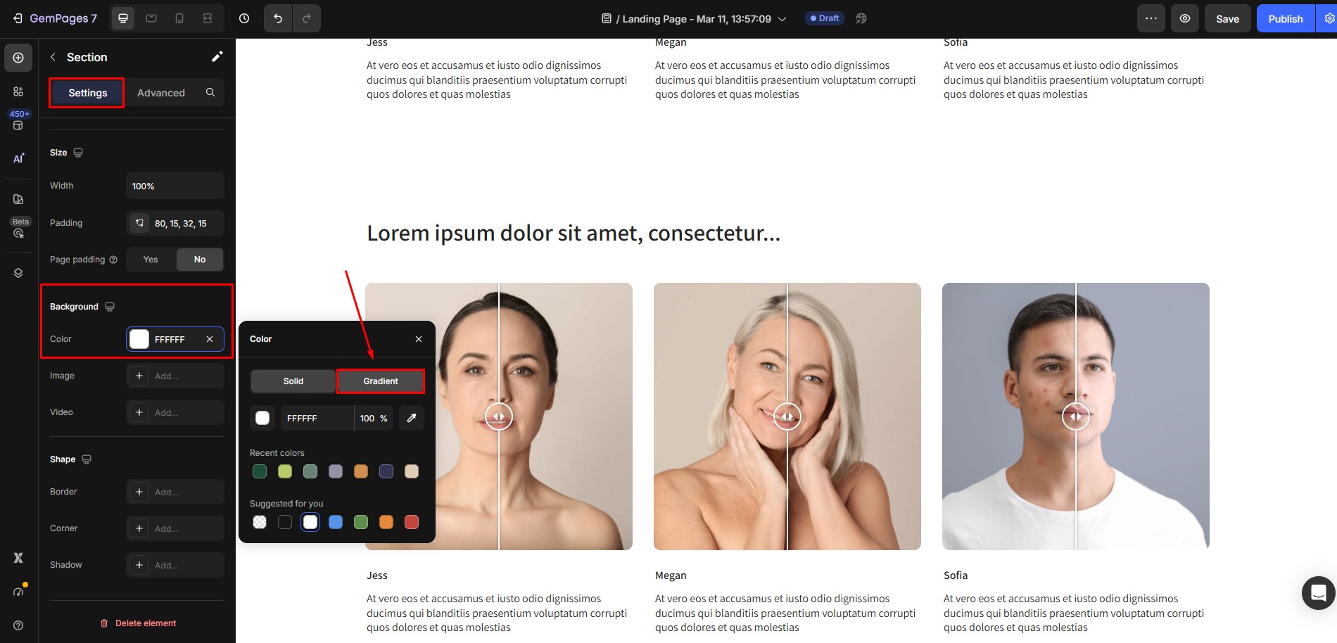
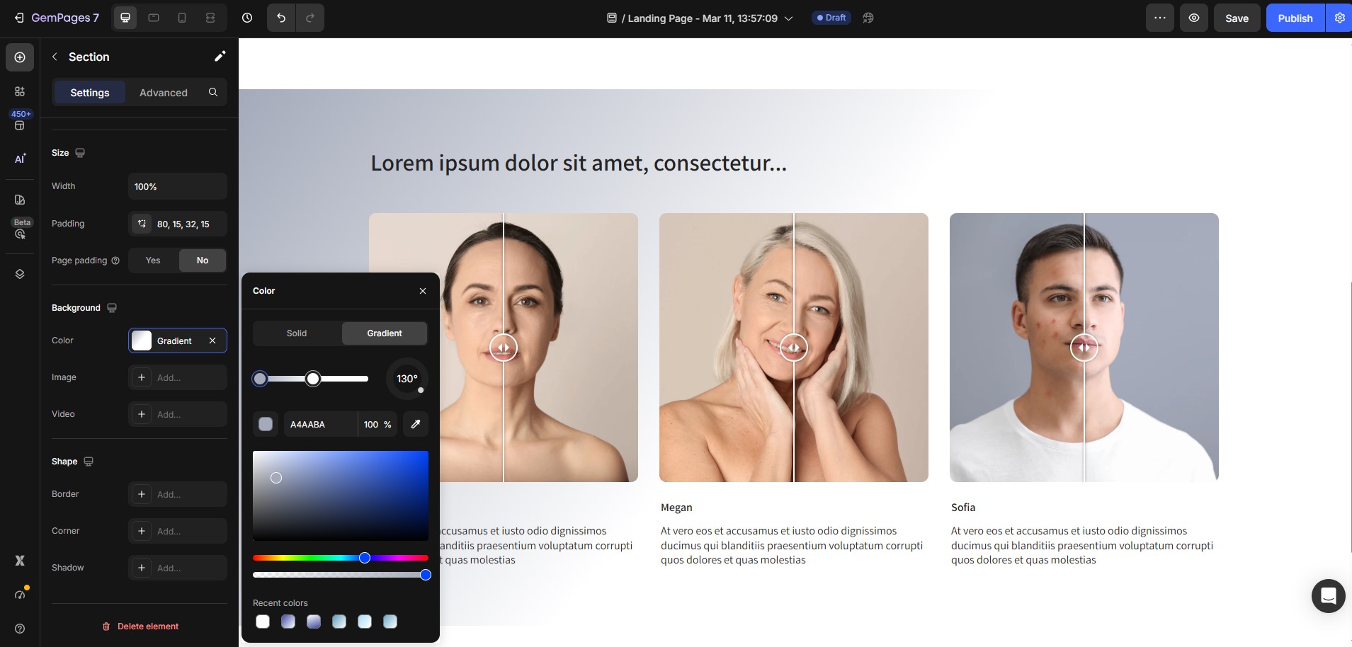
Step 2: Add the Gradient Background
Next, configure the duplicated version to use a gradient background.
- Select the duplicated section or element.
- Open the Settings panel.
- Navigate to Background.
- Select Color → Gradient.
- Adjust the gradient colors and direction based on your design preference.
For a more detailed guide on how to use gradient background, please refer to this article: Add a Gradient Background.
At this stage, you now have:
- One version with the original background
- One version with a gradient background
Step 3: Configure Device Visibility
Now you need to control which version appears on each device.
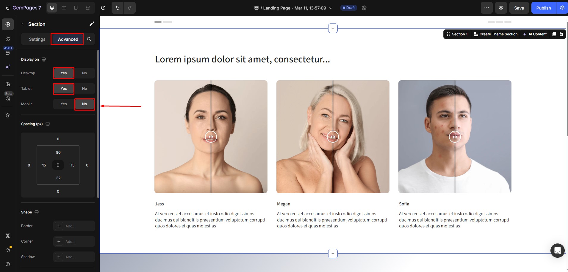
Original Section (Desktop + Tablet)
Select the original section, then configure its display settings so it only appears on larger screens.
Enable visibility for:
- Desktop
- Tablet
Disable visibility for:
- Mobile
Duplicated Section (Mobile Only)
Next, select the duplicated section with the gradient background.
Set its display settings to:
Enable visibility for:
- Mobile
Disable visibility for:
- Desktop
- Tablet
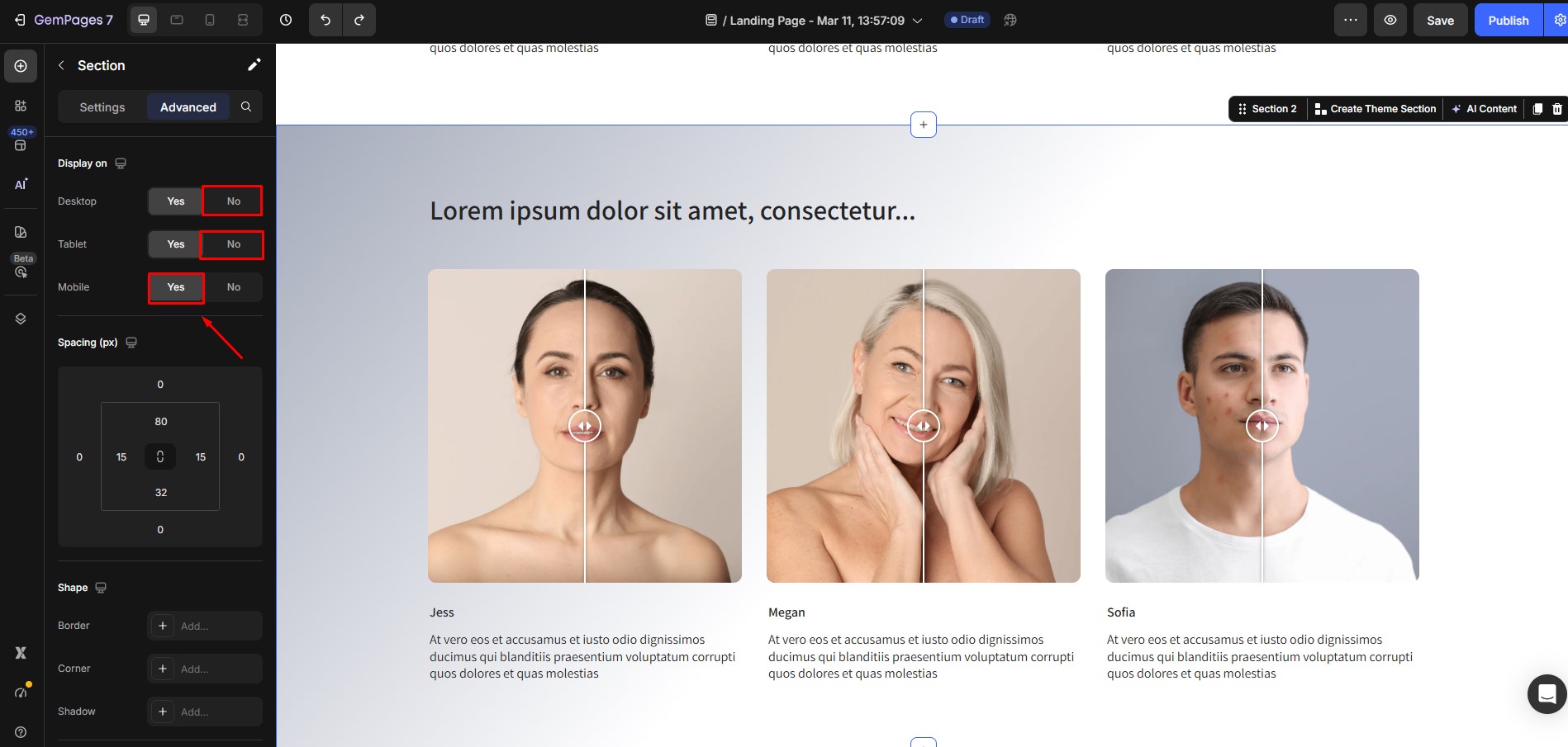
This ensures that the gradient version only appears on mobile devices.
Step 4: Save and Publish the Page
After finishing the configuration:
- Click Save.
- Publish or update your page.
Your page will now display:
- The original background on desktop and tablet
- The gradient background only on mobile
Other Design Customizations You Can Apply With This Method
This device-specific duplication method can also be useful for other design adjustments, such as:
- Using different background images for mobile
- Adjusting spacing and layout structures
- Showing simplified mobile sections
- Creating mobile-specific campaign designs
Important Note
This approach works by duplicating sections or elements, which increases the number of elements on the page. For this reason, we recommend using this method only when necessary. Excessive duplication can make pages harder to maintain and manage. Whenever possible, try using responsive settings first before creating duplicate sections.


Thank you for your comments