


Customizing the Checkbox element background color is a simple way to create more visually consistent and professional forms in your Shopify store.
In this tutorial, you’ll learn how to change the background color of a Checkbox element in GemPages using Custom Code.
Before You Start
Before following this tutorial, make sure you already have:
- A page created in GemPages
- A Checkbox element added to your page
- Access to the GemPages editor
Step 1: Open the Custom Code Panel
Inside the GemPages editor, locate the Checkbox element you want to customize.
Right-click the Checkbox element.
Then select: Custom Code
This will open the Custom Code panel for the selected element.
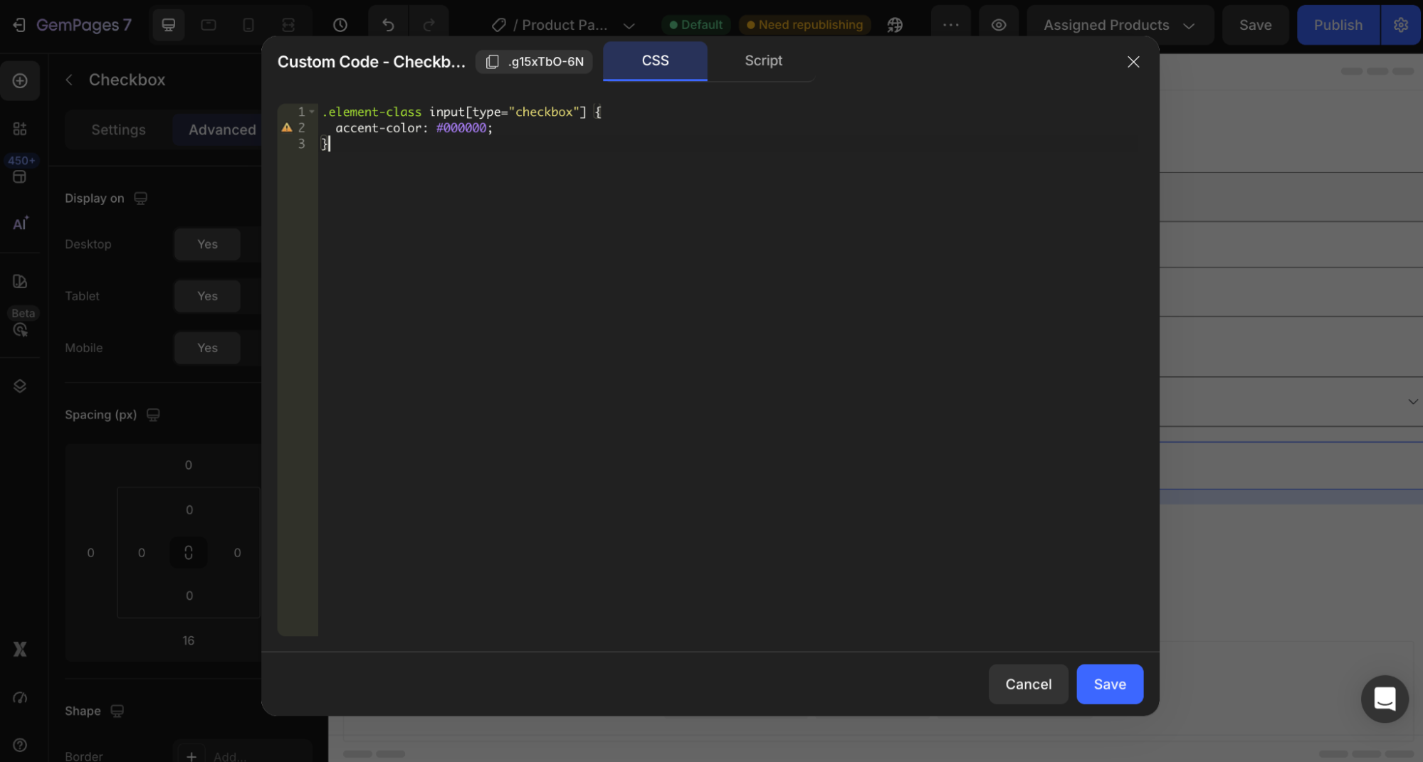
Step 2: Add the CSS Code
Paste the following code into the Custom Code editor:
.element-class input[type=”checkbox”] {
accent-color: #000000;
}
Important Notes
1. Replace .element-class
You must replace:
.element-class
with the actual class name of your Checkbox element.
You can find the element class at the top-left corner of the Custom Code panel.
Example:
.gf-checkbox-123 input[type=”checkbox”] {
accent-color: #1a73e8;
}
2. Replace #000000 With Your Color Code
Replace the HEX value with your preferred checkbox color.
Examples:
| Color | HEX Code |
| Black | #000000 |
| White | #ffffff |
| Blue | #1a73e8 |
| Red | #ff0000 |
| Green | #34a853 |


Thank you for your comments