


About Button Text Shadow in GemPages
The text inside the Button element can be customized using CSS. By adding a text-shadow effect, you can:
- Make button text more visible on busy backgrounds
- Create a more modern or premium design look
- Improve visual hierarchy for call-to-action buttons
- Highlight important actions such as Buy Now, Add to Cart, or Get Started
This method works with Button elements in GemPages where you want to visually enhance the text without changing the button layout.
Step-by-Step: How to Add Shadow to Button Text
Follow these steps carefully to apply a shadow effect to your button text.
Step 1: Open Your Page in GemPages Editor
From your GemPages Dashboard, open the page that contains the button you want to edit.
Locate the Button element that contains the text you want to add shadow to.
Step 2: Open the Custom Code Panel
Right-click directly on the Button element that contains the text.
Then:
- Select Custom Code
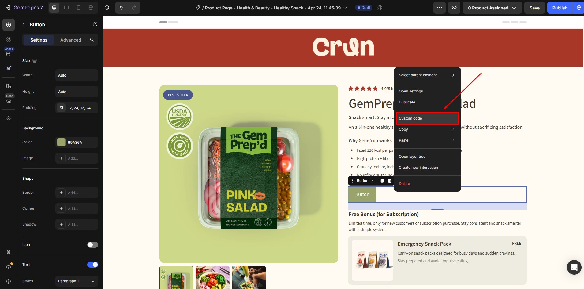
- The CSS panel will appear
This panel allows you to add custom styling specifically to that button.
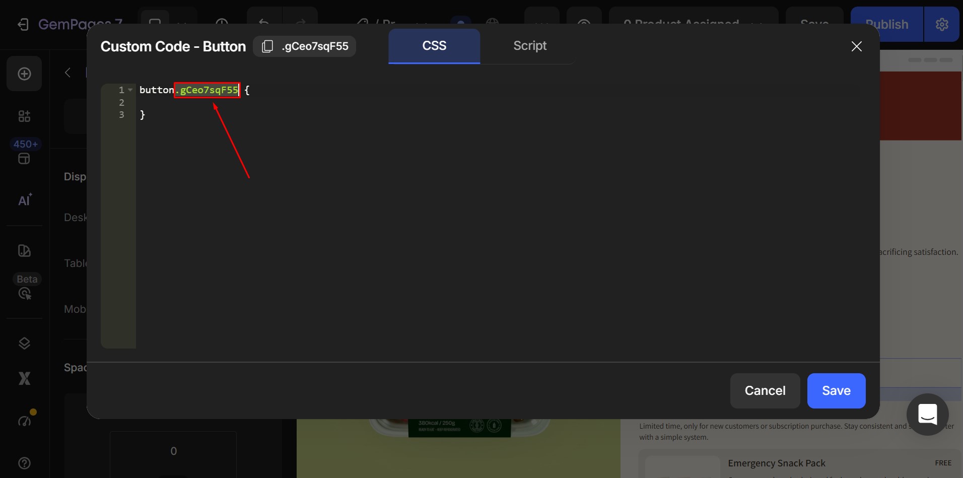
Step 3: Copy the Element Class
When the CSS panel opens, you will see an element class at the very first line.
It will look something like this:
.gp-button-abc123
Copy this class name — you will use it in the next step.
Step 4: Paste the Text Shadow Code
Add the following custom CSS into the panel:
| .ElementClass {
text-shadow: 2px 2px 4px rgba(0, 0, 0, 0.3) !important; } |
Then:
- Replace ElementClass with your actual button class
- Click Save
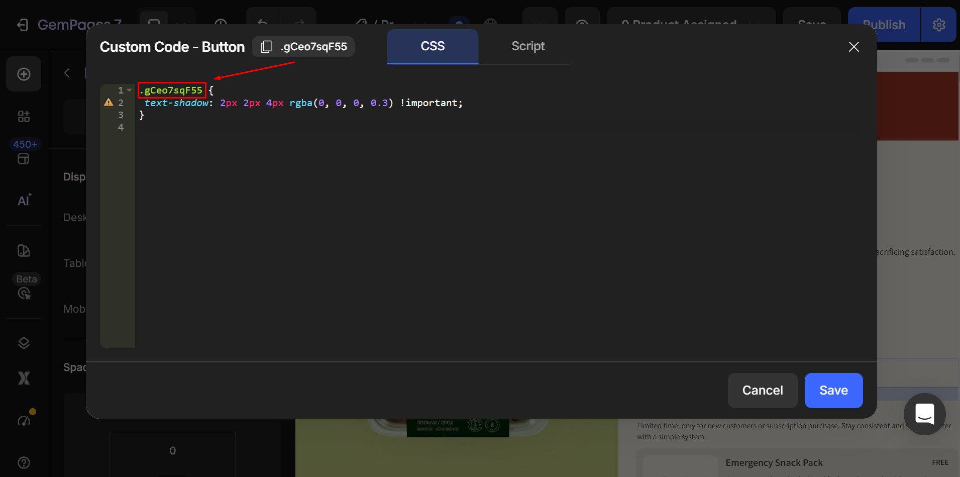
For example, if your element class is: .gp-button-abc123
Your final code should look like:
.gp-button-abc123 {
text-shadow: 2px 2px 4px rgba(0, 0, 0, 0.3) !important;
}
Once applied, your button text will display with a soft shadow effect.
Understanding the Text Shadow Values
The text-shadow property includes four values. Each value controls how the shadow looks.
text-shadow: 2px 2px 4px rgba(0, 0, 0, 0.3);
Here is what each value means:
2px → Horizontal Offset
Controls how far the shadow moves left or right.
Examples:
2px → moves shadow to the right
-2px → moves shadow to the left
2px → Vertical Offset
Controls how far the shadow moves up or down.
Examples:
2px → moves shadow downward
-2px → moves shadow upward
4px → Blur Radius
Controls how soft or sharp the shadow appears.
Examples:
0px → sharp shadow
4px → soft shadow
10px → very soft shadow
Higher numbers create softer shadows.
rgba(0, 0, 0, 0.3) → Shadow Color
Controls the color and transparency of the shadow.
Format:
rgba(red, green, blue, opacity)
Example:
rgba(0, 0, 0, 0.3)
Means:
- Red: 0
- Green: 0
- Blue: 0
- Opacity: 0.3 (30% visible)
This creates a semi-transparent black shadow.
If you want to create custom shadow colors, these tools can help you generate RGBA values easily.
- https://rgbacolorpicker.com
- https://cssgradient.io
- https://www.w3schools.com/colors/colors_picker.asp
- https://htmlcolorcodes.com
These tools allow you to:
- Pick any color visually
- Adjust transparency (opacity)
- Copy the rgba(…) value directly
- Preview shadow colors before using them


Thank you for your comments