


In some layouts, you may want to adjust the icon size to better match your button text or overall design. Currently, icon size inside a Button element cannot be adjusted directly from the built-in styling options. To customize the icon size, you can use a small CSS snippet inside the element settings.
This guide walks you through each step to apply the change correctly.
About Button Layouts With Icons
The Button element in GemPages supports different layouts depending on how you configure it.
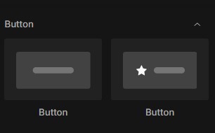
There are two common button layouts:
- Button Without Icon: This layout contains only text and does not include any icon.
- Button With Icon: This layout includes an icon placed before the button text. Icons help make buttons more visually engaging and easier to recognize.
How to Change Icon Size in Button Element Using Custom Code
Follow the steps below to adjust the icon size inside your Button element.
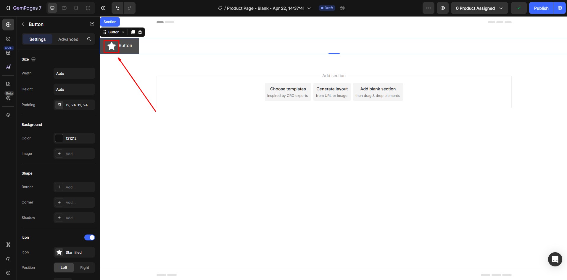
Step 1: Select the Button Element That Contains the Icon
From the GemPages editor:
- Open the page or template where your Button element is located.
- Click directly on the Button element that contains the icon.
- Confirm that the selected button includes an icon placed before the text.
Once selected, the element settings panel will appear on the left side of the editor.
Make sure you are editing the correct button before continuing.
Step 2: Open the Custom Code Editor
After locating the Button element:
- Right-click on the Button element that contains the icon.
- From the dropdown menu, select Custom Code.
This action opens the Custom Code editor, where you can add CSS that applies only to this specific element.
This section allows you to apply additional styling to the selected element.
Step 3: Add CSS Code to Change Icon Size
Inside the Custom CSS field, paste the following code:
| button.ElementClass svg {
font-size: 50px; } |
This code controls the size of the icon inside the selected button.
Replace:
- .ElementClass with the class shown at the top.
- 50px with the size you want.
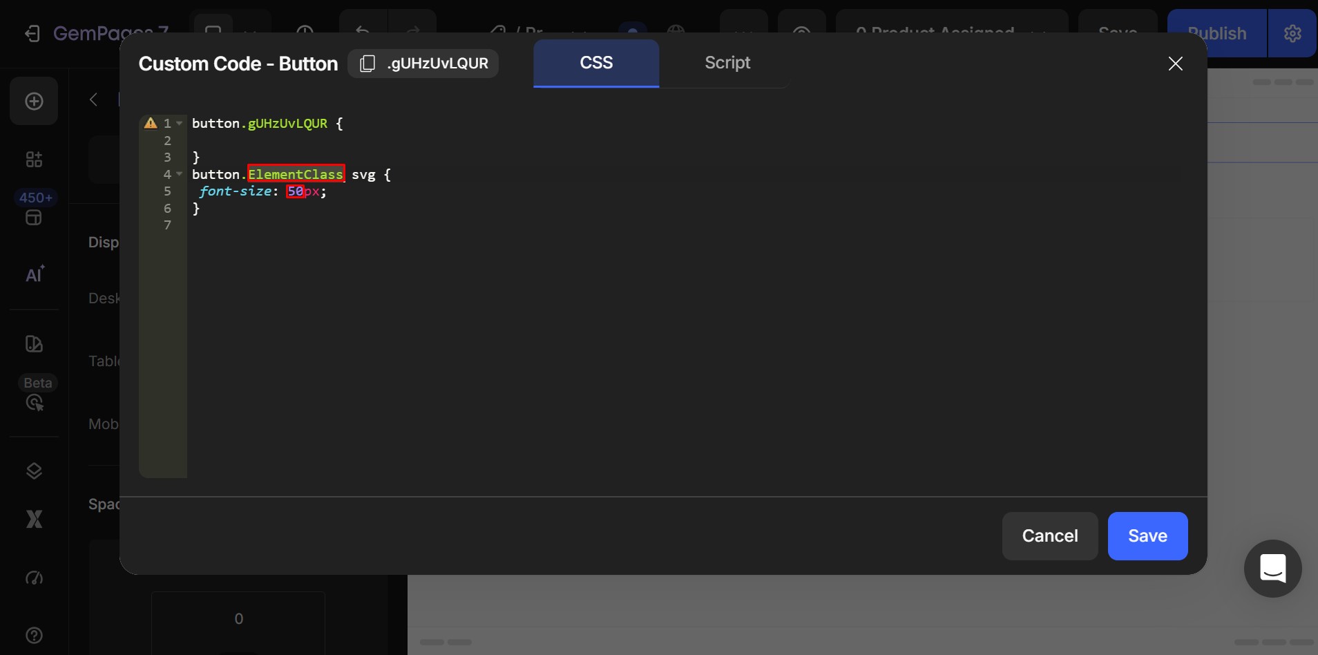
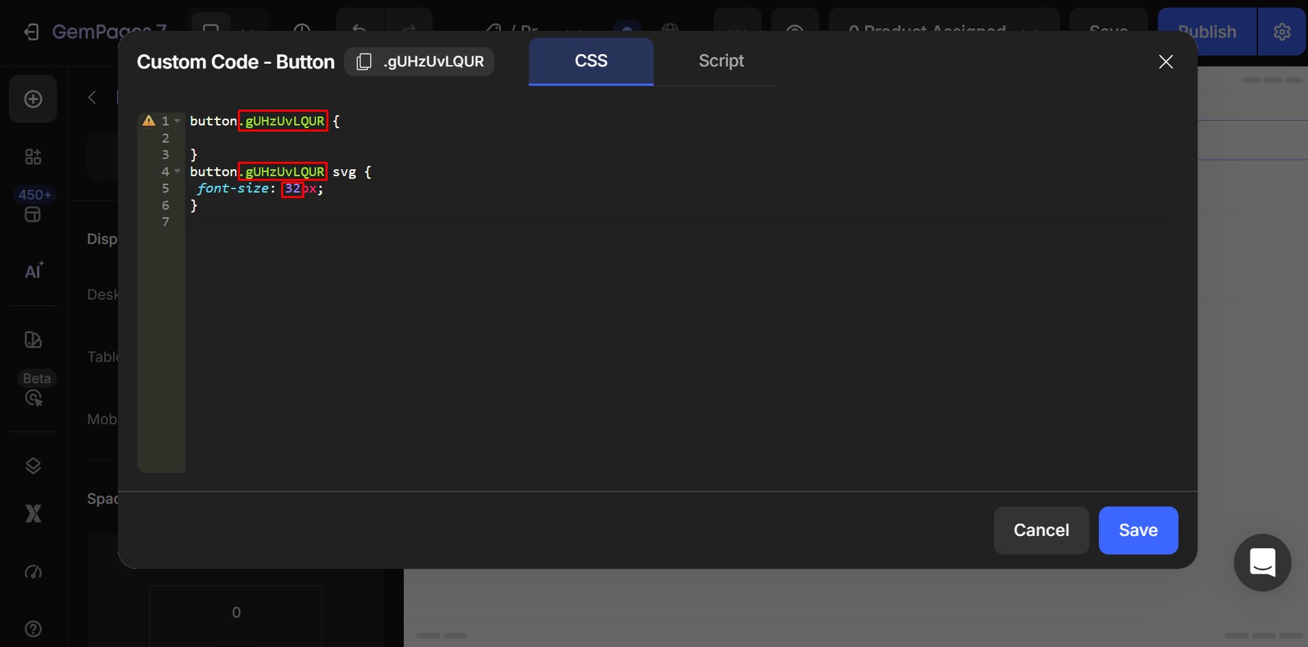
After entering the code, click Save.
The icon size will update based on the value you entered:
Step 4: Preview the Result
After publishing:
- Preview your page.
- Check whether the icon size looks balanced with the button text.
- Test the layout on both desktop and mobile views.
If needed, return to the editor and adjust the size value again.
You can repeat the process until the icon size matches your design.
How to Choose the Right Icon Size
The correct icon size depends on your button size and text style.
Below are commonly used size ranges:
| Button Type | Recommended Icon Size |
| Small button | 16px – 20px |
| Standard button | 20px – 24px |
| Large button | 24px – 32px |
| Hero button | 32px – 40px |
Use these ranges as starting points, then adjust based on your layout.


Thank you for your comments