


By default, Carousel navigation in GemPages is displayed as dot indicators. While dots work well in many cases, some users prefer using left and right arrow buttons for easier navigation and a more modern user experience.
With a simple custom CSS snippet, you can reposition the navigation arrows and create a cleaner layout that replaces the default dot-style navigation. This article will guide you step-by-step on how to replace Carousel dots with navigation arrows in GemPages using custom code.
Step-by-Step: How to Replace Carousel Dots with Navigation Buttons
Follow these steps carefully to apply the navigation arrow layout.
Step 1: Right-click the Carousel Element
Open your page in the GemPages Editor.
Then:
- Locate the Carousel element
- Right-click directly on the Carousel
- Select Custom Code
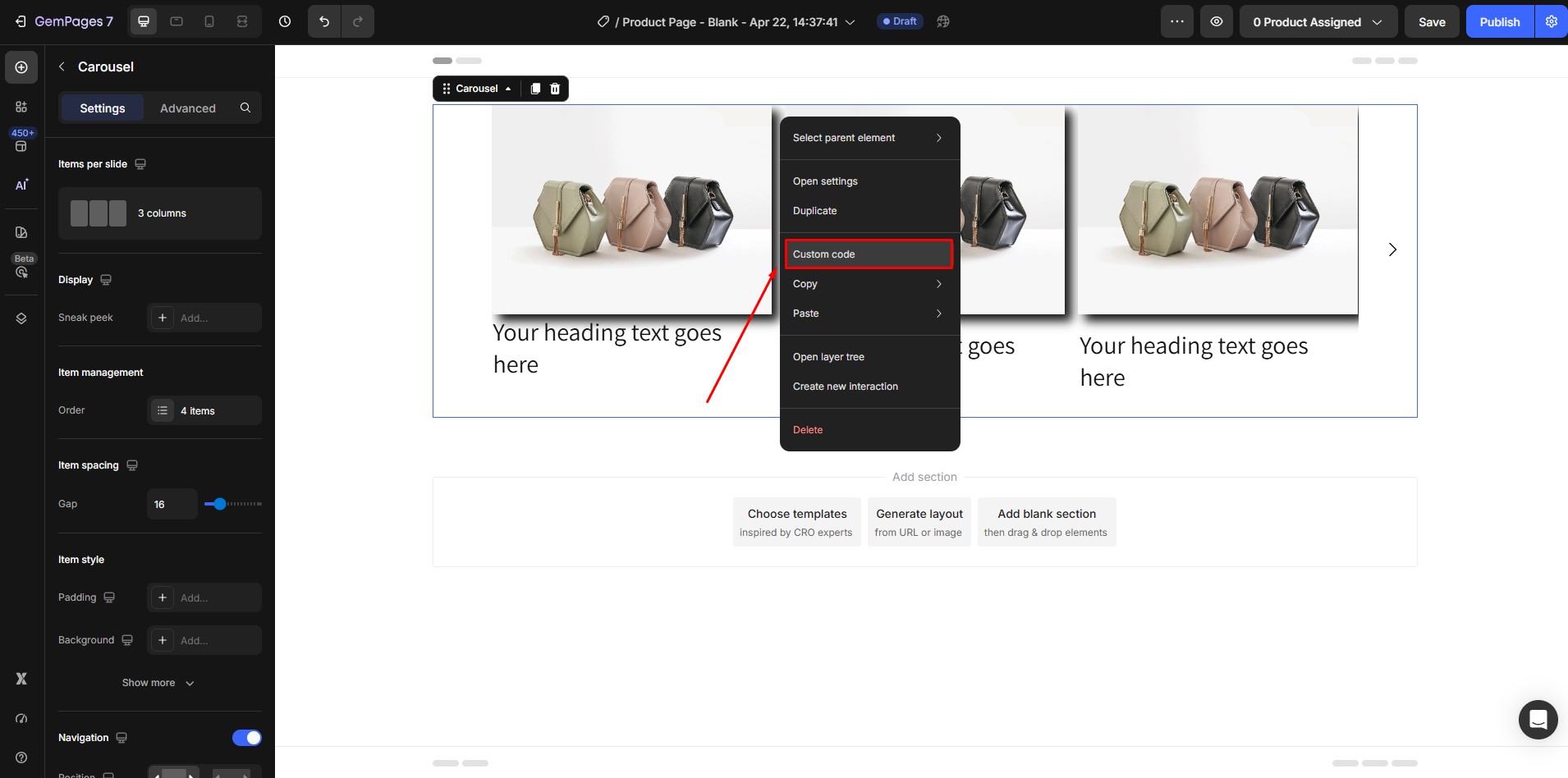
This will open the CSS Custom Code panel.
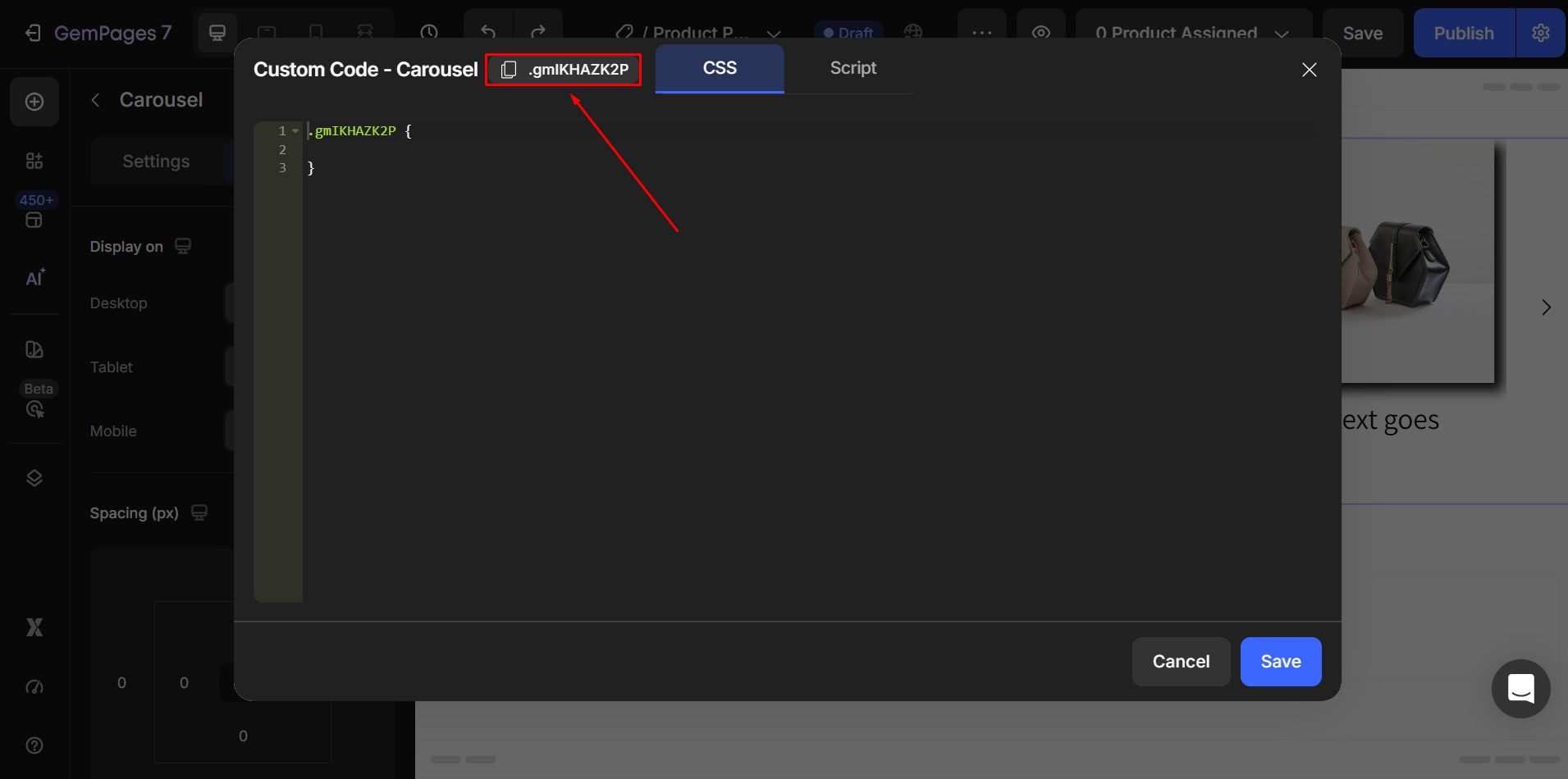
Step 2: Copy the Carousel Class from the First Line
Inside the Custom Code panel:
- Look at the first line
- You will see the Carousel class
Copy this class name. You will use it in the next step.
Step 3: Paste the Navigation Button Code
Paste the following CSS into the Custom Code panel:
.carouselID .gem-slider-previous {

 bottom: -40px !important;

 top: auto !important;

 left: calc(50% - 40px) !important;

}
|
.carouselID .gem-slider-next {

 bottom: -40px !important;

 top: auto !important;

 right: calc(50% - 40px) !important;

}
|
Then:
Replace:
carouselID
With:
Your actual Carousel class that you copied in Step 2.
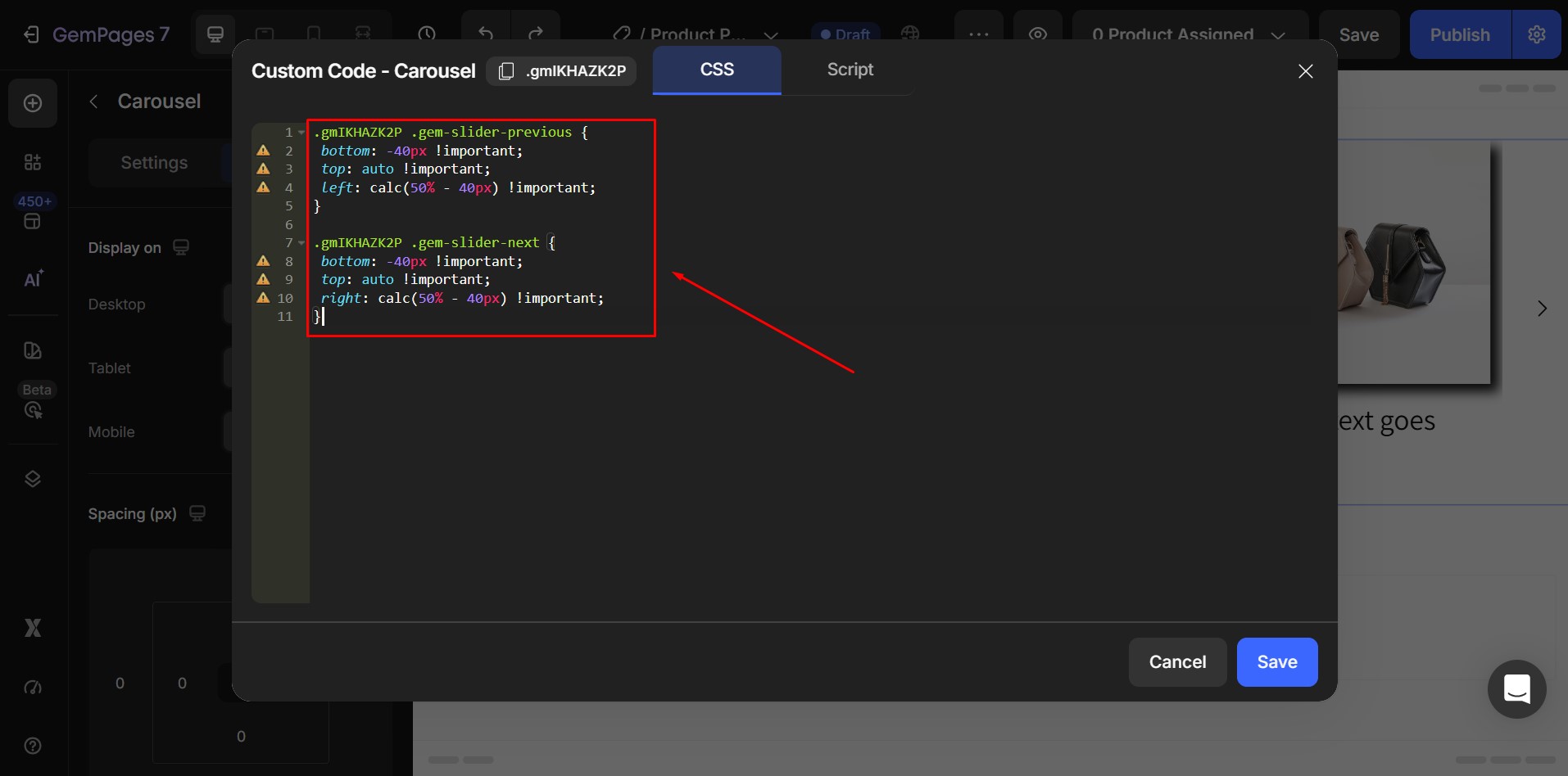
After that:
- Click Save
- Refresh the preview
- Check the navigation layout
Step 4: Click Save to Apply Changes
Once you finish pasting the code:
- Click Save
- Refresh the page preview if needed
Your Carousel navigation should now display arrow buttons positioned below the slider, making navigation clearer and easier to use.


Thank you for your comments